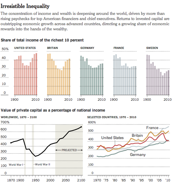
Tax Day for Americans seems like a great time to talk about income inequality. The article from which this chart comes talks about a recent book exploring the parallels of the 19th century’s inequality—as the article reminds us, the time of “Please, sir, may I have another?”—and the forecast for the 21st. Anyway, the graphic is a nice use of small multiples and highlights that despite the damage done to capital wealth by Great Depressions and two world wars, it is well on its way back to unequal levels.
Credit for the piece goes to the New York Times graphics department.
Leave a Reply
You must be logged in to post a comment.