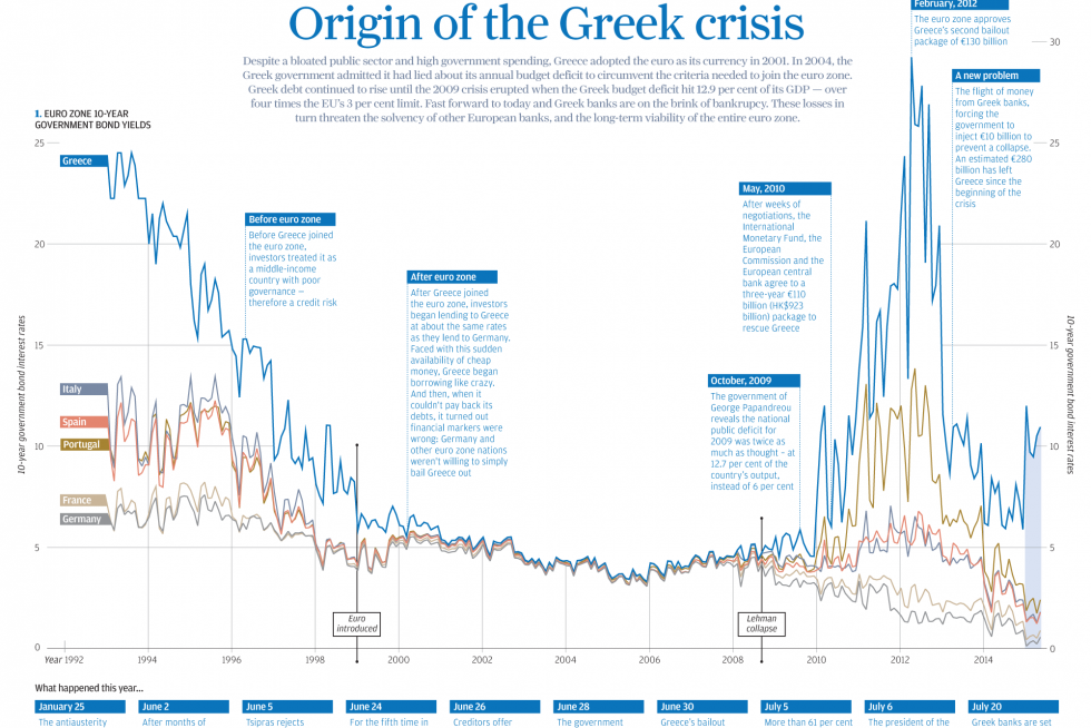
In today’s post we look at a graphic made by the South China Morning Post to explain the Greek Crisis. The graphic does a nice job anchoring the story in a combined chart and timeline. The reader then continues down the piece learning about additional points from demographics to text-based explanations.
Credit for the piece goes to the South China Morning Post graphics department.
Leave a Reply
You must be logged in to post a comment.