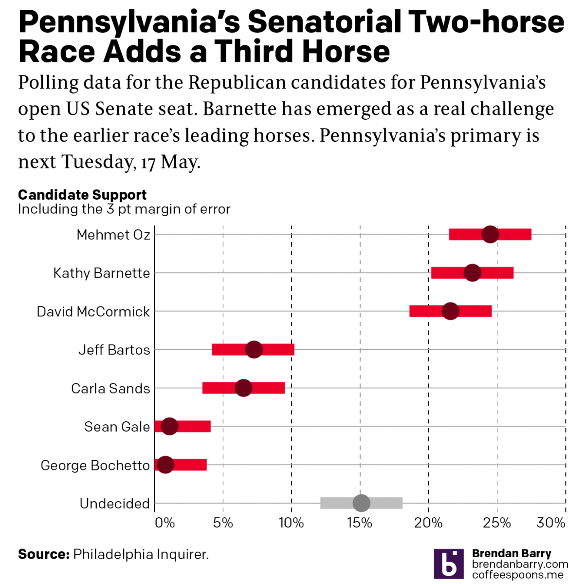
Tuesday’s Data on Covid-19

Here are the Tuesday figures for Pennsylvania, New Jersey, Delaware, Virginia, and Illinois. At the end is an updated version of the flattening curves chart as well. Given the value of these graphics that people have been texting, emailing, and DMing me on social media, I might consider making these a regular staple here on my blog as well. I would probably slowly write about other graphics covering the outbreak as well.

Any feedback is welcome on how to make the graphics more useful to you, the public.

Pennsylvania has finally reached the point where the virus has infected at least one person in every county. Now, if we shift our attention a wee bit to the deaths, we can see those are still largely confined to the eastern third of the state.

The condition in Pennsylvania

New Jersey continues to suffer greatly. But a sharp increase in new cases could be a blip, or it could mean the curve isn’t flattening. We need more data to see a longer trend. Regardless, over 3000 more people were reported infected and over 200 more died.

The condition in New Jersey

Delaware worsened significantly. As a small state, it has a lower captive population. But it is rapidly approaching 1000 cases. In fact, I would not be surprised if that is the headline from Wednesday.

The condition in Delaware

Virginia also saw a significant uptick in cases. And most counties and independent cities in eastern Virginia now report cases. But the rural, mountainous counties in the west and southwest are not uniformly infected. At least not yet.

The condition in Virginia

Illinois saw some geographic spread, but again, compared to a state like Pennsylvania, the worst in Illinois is disproportionately concentrated in the Chicago metropolitan area.

The condition in Illinois

Lastly, the curves are not flattening in all the states but maybe New Jersey. But as I noted above, the higher daily cases there might be a blip.

The state of curves
The state of curves

Credit for the pieces goes to me.

Where’s My Corona? Another Round, Please

This past weekend I continued looking at the spread of COVID-19 across the United States. But in addition to my usual maps of Pennsylvania, New Jersey, Delaware, Virginia, and Illinois, I also looked at the number of cases across the United States adjusted for population. I then looked at the five aforementioned states in terms of new cases to see if the curve is flattening. Finally, I looked at the number of hospital beds per 1000 people vs the number of cases per 1000 people.

The latter in particular I wanted to be an examination of hospitalisation rates vs ICU beds, which are a small fraction of total hospital beds. But as I could not find that data, I made do with overall cases and overall beds.

So first let’s look at the cases across the U.S. What you can see is that whilst New York and New Jersey do have some of the worst of the impact, Washington is still not great and Louisiana and Michigan are also suffering.

The situation across the United States

And then when we look at the states by their cases per 1000 people and their hospital beds per 1000 people, we see that the states often claimed to be overwhelmed, New York, New Jersey, and Washington are all well over the blue line, which indicates an equal number of beds and cases per 1000 people, or near it. Because it is important to remember that not all beds are the type needed for COVID-19 victims, who often require the more fully kitted out ICU beds. Additionally, not all cases are severe enough to warrant hospitalisation.

Cases per 1k people vs hospital beds per 1k people

Then from the broader national view, we can look at the states of interest. Here, those of you who have been following my social media posts, you can see fewer dark purples in these maps. That’s because I have adopted a new palette that has sacrificed granularity at the lower end of the scale and added it at the top, a particular need in New Jersey and the Philadelphia and Chicago metro areas. And finally we look at the daily new cases to see if that curve is flattening.

Pennsylvania now has almost every county infected. But unlike Illinois, which has a similar infection rate but more unaffected counties, Pennsylvania has fewer cases in its big city, Philadelphia, and has more cases in the smaller cities and towns.

The situation in Pennsylvania

New Jersey is just a disaster. Deaths are now reported in every county—so I can probably remove those orange outlines. The only potential good news is that new cases for the second day in a row were fewer than the day before. It could be a blip. But it could also be a signal that the peak of infection has or is nearing. That said, hospitalisations and deaths are lagging indicators and could take two weeks to follow the positive test results. So in the best case scenario that this is a peak, New Jersey is far from out of the woods.

The situation in New Jersey

Delaware is the smallest state I look at—and one of the smallest in the union overall—but its cases are worryingly increasing rapidly, although like every state I examine in detail it had fewer new cases Sunday than Saturday.

The situation in Delaware

Virginia is in a better spot overall than the other four states. You can see that in the national map above. And most of Virginia’s cases are concentrated in the DC and Richmond areas as well as the cities along the peninsulas jutting into the Chesapeake.

The situation in Virginia

Illinois is, as noted above, similar to Pennsylvania in terms of infections. In terms of deaths, however, it is doubling Pennsylvania’s numbers. And most of its cases are located in and around Chicago. Big chunks of downstate Illinois are unaffected or lightly affected compared to the Commonwealth.

The situation in Illinois

Finally, as I noted in New Jersey, could these lower numbers Sunday than Saturday be meaningful? Possibly. But in all five states? Highly unlikely. Regardless, we can look at the number of daily new cases and see if that curve of infection is flattening. We should wait several days before beginning to make that assessment. But one can hope.

The case for flattening curves

All of this is to say that things are bad and likely will continue to get worse. But I will keep looking at the data daily and presenting it to the public to keep them informed.

Credit for this piece is mine.

Another Friday, Another Corona with Lime Update

Today is yet another Friday in the pandemic. And so I wanted to just upload a few of the graphics I have been making for family, friends, and coworkers and posting on the Instagram and the Facebook. I did this two weeks ago as well, and if you compare those maps to these, you will see quite a stark difference. But on to today’s maps.

As a brief reminder, I am specifically looking at Pennsylvania, New Jersey, and Delaware—the tri-state region for my non-Philly followers—as well as Virginia and Illinois by the request of friends and former colleagues who live in those states. And then at the end I’ve been putting the tri-state region together to provide a fuller regional context.

Lastly, for today only, the Bureau of Labour Statistics published its jobs report about the number of job losses in March across the US. And…it wasn’t pretty.

Conditions in Pennsylvania
Conditions in New Jersey
Conditions in Delaware
Conditions in Virginia
Conditions in Illinois
Conditions in the tri-state region

Plus, the added bonus of the Bureau of Labour Statistics’ monthly jobs report. And spoiler, things aren’t so great out there.

Conditions in the national job market. Not great!

Credit for the work is mine.


Modelling the Impact of Not Sheltering in Place or Staying at Home

The administration botched the early stages of the COVID-19 pandemic. Only within the last two weeks have states acted to begin enacting dramatic policies aimed at slowing the spread of the virus through their communities. But what policies the federal government has enacted are now threatened by an administration that prioritises the economy and market over the lives of the citizens it leads.  The White House is discussing loosening all the policies of social distancing that health officials and scientists say are necessary to slow the spread of the virus.

This website from CovidActNow.org uses a model to predict the impact state by state of various policies on hospital overcrowding and ultimately deaths. The site opens with a map of the United States showing, broadly, what kind of response each state has followed (understanding things change rapidly these days).

The state of reactions in the United States

That also serves as the navigation for a deep dive into those models for that state. Here I have selected my home state of Pennsylvania. It borders New Jersey and New York, two states that revolve, at least in part, around New York City, rapidly becoming the epicentre of the US outbreak, supplanting Seattle and the Pacific Northwest. What would the state face if we allowed things to keep going blithely on? What would happen if we merely socially distance for three months? What if we shelter in place for three months? (Emphasis added by me to show this is a long-term problem.)

Potential outcomes for Pennsylvania

Turns out that things don’t work out that well if we don’t stay at home, stop travelling, stop socialising. A table below the line charts shows the user how bad things go for the state in a table.

A table of potential outcomes

As you can see, for Pennsylvania, if we were to continue going on like normal, that would result in the deaths of almost the size of the entire city of Pittsburgh. Imagine if the city of Pittsburgh were suddenly wiped off the state map. That’s the level we are talking about.

Just three months of just social distancing? Well now you’re talking about wiping out just the cities of Allentown and Scranton.

Sheltering in place for three months, statewide? Well, thankfully Pennsylvania has lots of towns around the size of 5000 to choose from. Imagine no more Paoli, or Tyrone. Or maybe a Collegeville or Kutztown. An Oxford or a Media. Pick one of those and wipe it from the map.

Fundamentally the choice comes down to, do you want to restart your economy or do you want to save lives? Saving lives will undoubtedly mean unemployment, shattered 401k plans, bankruptcies, mental health problems, and cities, towns, and industries devastated without a tax base to provide for the necessary services. But, saving those jobs and dollars will means tens if not hundreds of thousands of deaths.

I don’t envy the state executive branches making these decisions.

Pennsylvania has chosen a middle road, if you will. It enacted a stay-at-home policy for seven counties: Allegheny (Pittsburgh); Philadelphia and its suburban counties of Bucks, Chester, Delaware, and Montgomery; and Monroe County. The rest of the state, primarily where the virus has yet to make any real significant appearance or appears to be spreading in the community, is not under the strictest of measures. This site’s model doesn’t account for a partial, statewide stay-at-home, but Pennsylvania’s choice is clearly a far superior one for people who prioritise lives over dollars.

Finally, to the people I have seen from my apartment gathering in parks, partying in outdoor spaces, that I can hear throwing house parties, please stop. If not for you, for the rest of us.

Credit for the piece goes to CovidActNow.org.

The Spread of COVID-19 in Select States

By now we have probably all seen the maps of state coverage of the COVID-19 outbreak. But state level maps only tell part of the story. Not all outbreaks are widespread within states. And so after some requests from family, friends, and colleagues, I’ve been attempting to compile county-level data from the state health departments where those family, friends, and colleagues live. Not surprisingly, most of these states are the Philadelphia and Chicago metro areas, but also Virginia.

These are all images I have posted to Instagram. But the content tells a familiar story. The outbreaks in this early stage are all concentrated in and around the larger, interconnected cities. In Pennsylvania, that means clusters around the large cities of Philadelphia, Pittsburgh, and Harrisburg. In New Jersey they stretch along the Northeast Corridor between New York and Trenton (and along into Philadelphia) and then down into Delaware’s New Castle County, home to the city of Wilmington. And then in Virginia, we see small clusters in Northern Virginia in the DC metro area and also around Richmond and the Williamsburg area. Finally in Illinois we have a big cluster in and around Chicago, but also Springfield and the St. Louis area, whose eastern suburbs include Illinois communities like East St. Louis.

19 March county wide spread of COVID-19

I have also been taking a more detailed look at the spread in Pennsylvania, because I live there. And I want to see the rapidity with which the outbreak is growing in each county. And for that I moved from a choropleth to a small multiple matrix of line charts, all with the same fixed scale. And, well, it doesn’t look good for southeastern Pennsylvania.

County levels compared

Then last night I also compared the total number of cases in Pennsylvania, New Jersey, Delaware, and Virginia. Most interestingly, Pennsylvania and New Jersey’s outbreaks began just a day apart (at least so far as we know given the limited amount of testing in early March). And those two states have taken dramatically different directions. New Jersey has seen a steep curve doubling less than every two days whereas Pennsylvania has been a bit more gradual, doubling a little less than every three.

State levels since early March

For those of you who want to continue following along, I will be looking at potential options this coming weekend whilst still recording the data for future graphics.

Credit for the pieces is mine.

Axis Lines in Charts

The British election campaign is wrapping up as it heads towards the general election on Thursday. I haven’t covered it much here, but this piece from the BBC has been at the back of my mind. And not so much for the content, but strictly the design.

In terms of content, the article stems from a question asked in a debate about income levels and where they fall relative to the rest of the population. A man rejected a Labour party proposal for an increase in taxes on those earning more than £80,000 per annum, saying that as someone who earned more than that amount he was “not even in the top 5%, not even the top 50”.

The BBC looked at the data and found that actually the man was certainly within the top 50% and likely in the top 5%, as they earn more than £75,300 per annum. Here in the States, many Americans cannot place their incomes within the actual spreads of income. The income gap here is severe and growing.  But, I want to look at the charts the BBC made to illustrate its points.

The most important is this line chart, which shows the income level and how it fits among the percentages of the population.

Are things lining up? It's tough to say.
Are things lining up? It’s tough to say.

I am often in favour of minimal axis lines and labelling. Too many labels and explicit data points begin to subtract from the visual representation or comparison of the data. If you need to be able to reference a specific data point for a specific point on the curve, you need a table, not a chart.

However, there is utility in having some guideposts as to what income levels fit into what ranges. And so I am left to wonder, why not add some axis lines. Here I took the original graphic file and drew some grey lines.

Better…
Better…

Of course, I prefer the dotted or dashed line approach. The difference in line style provides some additional contrast to the plotted series. And in this case, where the series is a thin but coloured line, the interruptions in the solidity of the axis lines makes it easier to distinguish them from the data.

Better still.
Better still.

But the article also has another chart, a bar chart, that looks at average weekly incomes across different regions of the United Kingdom. (Not surprisingly, London has the highest average.) Like the line chart, this bar chart does not use any axis labels. But what makes this one even more difficult is that the solid black line that we can use in the line charts above to plot out the maximum for 180,000 is not there. Instead we simply have a string of numbers at the bottom for which we need to guess where they fall.

Here we don't even a solid line to take us out to 700.
Here we don’t even a solid line to take us out to 700.

If we assume that the 700 value is at the centre of the text, we can draw some dotted grey lines atop the existing graphic. And now quite clearly we can get a better sense of which regions fall in which ranges of income.

We could have also tried the solid line approach.

But we still have this mess of black digits at the bottom of the graphic. And after 50, the numbers begin to run into each other. It is implied that we are looking at increments of 50, but a little more spacing would have helped. Or, we could simply keep the values at the hundreds and, if necessary, not label the lines at the 50s. Like so.

Much easier to read
Much easier to read

The last bit I would redo in the bar chart is the order of the regions. Unless there is some particular reason for ordering these regions as they are—you could partly argue they are from north to south, but then Scotland would be at the top of the list—they appear an arbitrary lot. I would have sorted them maybe from greatest to least or vice versa. But that bit was outside my ability to do this morning.

So in short, while you don’t want to overcrowd a chart with axis lines and labelling, you still need a few to make it easier for the user to make those visual comparisons.

Credit for the original pieces goes to the BBC graphics department.

Food Flows Connect Counties

For my American audience, this week is Thanksgiving. That day when we give thanks for Native Americans giving European settlers their land for small pox ridden blankets. And trinkets. Don’t forget the trinkets. But we largely forget about the history and focus on three things: family, food, and American football. Not necessarily in that order.

But this week I am largely going to want to focus on the food.

Today we can look at a graphic coming from a team of researchers at the University of Illinois who examined the flows of food across the United States, down to the county level. It helped produce this map that shows the linkages between counties.

Oh look at that Mississippi River trail

To be sure, the piece uses some line charts and other maps to showcase the links, but the star is really this map. But aside from its lack of Alaska and Hawaii, I think it suffers from one key design choice: leaving the county borders black.

The black lines, while thin, compete with the faint blue lines that show the numerically small links between counties. Larger trade flows, such as those within California, are clearly depicted with thicker strokes that contrast with the background political boundaries of the counties. But the light blue lines recede into the background beneath the borders.

I wonder if a map of solid, light grey fills and white county borders would have helped showcase the blue lines and thus trade flows a little bit better. After all, the problem is especially  noticeable in the eastern half of the United States where we have much geographically smaller counties.

Hat tip to friend and former colleague Michael Schaefer for sharing the article in question.

Credit for the piece goes to Megan Konar et al.

Casual Fails?

In a recent Washington Post piece, I came across a graphic style that I am not sure I can embrace. The article looked at the political trifecta at state levels, i.e. single political party control over the government (executive, lower legislative chamber, and upper legislative chamber). As a side note, I do like how they excluded Nebraska because of its unicameral legislature. It’s also theoretically non-partisan (though everybody knows who belongs to which party, so you could argue it’s as partisan as any other legislature).

At the outset, the piece uses a really nice stacked bar chart. It shows how control over the levers of state government have ebbed and flowed.

You can pretty easily spot the recent political eras by the big shifts in power.

It also uses little black lines with almost cartoonish arrowheads to point to particular years. The annotations are themselves important to the context—pointing out the various swing years. But from an aesthetic standpoint, I have to wonder if the casualness of the marks detracts from the seriousness of the content.

Sometimes the whimsical works. Pie charts about pizza pies or pie toppings can be whimsical. A graphic about political control over government is a different subject matter. Bloomberg used to tackle annotations with a subtler and more serious, but still rounded curve type of approach. Notably, however, Bloomberg at that time went for an against the grain, design forward, stoic business serious second approach.

Then we get to a choropleth map. It shows the current state of control for each state.

X marks the spot?

X marks the spot?However, here the indicator for recent party switches is a set of x’s. These have the same casual approach as the arrows above. But in this case, a careful examination of the x’s indicates they are not unique, like a person drawing a curve with a pen tool. Instead these come from a pre-determined set as the x’s share the exact same shape, stroke lengths and directions.

In years past we probably would have seen the indicator represented by an outline of the state border or a pattern cross-hatching. After all, with the purple being lighter than the blue, the x’s appear more clearly against purple states than blue. I have to admit I did not see New Jersey at first.

Of course, in an ideal world, a box map would probably be clearer still. But the curious part is that the very next map does a great job of focusing the user’s attention on the datapoint that matters: states set for potential changes next November.

Pennsylvania is among the states…

Here the states of little interest are greyed out. The designers use colour to display the current status of the potential trifecta states. And so I am left curious why the designers did not choose to take a similar approach with the remaining graphics in the piece.

Overall, I should say the piece is strong. The graphics generally work very well. My quibbles are with the aesthetic stylings, which seem out of place for a straight news article. Something like this could work for an opinion piece or for a different subject matter. But for politics it just struck a loud dissonant chord when I first read the piece.

Credit for the piece goes to Kate Rabinowitz and Ashlyn Still.

More Pub Trivia Scores

Next week is Thanksgiving and for me that means no pub trivia next week. So ahead of a two-week gap, here are our latest (and greatest?) in trivia scores. We won some, we lost some. And we definitely blew some. The key, as always, remains score points before music. Because we do not know music.

At best an unsteady performance…

Credit for this piece goes to me.

The Shifting Suburbs

Last we looked at the revenge of the flyover states, the idea that smaller cities in swing states are trending Republican and defeating the growing Democratic majority in big cities. This week I want to take a look at something a few weeks back, a piece from CityLab about the elections in Virginia, Kentucky, and Mississippi.

There’s nothing radical in this piece. Instead, it’s some solid uses of line charts and bar charts (though I still don’t generally love them stacked). The big flashy graphic was this, a map of Virginia’s state legislative districts, but mapped not by party but by population density.

Democrats now control a majority of these seats.

It classified districts by how how urban, suburban, or rural (or parts thereof) each district was. Of course the premise of the article is that the suburbs are becoming increasingly Democratic and rural areas increasingly Republican.

But it all goes to show that 2020 is going to be a very polarised year.

Credit for the piece goes to David Montgomery.