First, a brief housekeeping thing for my regular readers. It is that time of year, as I alluded to last week, where I’ll be taking quite a bit of holiday. This week that includes yesterday and Friday, so no posts. After that, unless I have the entire week off—and I do on a few occasions—it’s looking like three days’ worth of posts, Monday through Wednesday. Then I’m enjoying a number of four day weekends.
But to start this week, we have Game 6 of the World Series tonight between the Atlanta Braves and the Houston Astros. That should the Braves vs. the Red Sox, but whatever. If you want your bats to fall asleep, you deserve to lose. Anyways, rest in peace, RemDawg.
Yesterday the BBC posted an article about baseball, which is first weird because baseball is far more an American sport that’s played in relatively few countries. Here’s looking at you Japanese gold medal for the sport earlier this year. Nevertheless I fully enjoyed having a baseball article on the BBC homepage. But beyond that, it also combined baseball with history and with data and its visualisation.
You might say they hit the sweet spot of the bat.
There really isn’t much in the way of graphics, because we’re talking about work from the 1910s. So I recommend reading the piece, it’s fascinating. Overall it describes how Hugh Fullerton, a sportswriter, determined that the 1919 White Sox had thrown the World Series.
Fullerton, long story short, loved baseball and he loved data. He went to games well before the era of Statcast and recorded everything from pitches to hits and locations of batted balls. He used this to create mathematical models that helped him forecast winners and losers. And he was often right.
For the purposes of our blog post, he explained in 1910 how his system of notations worked and what it allowed him to see in terms of how games were won and lost. Below we have this screen capture of the only relevant graphic for our purposes.
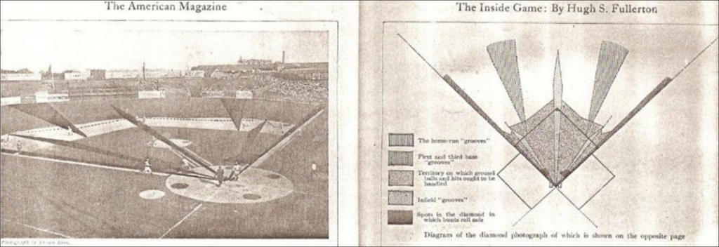
In it we see the areas where the batter is like safe or out depending upon where the ball is hit. Along the first and third base foul lines we thin strips of what all baseball fans fear: doubles or triples down the line. If you look closely you can see the dark lines become small blobs near home plate. We’ve all seen those little tappers off the end of the bat that die, effectively a bunt.
Then in the outfield we have the two power alleys in right- and left-centre. When your favourite power hitter hits a blast deep to the outfield for a home run, it’s usually in one of those two areas.
We also have some light grey lines, which are more where batted balls are going to get through the infielders. We are talking ground balls up the middle and between the middle infielders and the corners. Of course this was baseball in the early 20th century. And while, yes, shifting was a thing, it was nowhere near as prevalent. Consequently defenders were usually lined up in regular positions. These correspond to those defensive alignments.
Finally the vast majority of the infield is coloured another dark grey, representing how infielders can usually soak up any groundball and make the play.
The whole article is well worth the read, but I loved this graphic from 1910 that explains (unshifted) baseball in the 21st century.
Credit for the piece goes to Hugh Fullerton.
Leave a Reply
You must be logged in to post a comment.