Last week the Washington Post published a nice long-form article about the troubles facing the Colorado River in the American and Mexican west. The Colorado is the river dammed by the Hoover and Glen Canyon Dams. It’s what flows through the Grand Canyon and provides water to the thirsty residents of the desert southwest.
But the river no longer reaches the ocean at the Gulf of California.
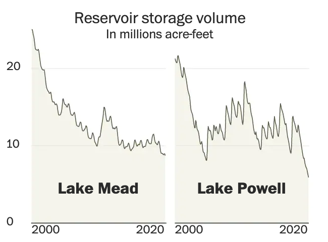
Why? Part drought, part population growth, and part economic activity. The article does a great job of exploring the issue and it does so through the occasional use of information graphics. This screenshot captures the storage capacity of the two main dams, Lake Mead and Lake Powell, created by the Hoover and Glen Canyon Dams, respectively. You may have heard of these recently because the water shortages presently affecting the region have brought reservoir levels to some of their lowest levels in years. And that means people have been finding all sorts of things.
But the graphic does a nice job of showing just how low things have gotten of late. Naturally I am curious what the data looks like on a longer timeline. Hoover Dam, of course, began during the administration of Herbert Hoover but was completed during the Franklin Roosevelt administration—who also renamed the dam as Boulder Dam though Congress reversed that change in 1947. Lake Powell came along three decades later and so the timelines would not be the exact same, but I am curious all the same.
The overall article makes sparse use of the graphics and they occupy much less space in the design than the numerous accompanying photographs. But the balance in terms of content works, I just would have preferred the charts and maps a bit larger.
Contrast this to what we explored last week in a New York Times piece, specifically the online version. There we saw graphics with no headers, data descriptors, axes labels, &c. Here we see the Washington Post was able to create a captivating piece but treat the data and information—and the reader—with respect. There are fewer graphics in this piece, but the way they were handled puts this leaps and bounds above the online version we looked at last week.
Credit for the piece goes to a lot of people, but the graphics specifically to John Muyskens. The rest of the credits go to the author Karin Brulliard and then just copying and pasting from the page: Editing by Amanda Erickson and Olivier Laurent. Photography by Matt McClain. Video by Erin Patrick O’Connor and Jesús Salazar. Video editing by Jesse Mesner-Hage and Zoeann Murphy. Graphics by John Muyskens. Graphics editing by Monica Ulmanu. Design and development by Leo Dominguez. Design editing by Matthew Callahan and Joe Moore. Copy editing by Susan Stanford. Additional editing by Ann Gerhart.