Here’s an interesting post from FiveThirtyEight. The article explores where different states have spent their pandemic relief funding from the federal government. The nearly $2 trillion dollar relief included a $350 billion block grant given to the states, to do with as they saw fit. After all, every state has different needs and priorities. Huzzah for federalism. But where has that money been going?
Enter the bubbles.
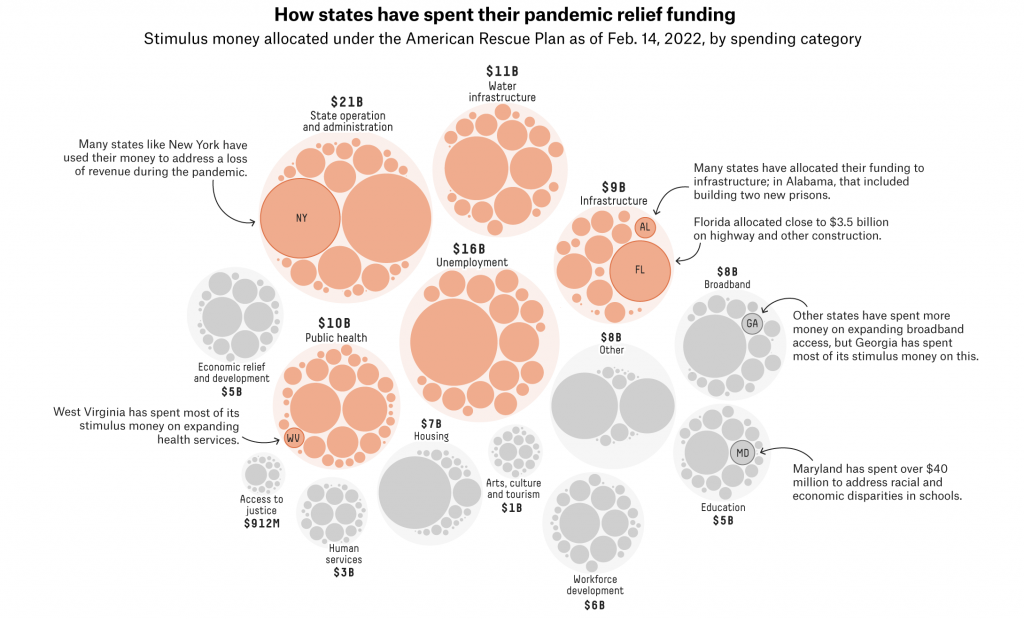
This decision to use a bubble chart fascinates me. We know that people are not great at differentiating between area. That’s why bars, dots, and lines remain the most effective form of visually communicating differences in quantities. And as with the piece we looked at on Monday, we don’t have a legend that informs us how big the circles are relative to the dollar values they represent.
And I mention that part because what I often find is that with these types of charts, designers simply say the width of the circle represents, in this case, the dollar value. But the problem is we don’t see just the diameter of the circle, we actually see the area. And if you recall your basic maths, the area of a circle = πr2. In other words, the designer is showing you far more than the value you want to see and it distorts the relationship. I am not saying that is what is happening here, but that’s because we do not have a legend to confirm that for us.
This sort of piece would also be helped by limited duty interactivity. Because, as a Pennsylvanian, I am curious to see where the Commonwealth is choosing to spend its share of the relief funds. But there is no way at present to dive into the data. Of course, if Pennsylvania is not part of the overall story—and it’s not—than an inline graphic need not show the Keystone State. In these kinds of stories, however, I often enjoy an interactive piece at the end wherein I can explore the breadth and depth of the data.
So if we accept that a larger interactive piece is off the table, could the graphic have been redesigned to show more of the state level data with more labelling? A tree map would be an improvement over the bubbles because scaling to length and height is easier than a circle, but still presents the area problem. What a tree map allows is inherent grouping, so one could group by either spending category or by state.
I would bet that a smart series of bar charts could work really well here. It would require some clever grouping and probably colouring, but a well structured set of bars could capture both the states and categories and could be grouped by either.
Overall a fascinating idea, but I’m left just wanting a little more from the execution.
Credit for the piece goes to Elena Mejia.
Leave a Reply
You must be logged in to post a comment.