Yesterday I focused on the big graphic from the New York Times that crossed the full spread of the front/back page. But the graphic was merely the lead graphic for a larger piece. I linked to the online version of the article, but for this post I’m going to stick with the print edition. The article consists of a full-page open then an entire interior spread, all in limited colour. The remainder of the extensive coverage consists of photo essays and interviews that understandably attempt to humanise the data points, after all, each dot from yesterday represented one individual, solitary, human being. That is an important element of a story like this and other national and international tragedies, but we also need to focus on the data and not let the emotion of the story overwhelm our rational and logical analysis.
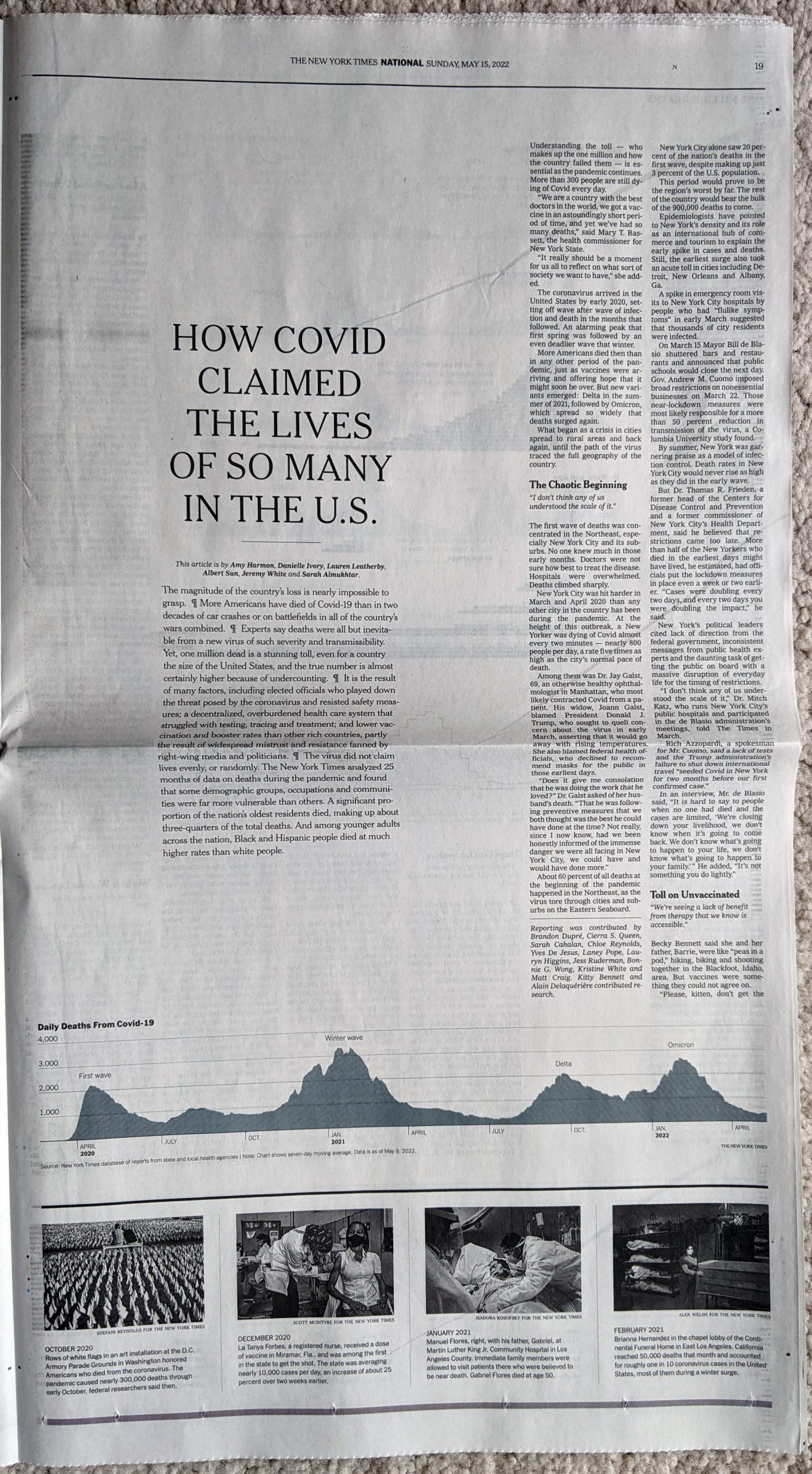
From a data visualisation standpoint the first page begins simply enough with a long timeline of the Covid-19 pandemic charting the number of absolute deaths each day. As we looked at yesterday, the absolute deaths tell part of the story. But if we were to have looked at the number of absolute cases in conjunction with the deaths, we could also see how the virus has thus far evolved to be more transmissible but less lethal. Here the number of daily deaths from Omicron surpassed Delta, but fell short of the winter peak in early 2021. But the number of cases exploded with Omicron, making its mortality rate lower. In other words, far more people were getting sick, but as far fewer were dying.
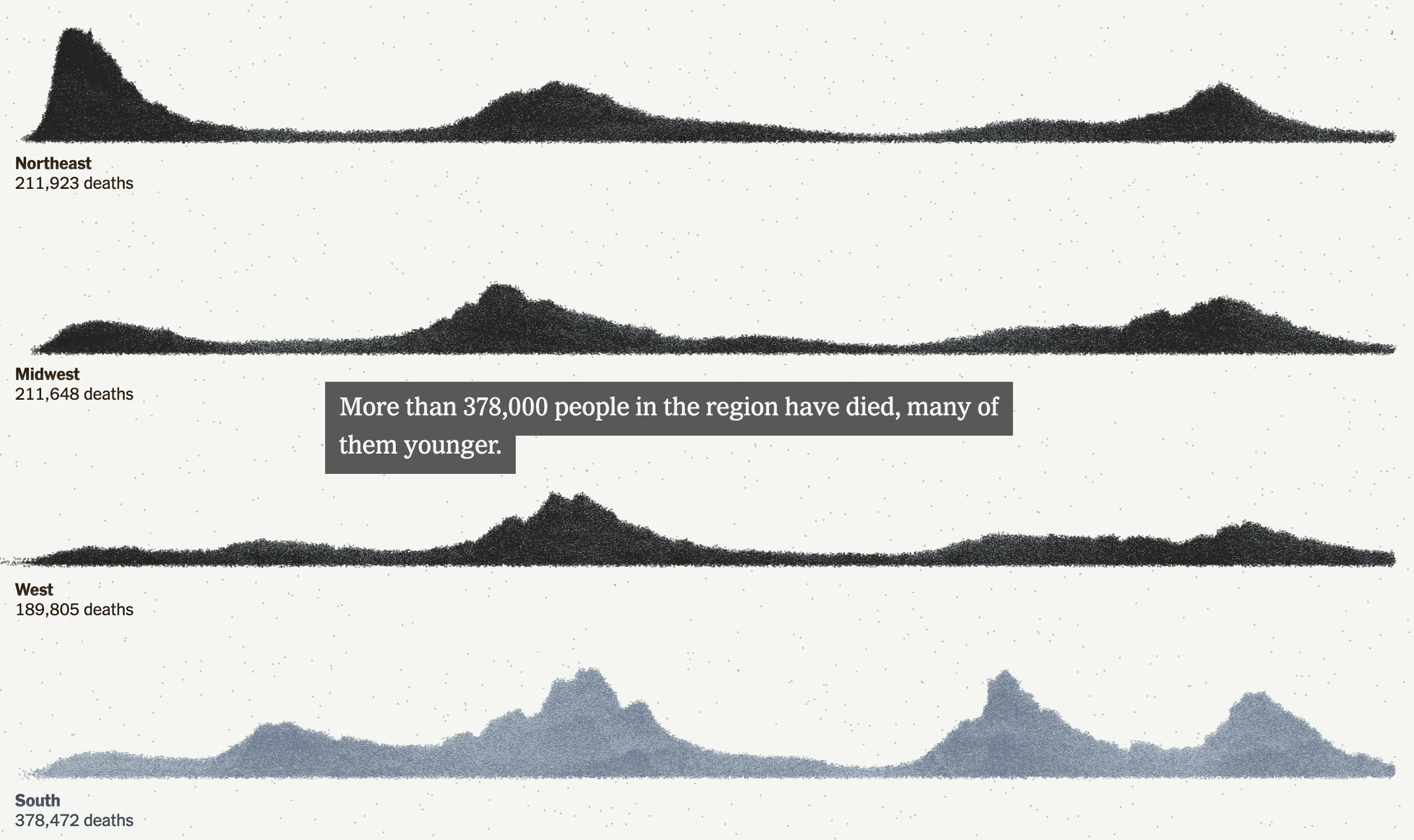
An interesting note is that if you take a look at the online version, there the designers chose a more stylised approach to presenting the data.
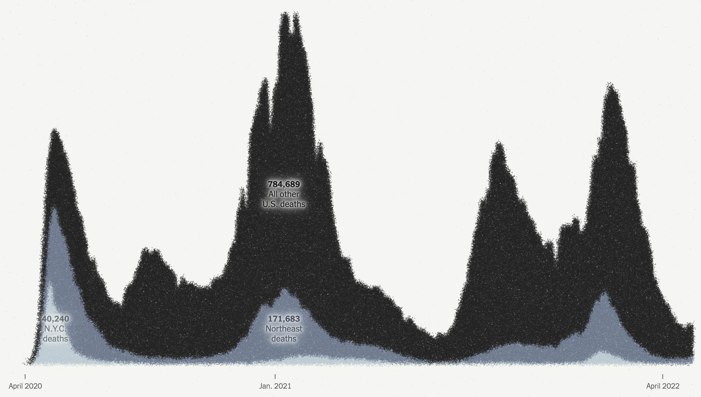
Here they kept the dot approach and simply stacked and reordered the dots. However, I presume for aesthetic reasons, they kept the stacking loose dots and dropped all the axis lines because it does make for a nice transition from the map to this chart. But they also dropped all headings and descriptors that tell the reader just what they are looking at. These decisions make the chart far less useful as a tool to tell the data-driven element of the story.
There are three annotations that label the number of deaths in New York, the Northeast, and the rest of the United States. But what does the chart say? When are the endpoints for those annotations? And then you can compare the scale of the y-axis of this chart and compare it to the printed version above. A more dramatic scale leads to a more dramatic narrative.
This sort of visual style of flash and fancy transitions over the clear communication of the data is why I find the print piece more compelling and more trustworthy. I find the online version, still useful, but far more lacking and wanting in terms of information design.
The interior spread is where this article shines.
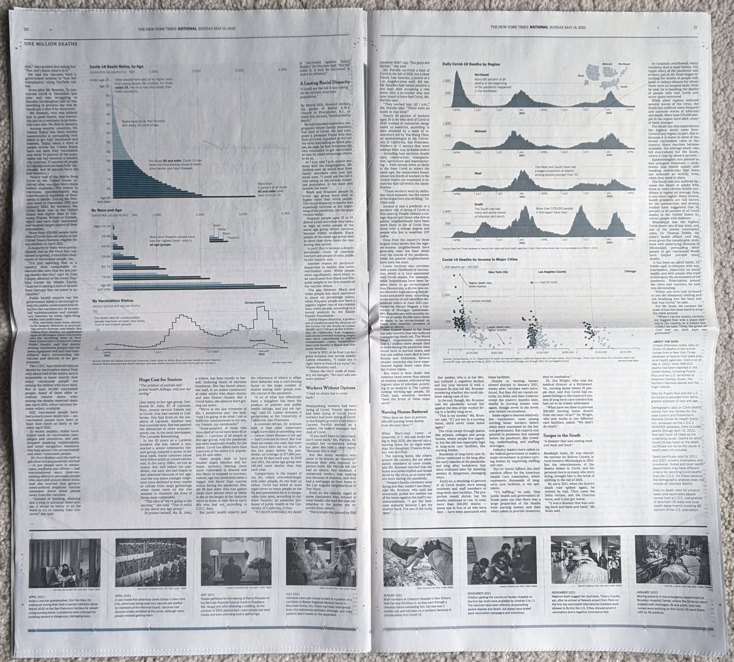
From an editorial design standpoint, the symmetry works very well here. It’s a clear presentation and the white space around the graphic blocks lets that content shine as it should in this type of story. Collectively these pieces do a great job telling the story of the pandemic thus far across the nation. The graphics do not need a lot of colour and make do with sparse flash. Annotations call the reader’s attention to salient points and outliers.
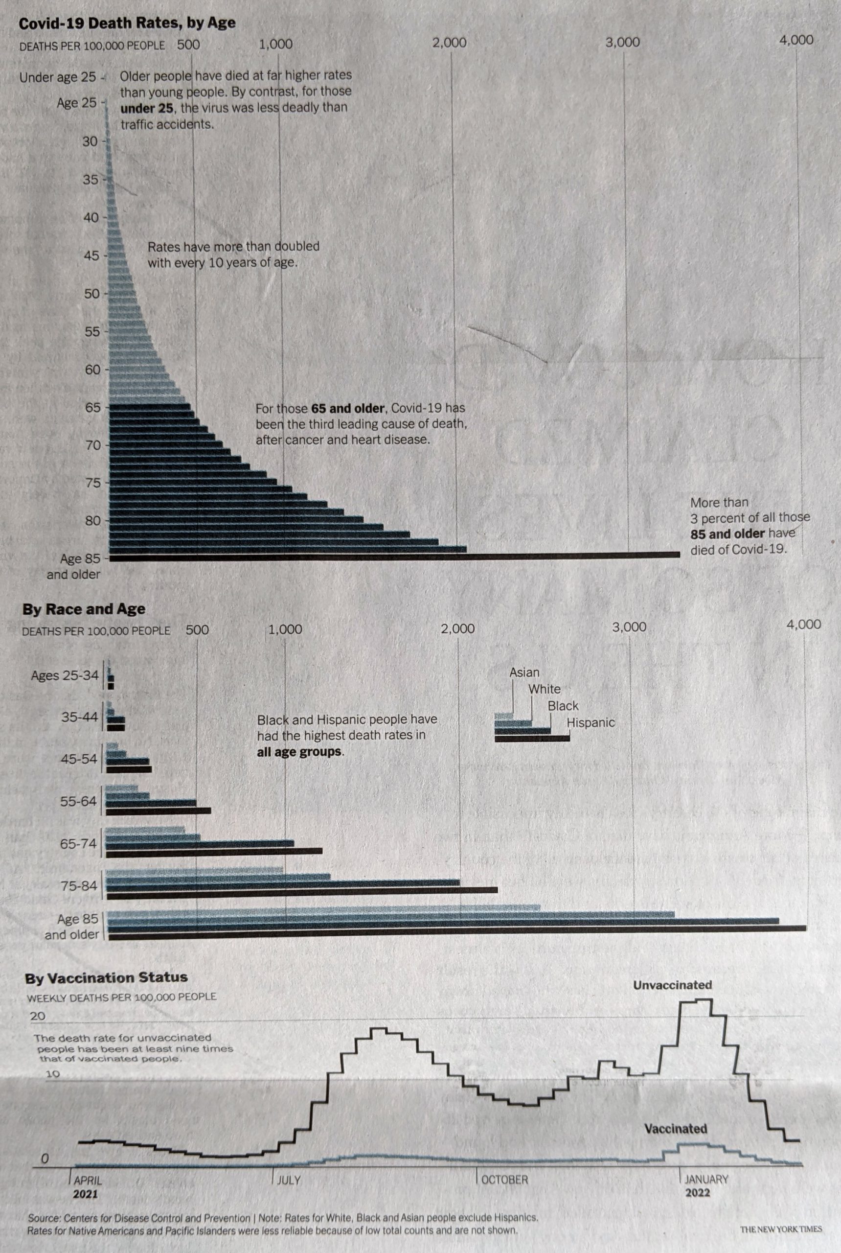
From a content standpoint, I would be particularly curious if we have robust data for deaths by education level. Earlier this year I recall reading news about a study that said education best correlated to Covid cases, and I would be curious to see if that held true for deaths. Of course these charts do a great job of showing just how effective the vaccines were and remain. They are the best preventative measure we have available to us.
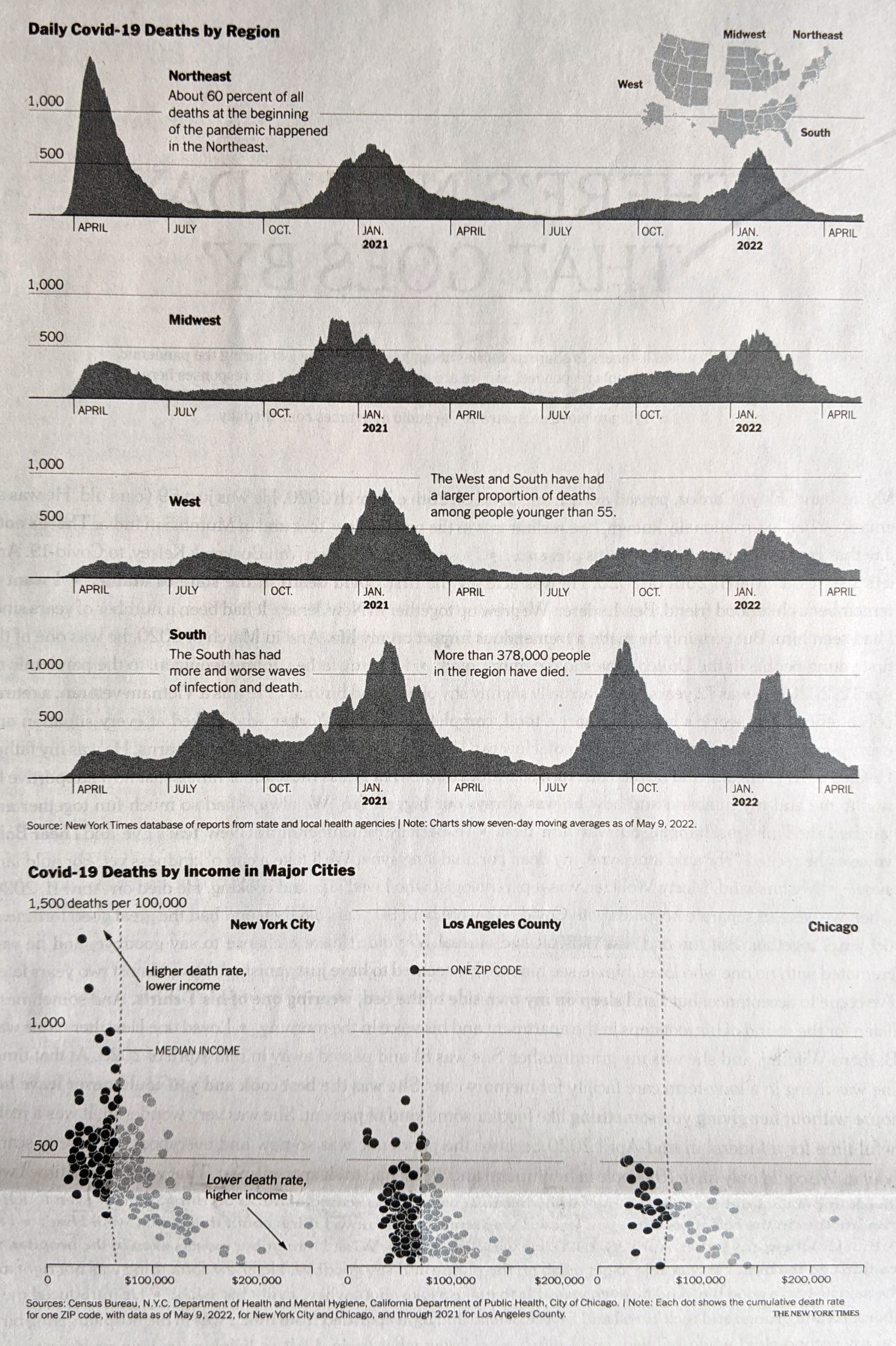
Here I disagree with the design decision of how to break down the states into regions. The Census Bureau breaks down the United States into four regions using the same names as in the graphic above. However, if you look closely at the inset map, you will see that Delaware, Maryland, and West Virginia in particular are included as part of the Northeast. (I cannot tell if the District of Columbia is included as part of the Northeast or South.)
Now compare that to the Census Bureau’s definition:
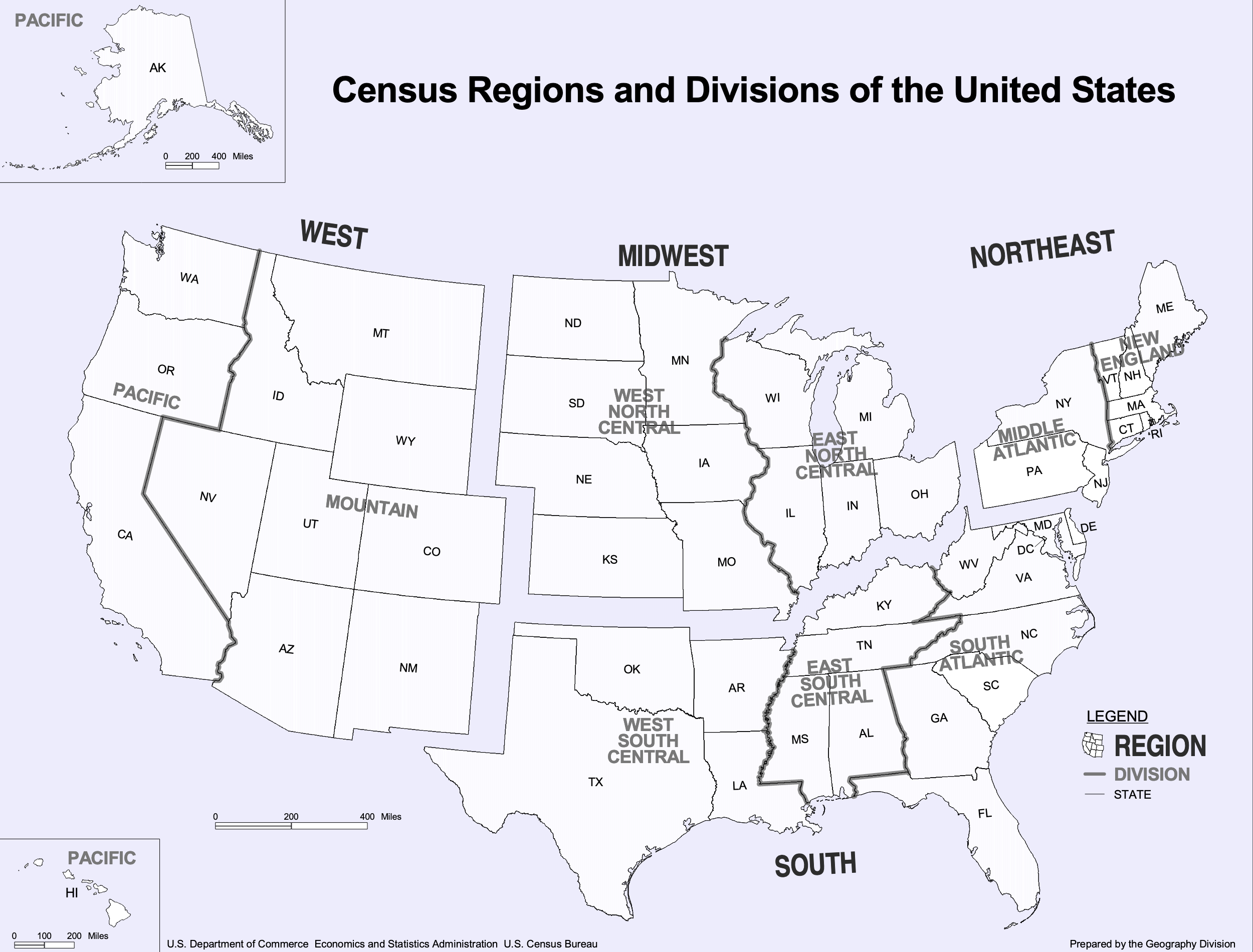
If you ask me to include Delaware and Maryland as part of the Northeast, well, if you’re selling it, I’ll buy it. After all, just because the Census Bureau defines the United States this way does not mean the New York Times has to. Both are connected to the Northeast Corridor via Amtrak and I-95 and are plugged into the Megalopolis economy. Maybe the Potomac should be the demarcation between Northeast and South. But I struggle to understand West Virginia. Before you go and connect it to the Northeast, I would argue that West Virginia has far more in common with the Midwest geographically, economically, and culturally.
More critically, given this issue, it strikes me as a serious problem when the online version of the chart—with the aforementioned issues—does not even include the little inset to highlight this at best unusual regional definition.
And so while I have reservations about the data—how would the data have looked if the states were realigned?—the design of the line charts overall is good.
Again, I am talking about the print version, not that online graphic. I would argue that the above screenshot is barely even a chart and more “data art” or an illustration of data. Consider here, for example, that for the South we have that muted slate blue for the dots, but the spacing and density of the dots leads to areas of lighter slate and darker slate. But a lighter slate means more space between stacked dots and darker slate means a more compact design. A lighter colour therefore pushes the “edge” of the line further up the y-axis and artificially inflates its value, not that we can understand what that value is as the “chart” lacks any sort of y-axis.
Finally the print piece has a set of small multiples breaking down deaths by income in the three largest American cities: New York, Los Angeles, and Chicago. These are just great little charts showing the correlation between income and death from Covid, organised by Zip code.
But this also serves as a stark reminder of just how much better the print piece is over the online version. Because if we take a look at a screenshot from the online article, we have a graphic that addresses all the issues I pointed out earlier.
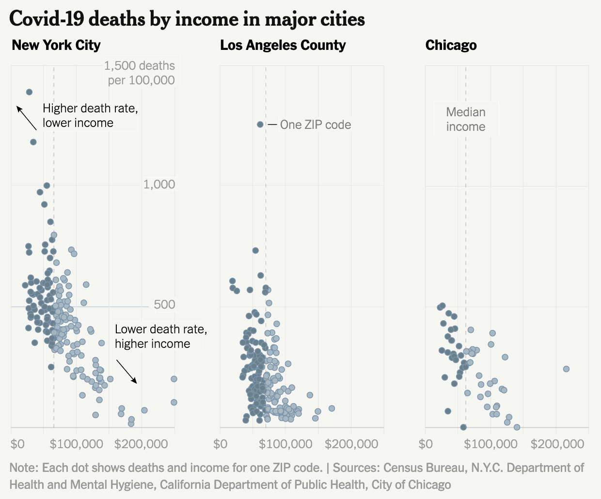
I am left to wonder why the reader of the online version does not have access to this clearer and more accurate representation of the data throughout the piece?
To me this article is a great example of when the print piece far exceeds that of the online version. Content-wise this is a great story that needed to be told this weekend, but design wise we see a significant gap in quality from print to online. Suffice it to say that on Sunday I was very glad I received the print version.
Credit for the piece goes to Sarah Almukhtar, Amy Harmon, Danielle Ivory, Lauren Leatherby, Albert Sun, and Jeremy White.
Comments
One response to “More on Those Million Covid-19 Deaths”
[…] this to what we explored last week in a New York Times piece, specifically the online version. There we saw graphics with no […]