The Olympics are over and Team GB did rather well, coming in second in the medals table with 27 gold medals, more than they won back in 2012 when they hosted the Olympics. (See my piece four years ago where a colleague of mine and I accurately predicted the UK’s total medal count.)
Consequently the BBC put together an article with several data-driven graphics exploring the performance and underpinnings of Team GB. This screenshot captures a ranking chart that generally works well.
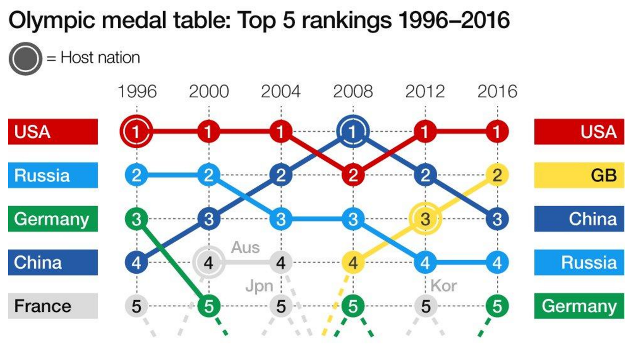
However, the use of the numbers within the dots is redundant and distracting. A better decision would have been to label the lines and let the eye follow the movement of the lines. A good decision, however, was to label the grey lines for those countries entering and falling out of the Top-5.
Credit for the piece goes to the BBC graphics department.
Leave a Reply
You must be logged in to post a comment.