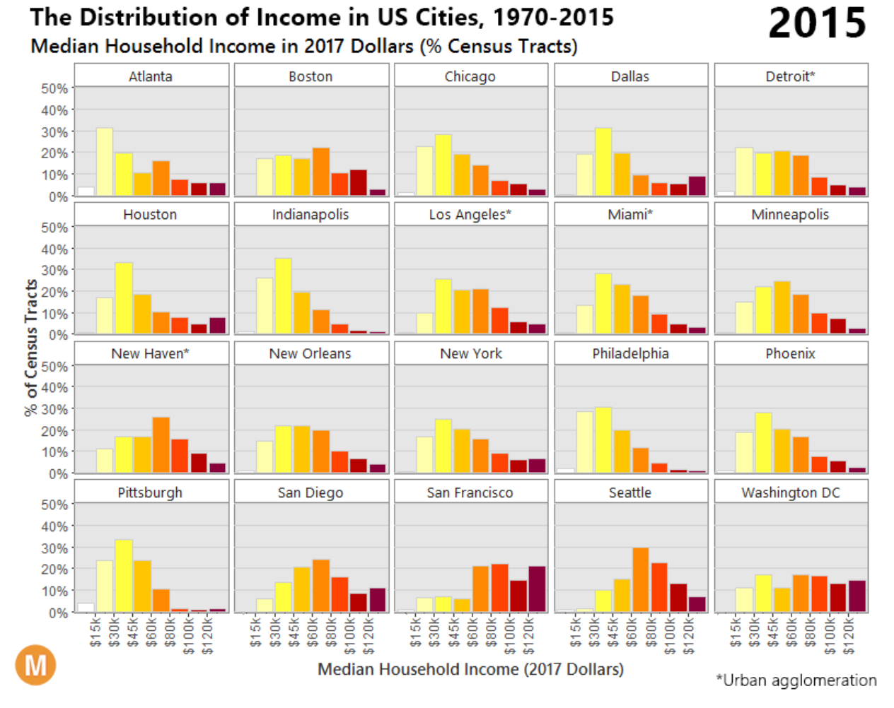
Today we look at income in American cities and in particular the middle class disappearance. The Guardian published the graphics, but they originate with Metrocosm, LTDB at Brown, and IPUMS National Historical Geographic Information System. So what are we looking at? Well, the big one is a set of small multiples of cities and their income breakdowns as percentages of city census tracts. This screenshot is static, but the original is an animated .gif.

I have a few issues with the design of the graphic, the most important of which is the colour palette. If the goal is to focus on the decline of the middle class—and I admit that may be the point of the Guardian’s authors and not the original authors—why are the most visually striking colours at the top of the income distribution. Instead, you would want to draw attention to the middle of each chart, not the right. And if the idea was that the darker colours represent the higher income groups, well the positioning of each bar on the chart and the axis labelling does that already. After all, if anything, the story is that in a number of cities the middle class has shrunk while the lower income groups have grown. And you can barely see that with the lower income groups coloured yellow.
My other issues are more minor design things such as the city labelling. I kept reading the label as being below the bars, not above as it actually is.
And then I wonder if a different chart form would be more effective at showing the decline in the middle class. Perhaps a line chart plotting the beginning and end points for each cohort?
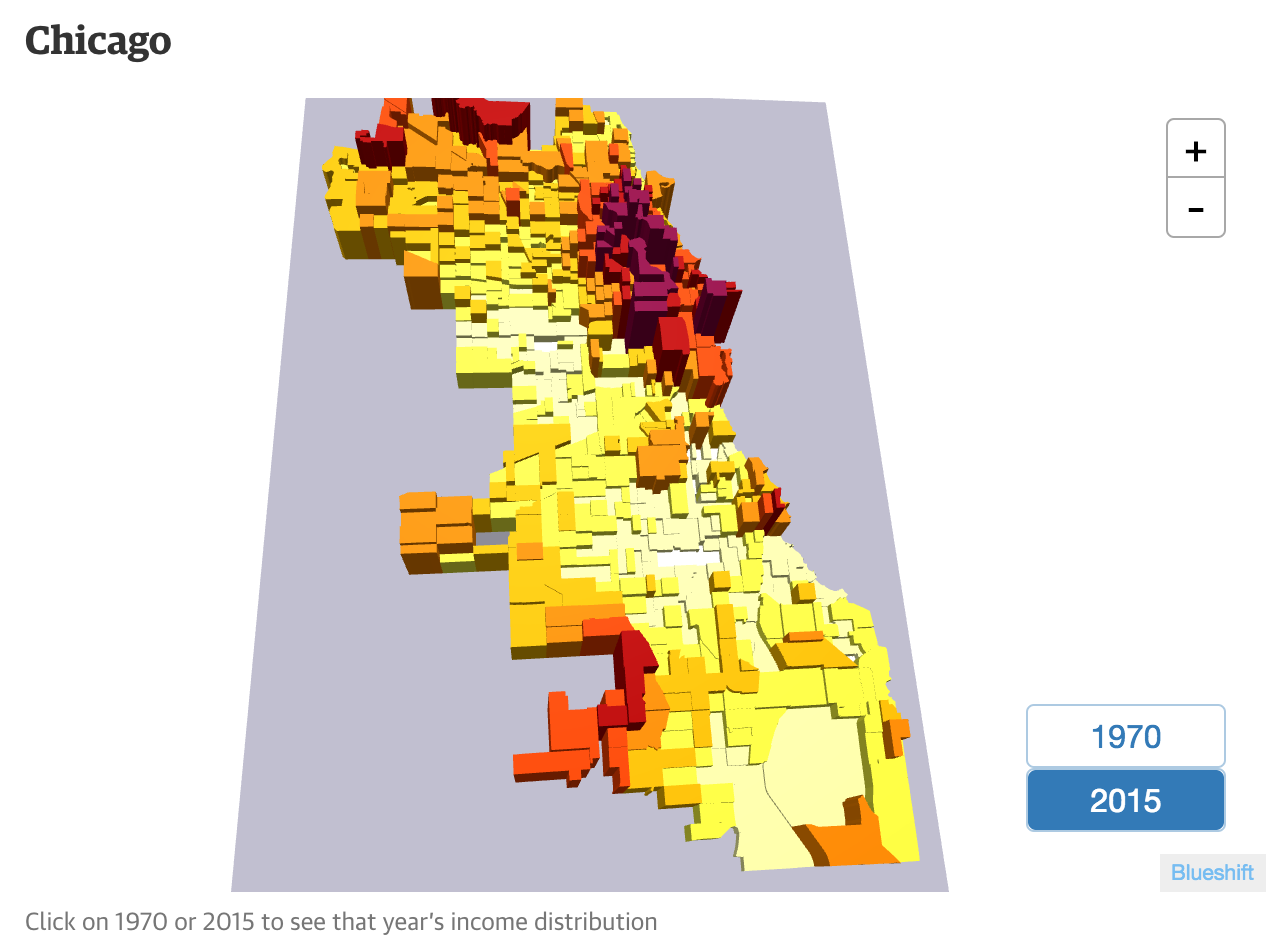
Then the piece gets into some three-dimensional maps that you can spin and rotate.

Yeah. Shall I count the ways? A more conventional choropleth would have served the purpose far more effectively. The dimensionality hides lower income tracts behind higher ones. The solution? Allow the user to rotate and spin the map? No, get rid of the dimensionality. It offers little to the understanding of the underlying data. Not to mention, are the areas of shadows shadows? Or are they another bin or cohort of income?
And then you have to read the piece to get a fuller understanding of my criticism.
But don’t worry, I can quote it.
Chicago was largely successful transitioning away from manufacturing to a service-based economy. This shift is evident in the bifurcated pattern present in 2015 – a heavy concentration of wealth in the business/financial district and marked decline in the surrounding area.
Those of you who read this blog from Chicago or who have lived in Chicago will pick up on it. The rest of you not so much. The concentration of wealth is not located in the business/financial district. Those dark red skyscrapers are not actual skyscrapers, they are census tracts located not in the financial district, but the areas of River North, Old Town, Gold Coast, &c. Thinking of the issue more logically, yes incomes are up in cities that are doing well. But how many of those very wealthy live on the same block as their office? Not many. Your higher income is going to be concentrated in residential or mixed-residential neighbourhoods near, but not in the business/financial district.
The data behind this work fascinates me. I just wish the final graphics had been designed with a bit more consideration for the data and the stories therein. And a little bit of proper understanding of the cities and their geography would help the text.
Credit for the piece goes to Metrocosm, LTDB at Brown University, and IPUMS National Historical Geographic Information System.
