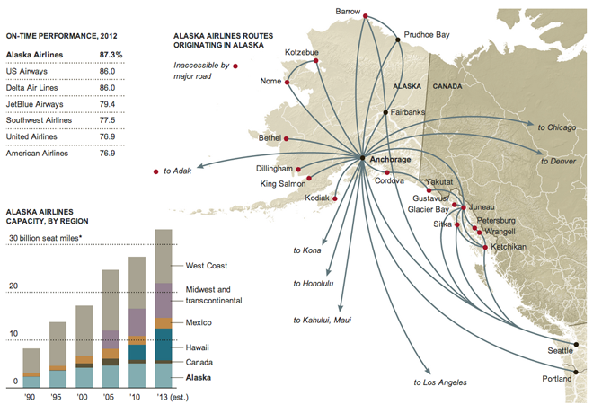
Here’s an older, March graphic from the New York Times that looks at Alaska Airlines. This exemplifies what maps do well; it maps relevant data onto a map. Perhaps that reads silly, but too often people map data just because most things are tied to a geography; things that happen in the world happen somewhere, ergo everything could be mapped.

In this graphic, however, mapping the tight and Alaska-focused network with tendrils sneaking off-map to distant cities. The map supports the article that tells how after decades of focusing on Alaska, the airline has begun to expand to Midwestern cities in the US, cities in Mexico, and Hawaii.
I am not terribly keen on the stacked bar chart. It highlights the steady Alaska market over the decades at the cost of showing dynamism in those Midwestern, Mexican, and Hawaiian markets.
Credit for the piece goes to the New York Times Graphics Department.
Leave a Reply
You must be logged in to post a comment.