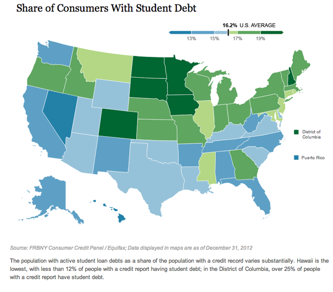
Earlier this month the Federal Reserve Bank of New York published a report on household debt. Among the findings was the story that student debt is rising to problematic levels as it may act as a brake on economic recovery. In short, without an economy creating jobs for the young (recent university graduates) it becomes increasingly difficult for the young to pay pack the loans for the sharply rising costs of university tuition.
The report made this argument by use of interactive choropleth maps and charts. The one below looks at

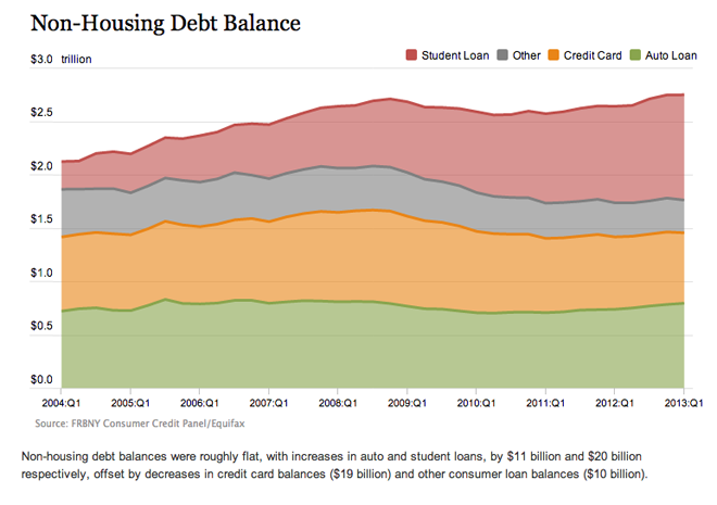
But another chart that talks about the rising levels of student loan debt misses the mark. Here we see some rather flat lines. Clearly student loans are growing, but without a common baseline, the variations in the other types of debt muddle that message.

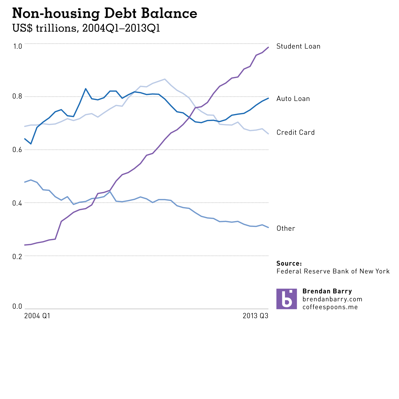
I took the liberty of using the data provided by the New York Fed and charting the lines all separately. Here you can clearly see just how in less than ten years, student loans have risen from $200 billion to $1,000 billion. This as credit card debt is falling along with other forms of debt (non-automotive).

The New York Fed did some great work, but with just one tweak to their visualisation forms, their story is made much more powerful and much more clear.
Credit for the original work goes to the Federal Reserve Bank of New York.
Leave a Reply
You must be logged in to post a comment.