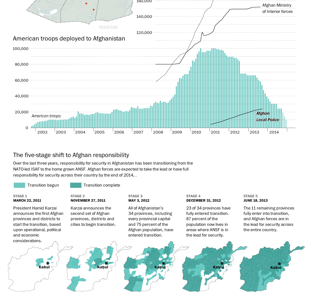
The United States and its allies are slowly beginning to pull out of Afghanistan. While several thousand troops will remain, the total will be nowhere near the peak figure a few years ago. This graphic from the Washington Post details just how this transition has been occurring.
Credit for the piece goes to Richard Johnson.
Leave a Reply
You must be logged in to post a comment.