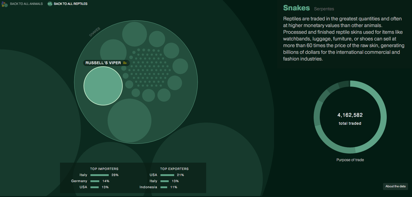
The story and data behind today’s graphic are worth telling. But, the execution leaves me feeling a bit empty. The piece kicks off a new series called Data Points from National Geographic. But, here in this piece we are looking for clear communication of data. So what do we get? Circles. Circles within circles within circles. My problem?

Well you can see from the first screenshot that we are missing the gap space, i.e. the space between the container circle and the data circle. The gap makes the container look larger than it really is. Granted, area is not a great way of comparing data points, but that aside, something like a tree map would probably be more accurate and still allow for the nesting that occurs, see below.

The overall display includes nice ancillary data about top importers and exporters along with how the animals in question are used. Some animals even have trade notes that offer more context on how particular animals are used.
On the plus side, the piece’s title is great: Space Monkeys and Tiger Wine. I mean, how can you not read that? While they missed lots of the moles popping out of circles on this one, they did nail the title.
Credit for the piece goes to Katilin Yarnall and Fathom Information Design.
Leave a Reply
You must be logged in to post a comment.