Happy Monday, all.
If this week’s news cycle cooperates, I am going to try and catch up on some things I have seen over the last several weeks that got bumped because of, well, Trump usually. Today we start with a piece on life expectancy from FiveThirtyEight.
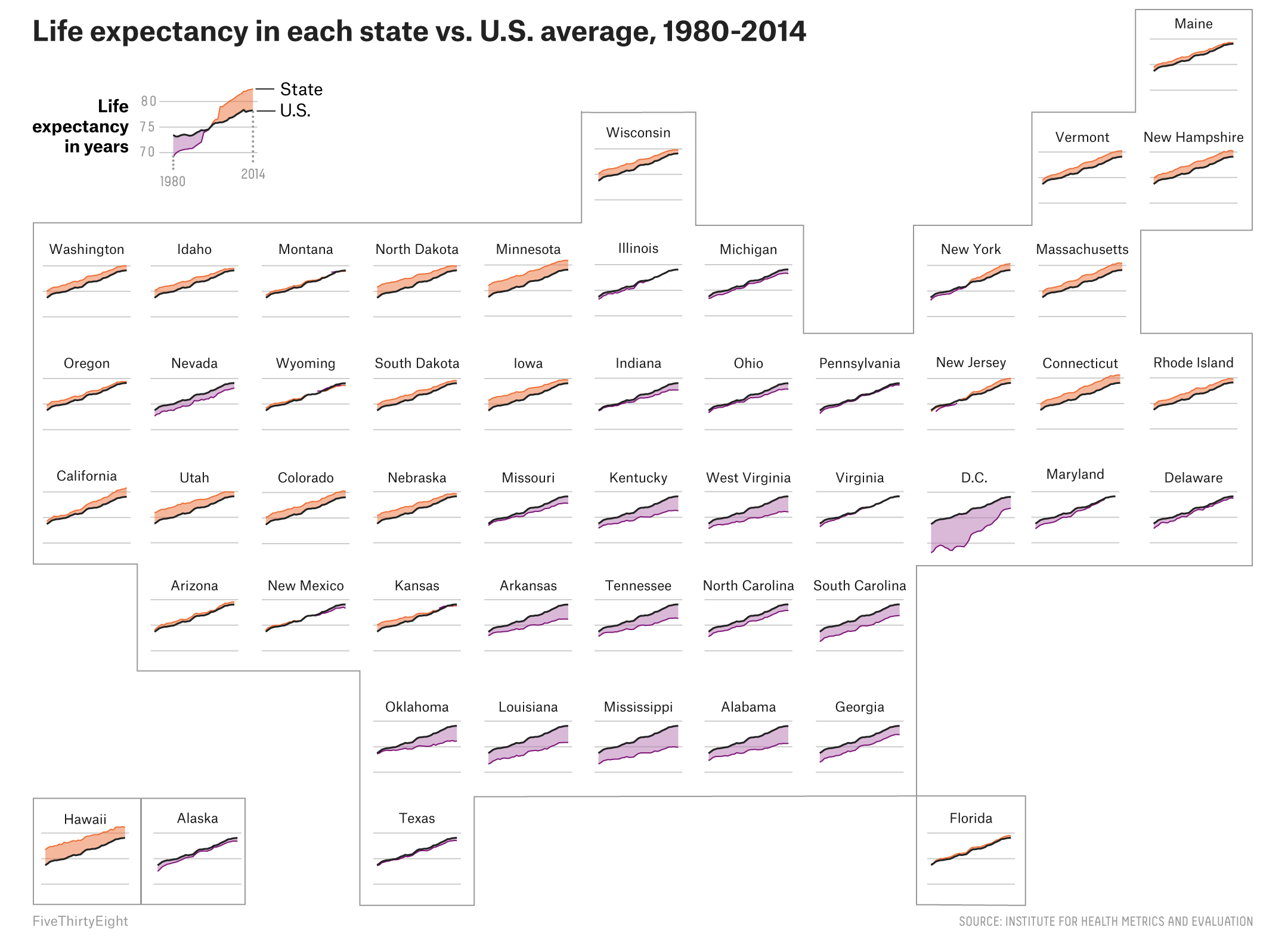
The piece begins with a standard choropleth to identify, at county levels, pockets of higher mortality. But what I really like is this small multiples map of the United States. It shows the changes in life expectancy for all 50 states. And the use of colour quickly shows, for those states drastically different than the national average, are they above or below said average.
Credit for the piece goes to the FiveThirtyEight graphics department.
Leave a Reply
You must be logged in to post a comment.