Earlier this morning (East Coast time) the Intergovernmental Panel on Climate Change (IPCC), the UN’s committee studying climate change, released its latest review of climate change. This is the first major review since 2013 and, spoiler, it’s not good.
I’ve read some news articles about the findings, but I want to critique and comment upon some of the graphics contained within the report itself. This started going too long, however, so I think I will break this into several shorter, more digestible chunks.
And I want to start with the first chart, two line charts that lay out the temperature changes we’ve seen.
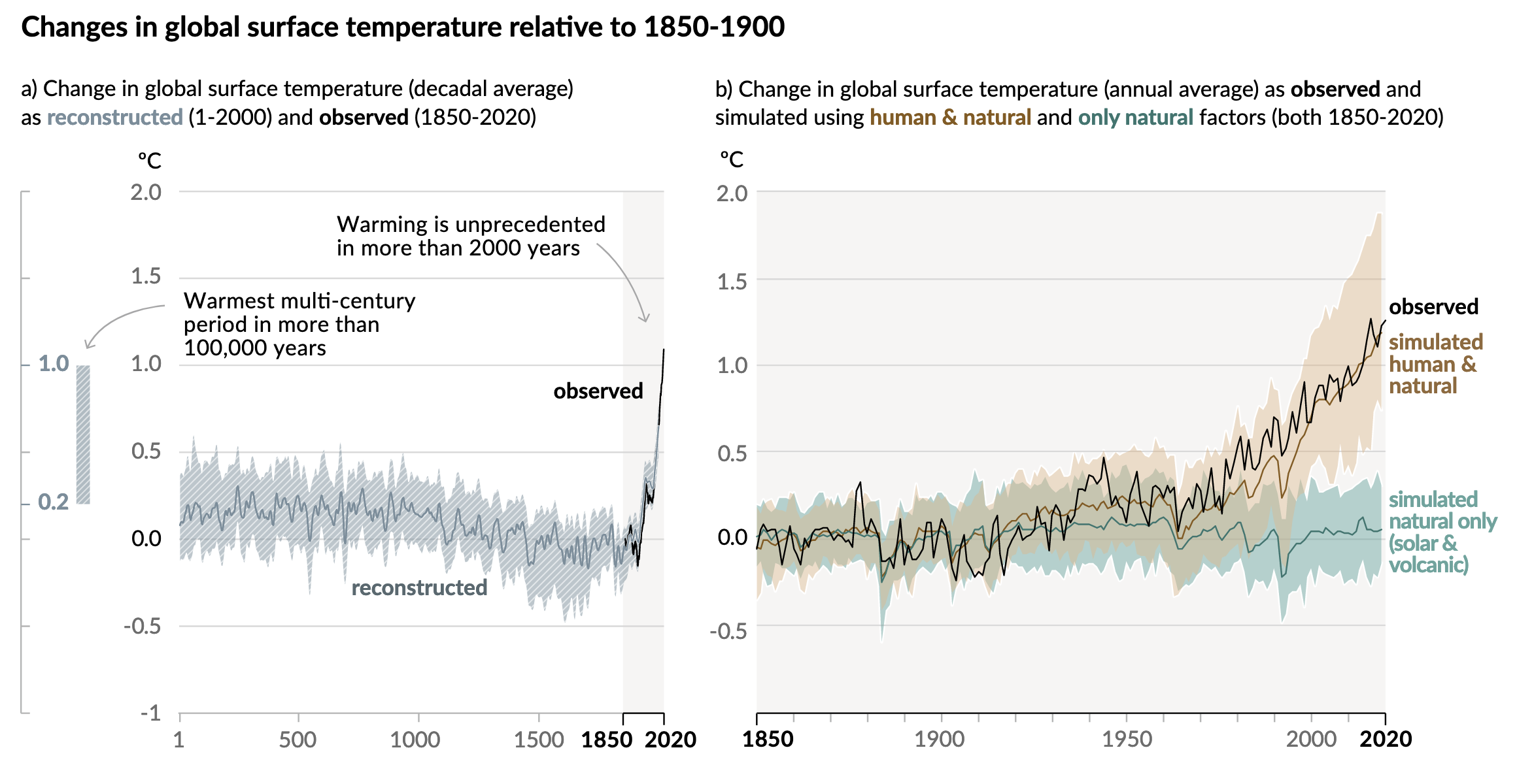
One of the first things I like here is the language. Often we might see these or similar charts that simply state temperatures from the year 1 through 2020. One of the common reasons I hear from people that deny climate change is that “people weren’t recording temperatures back in 1 AD.
They would be correct. We do not have planet-wide meteorological observations from the time of Julius Caesar. But in the year 2021 we do have science. And that allows us to take other evidence, e.g. dissolved carbon dioxide in ice, or tree ring size, &c., and use them to reconstruct the temperature record indirectly.
And reconstruct is the word the IPCC uses to clearly delineate the temperature data pre- and post-1850 when their observed data set begins.
The designers then highlight this observed data set, broadly coinciding with the Industrial Revolution when we as a species began to first emit extra greenhouse gasses into the atmosphere. You can see this as a faint grey background and a darker stroke along the x-axis.
Additionally, the designers used annotations to call out the first main point, that warming in the last almost two centuries is far beyond what we’ve seen in the last two millennia.
The second annotation points to a bar, reminiscent of the range of a box plot, that exists outside the x-axis and almost embedded within the y-axis. This bar captures the range of temperatures reconstructed in the past 100,000 years. And by including it in the chart, we can see that we have just recently begun to exceed even that range.
In the second chart, we have the entire background shaded light grey and the whole x-axis in a darker stroke to remind us that we are now looking at the Industrial/Post-Industrial era. But what this chart does is do what scientists do, test whether natural, non-manmade causes can fully explain the temperature increase.
They can’t.
The chart plots the modelled data looking at just natural causes vs. modelled data looking at natural causes plus human impacts. Those lines and their ranges are then compared to the temperatures we’ve observed and recorded.
Since the 1930s and 40s, it’s been a pretty clear and consistent tracking with natural plus manmade causes. For years the scientific community has been in agreement that humanity is contributing to the rising temperatures. This is yet more evidence to make the point even more conclusively.
These are two really good charts that taken together show pretty conclusively that humanity is directly responsible for a significant portion of Earth’s recent climate change.
I’ll have more on some other notable graphics in the report later in the week, so stay tuned.
Credit for the piece goes to the IPCC graphics team.
Leave a Reply
You must be logged in to post a comment.