A few weeks ago I wrote about the United Nation’s Intergovernmental Panel on Climate Change (IPCC) latest report on climate change, which synthesised the last several years’ data. If you didn’t see that post, suffice it to say things are bad and getting worse. At the time I said I wanted to return to talk about a few more graphics in the release. Well, here we are.
In this piece we have a map, three technically. In a set of small multiples, the report’s designers show the observed change, i.e. what’s happening today, and the degree of scientific consensus on whether humans are causing it.
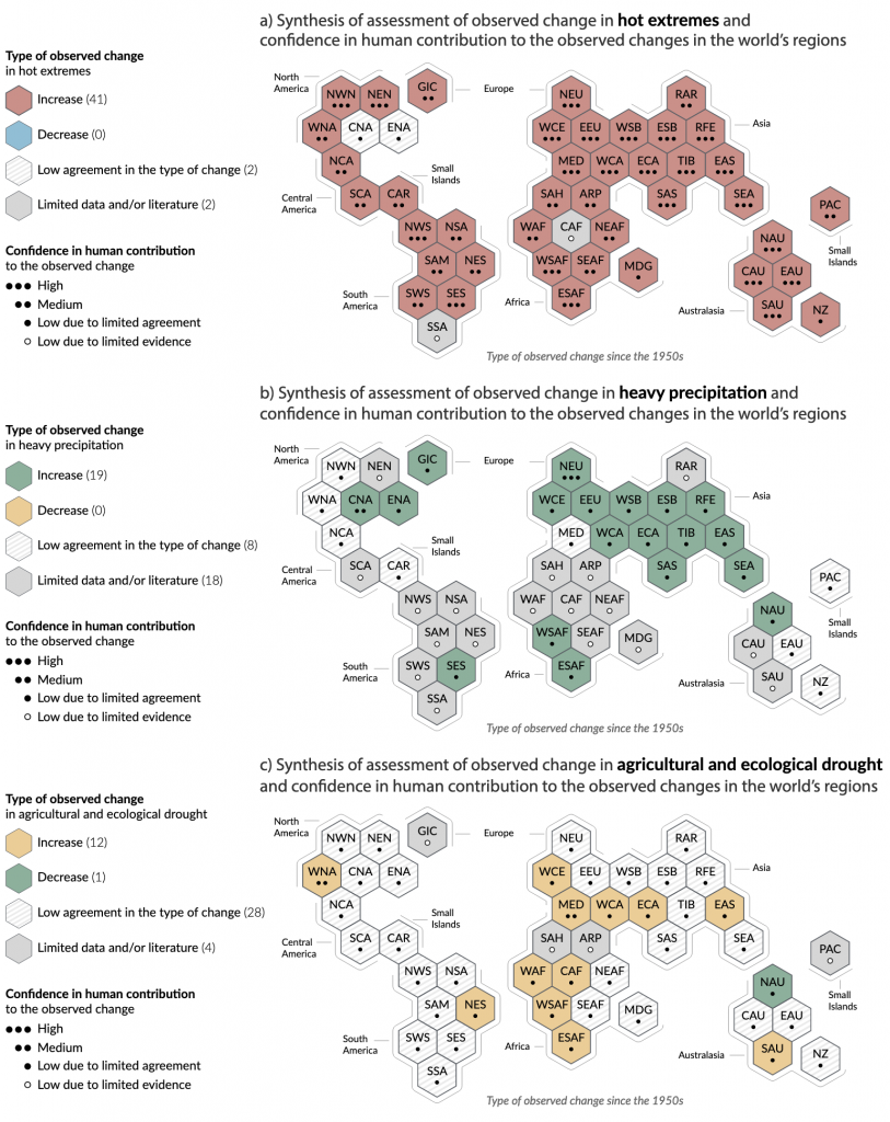
What I like about this is that, first, improved data and accuracy allows for sub-continental breakdowns of climate change’s impacts. That breakdown allowed the designers to use a tilemap consisting of hexagons to map those changes.
Since we don’t look at the world in this kind of way, the page also includes a generous note where it defines all these acronyms. Of course even with those, it still doesn’t look super accurate—and that is fine, because that’s the point—so little strokes outside clusters of hexagons are labelled to further help the reader identify the geographic regions. I really like this part.
I also like how little dots represent the degree of confidence. The hexagons give enough space to include dots and labels while still allowing the colours to shine. These are really nice.
But then we get to colour, the one part of this graphic with which I’m not totally thrilled. The first map looks at temperature, specifically heat extremes. Red means increase in heat extremes and blue means decrease. Fair enough. Hatched pattern means there is low consensus and medium grey means there’s little data. I like it.
Moving to the second map we look at heavy precipitation. Green means an increase and yellow a decrease. Hatched and medium grey both mean the same as before. I like this too. Sure, with clear titling you could still use the same colours as the first map, but I’ll buy if you’re selling you want visual distinction from the red–blue map above.
Then we get to the third map and now we’re looking at drought. Hatched and grey mean the same. Good. But now we have green and yellow, the same green and yellow as the second map. Okay…but I thought the second map showed we need a visual distinction from the first? But what makes it really difficult is that in this third map we invert the meaning of green and yellow. Green now means a decrease in drought and yellow an increase.
I can get that a decrease in drought means green fields and an increase in drought means dead and dying fields, yellow or brown. And sure, red and blue relate to hot and cold. But the problem is that we have the exact same colours meaning the opposite things when it comes to precipitation.
Why not use two other colours for precipitation? You wouldn’t want to use blue, because you’re using blue in the first map. But what about purple and orange, like I often do here on Coffeespoons? This is why I don’t think the designers needed to switch up the colours from map to map. Pick a less relational colour palette, say purple and orange, and colour all three maps with purple being an increase and orange being a decrease.
Colour is my big knock on these graphics, which unfortunately could otherwise have been particularly strong. Of course, I can’t blame designers for going with red and blue for hot and cold temperatures. I’ve had the same request in my career. But it doesn’t make reading these charts any easier.
Credit for the piece goes to the IPCC graphics team.
Leave a Reply
You must be logged in to post a comment.