I had something else for today, but this morning I opened the door and found my morning paper. Nothing terribly special. No massive headline. No large front-page graphic. See what I mean?
But then as I bent down to pick it up, I spotted a little tree map. But it turned out it wasn’t a tree map. It was a rectangle, largely, but it was actually a county map of Kansas. It was so small it fit within a single column.
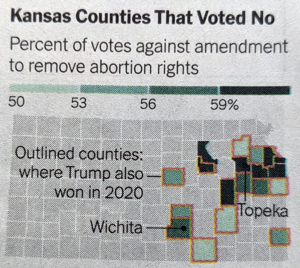
The map showed those counties that had a majority vote in favour of keeping abortion rights. And then those counties that also voted for Trump in 2020 were outlined in orange—a good colour pairing. Turned out a number of counties did.
Without wading into the politics of it, because that’s a separate article, this was a great little map. It didn’t need to be crazy complicated or even large.
Credit for the piece goes to the New York Times graphics department.