Pew recently released a report into the Asian American experience. The report used 66 different focus groups to gather feedback and then summarised that with quotes, video bits, and lots of text. But at the beginning of the report was a nice little graphic that detailed the composition of the focus groups.
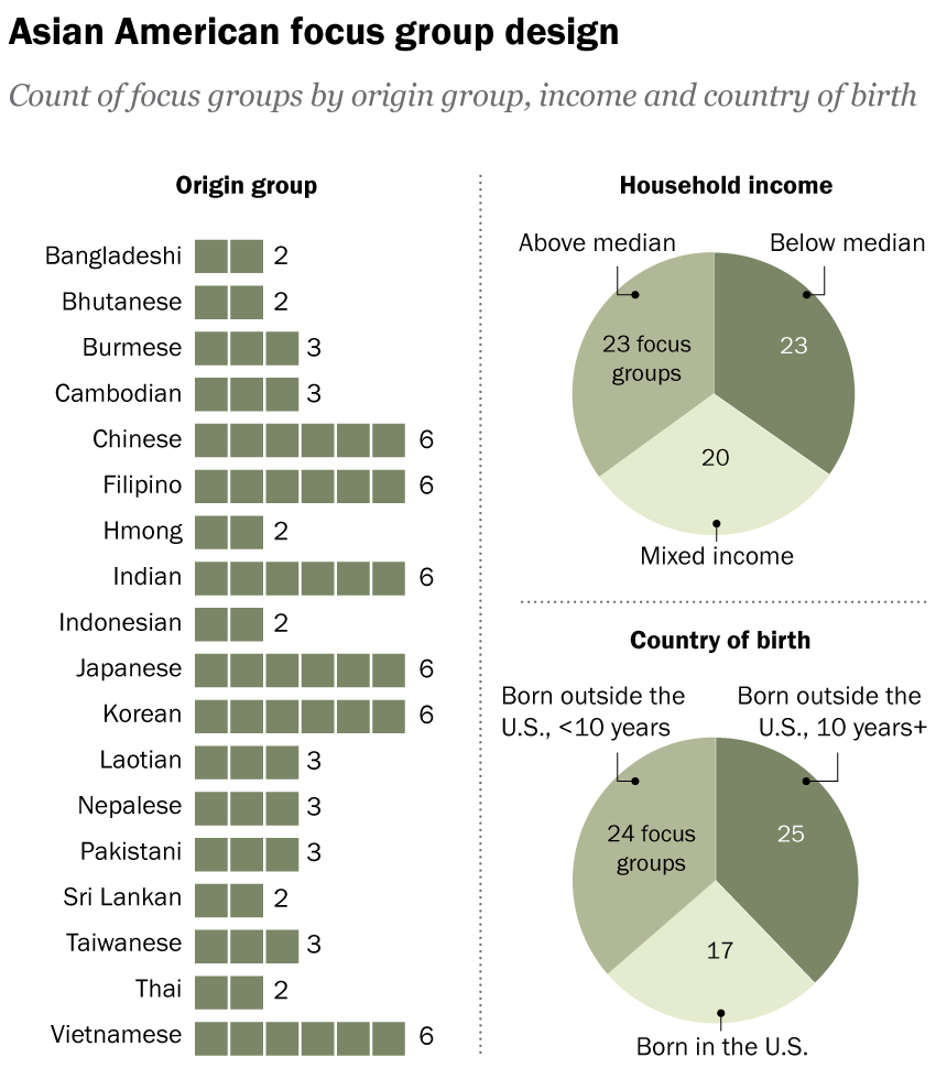
This is not a fancy graphic, nor need it be given its supplemental role to the overall piece. But I think it does a reasonable job of showing the construction of the overall focus group demographics, a key point to understanding the responses.
On the left we have a simple count of the number of focus groups by origin. For Indonesians we see there were two focus groups. And thus we have a number two besides the two blocks. Here the two is entirely extraneous and serves as a distracting visual sparkle at the end of the blocks. The advantage of using blocks as opposed to say a bar is that you can visualise the individual components or units, in this case there were two distinct focus groups of Indonesian origin. A user reading this chart should be able to count two blocks. And if they cannot count two blocks, I suspect they would be unable to grasp what the “2” means let alone the rest of the report.
To the right we have two pie charts. My…reticence…to use pies is well-known to long-time readers of Coffeespoons. But here we have the same type of data, counts of focus groups, and I have to wonder: why the designers did not stick with the same model of using individual blocks?
Here I chose to redesign the pie charts.
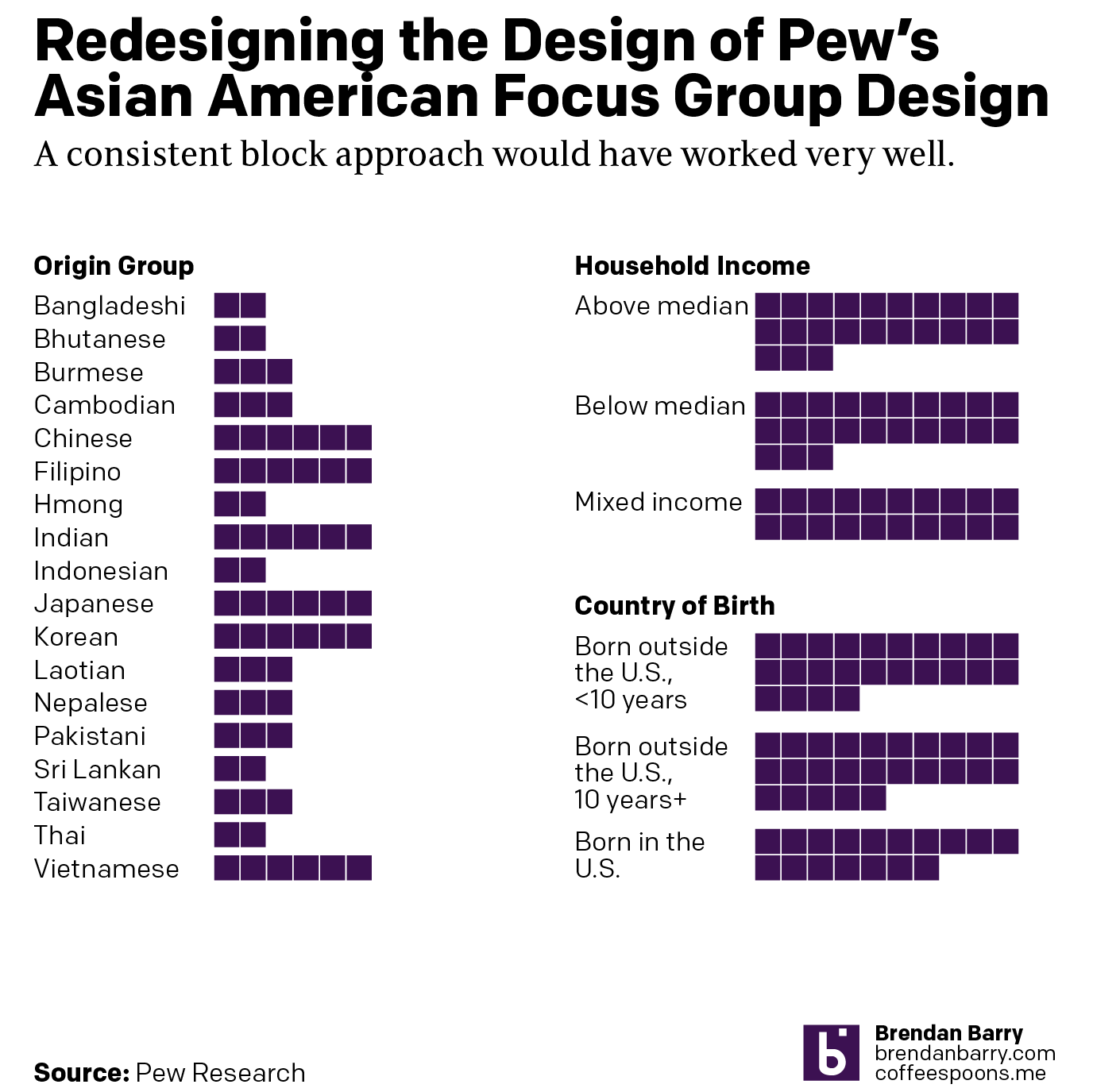
Nothing here is really new, I just removed the labels because people can count if they need to know the exact number. The labels add visual clutter to the design. And then of course I removed the pie charts and replaced them with blocks like on the left. I was even able to keep the layout roughly the same, albeit within my own graphics template.
Credit for the original goes to the Pew graphics department.
Credit for the redesign is mine.