Ah, a blizzard. Even if the worst of the storm that recently impacted Philadelphia struck mostly at night, it still left a picturesque mess for the morning. I, however, was struck by some of the maps of the snowfall totals and I figured that would be worth sharing today.
What got me started on this path was a graphic I found on Twitter when logging on to see how the Sox were doing during Spring Training. The graphic noted the first 24-inch snow total of the blizzard from Freehold, New Jersey and came from a meteorologist for Weather.com.
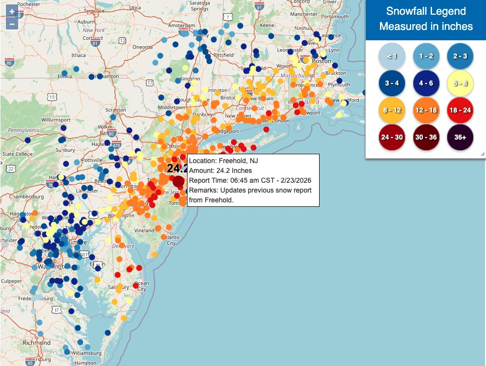
I had a few immediate problems with the graphic and they centred on the colour palette. First, I totally understand the designer is just using some Google or Google-like map layer. The problem is that this base layer uses colour to encode things like state parks—here’s looking at you, Pine Barrens—and interstate highways. Except that the data layer the designer added is using colour to encode, well, data that is the true purpose of the map.
In this particular case, seeing I-78, -80, -81, or whatever snaking across the map does not help me understand the amount of snow falling across the Northeast and New England. Arguably, the highways can help people better locate areas of interest to them, but for that a label will do. Same with the big blobs of green for the state parks. And using a whole bunch of blue for the Atlantic steals the visual thunder(snow) from the blizzard’s snowfall totals.
Compare that to the approach taken by the Philadelphia Inquirer.
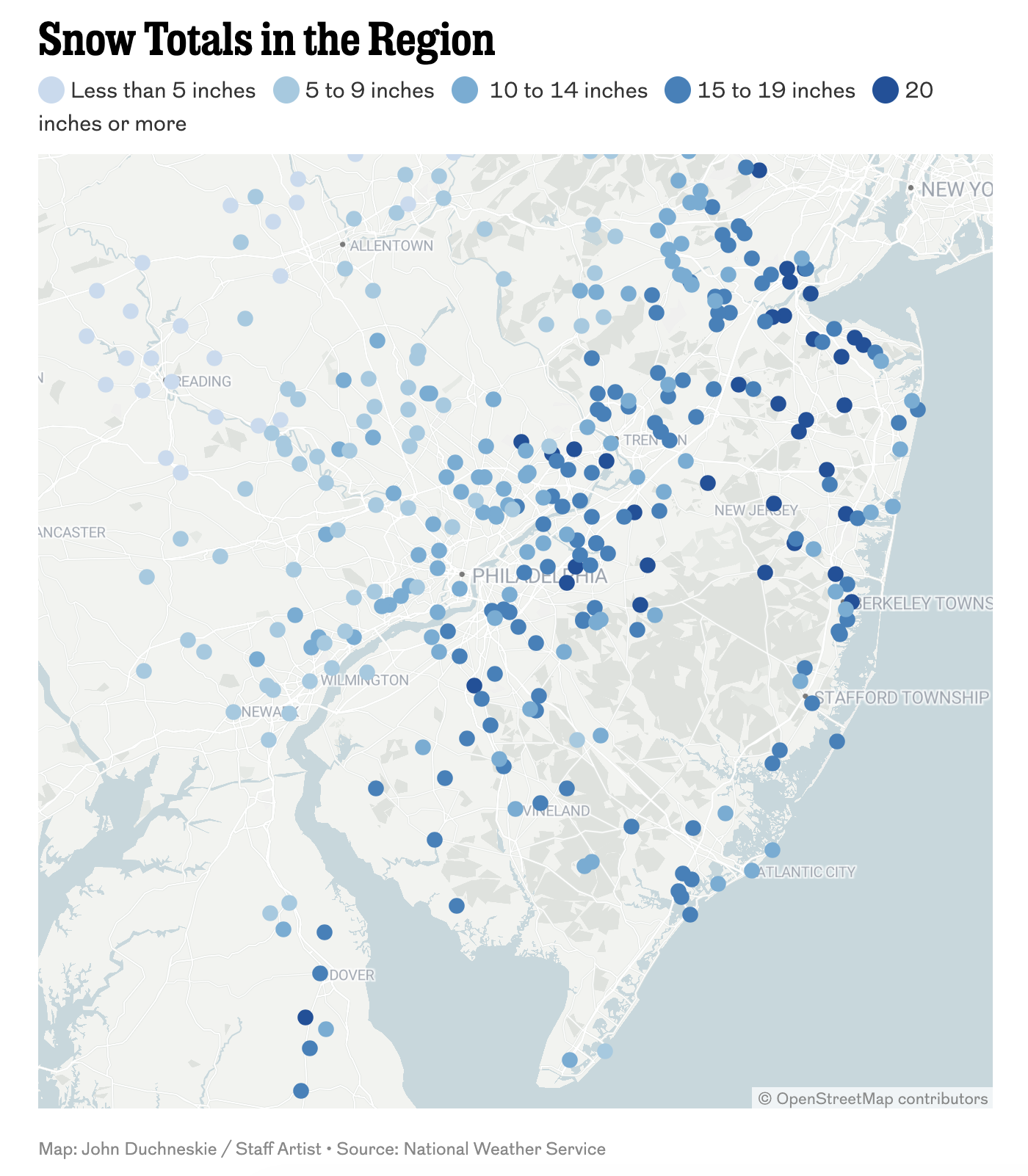
Same kind of map, dots for locations coloured by reported snowfall totals, but here the designer chose to strip colour away from the base layer map and use it to show the data. Here the Atlantic is still a wee bit blue in hue and the coastal reports from the barrier island towns visually blend into the sea. But I will take that tradeoff for the vastly clearer pointillist work of art that is the sea of blue drowning the Delaware Valley. (I will come back to the bins in a bit.) This map has far fewer objects calling for my visual attention through its use of a restrained palette.
I also had a look at what was going on up in Boston, because, again, Spring Training. The Boston Globe took a similar approach, but added on some additional functionality.
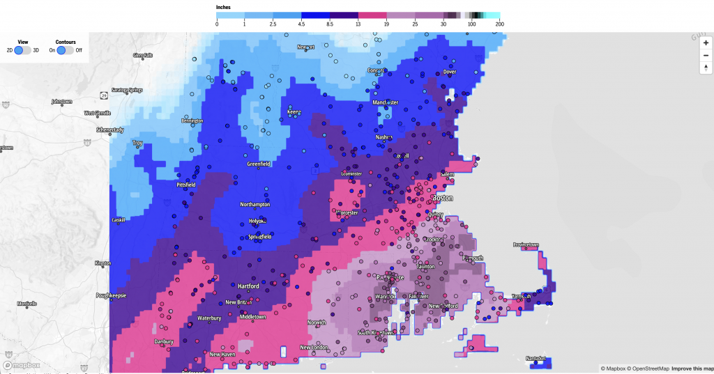
Here, the dots could be shown atop a contoured map of snowfall amounts. If you look to the far left of the screenshot, you can see how this designer also used a restrained palette for the base layer map.
Finally, this graphic from Philadelphia’s ABC affiliate, 6ABC, also showed up on my social media feed and I figure it is also worth a quick mention. (This is not meant to be an exhaustive post of all the different maps of the blizzard.)
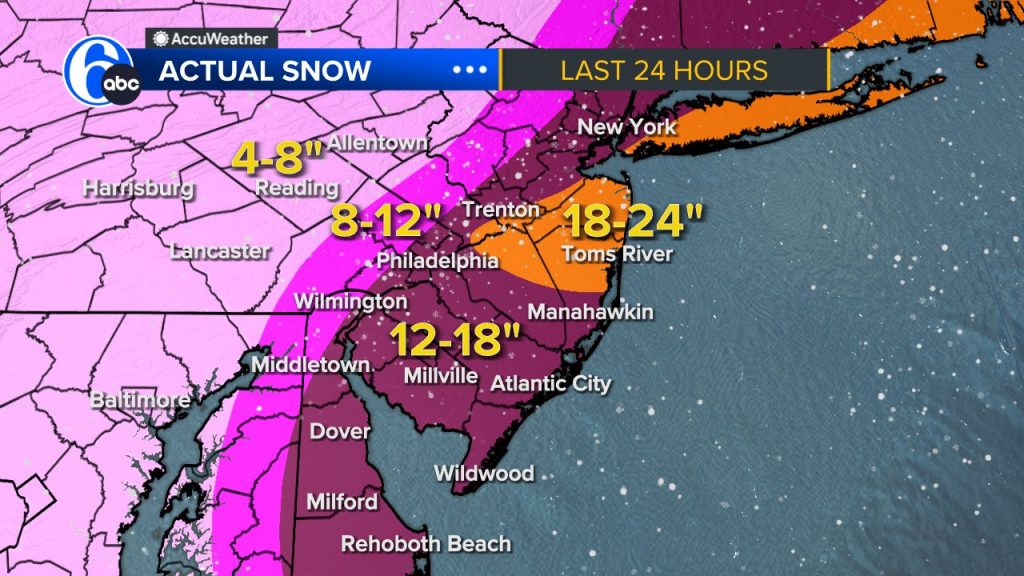
This is pretty standard, big areas of colour representing snowfall totals rather than individual locations. This is actually better than some maps I have seen, because 6ABC tends to leave in colour and patterns for things like state parks, urban areas, &c. And all those features can affect how transparent layers above appear and then compare and contrast to other regions. That said, I am not a fan of having an additional layer of snowflakes sitting atop the graphic. You win some, you lose some.
Nevertheless, my point stands that Weather.com would benefit from a more restrained colour palette for their base layer map. It would allow the colour of the reporting stations to stand out against the map.
But then I came to the colours chosen for the map. And this ties into the number of bins or buckets into which the totals fell. The 6ABC map has four bins: 4–8″, 8–12″, 12–18″, and 18–24″. The Inquirer has five bins. The Globe has eight real bins with some super high bins for what must be erroneous data points, because a table later on in the article adds context that the highest totals recorded all fell just short of 40″. But then you get to Weather.com and it has 12 distinct bins.
Fewer bins give you less granularity. But, it allows you, like the Inquirer does, to use a simple light to dark gradient. Light blue means less snowfall than dark blue. 6ABC’s four bins are fairly similar in a light pink to a purple with orange representing the highest total bin. Light to dark generally means lower to more snow with orange calling the user’s attention to the most significantly impacted area of the region.
The Globe’s eight bins sort of kind of use two colours. The first four bins are blues. Light to dark. Less snow to more snow. Easy peasy. Then you move from a dark blue to an even darker purple. Fine and dandy. Then the bins move to a bright pink. Like the 6ABC map, fine, it calls attention to the outliers.
But then it gets tricky, because after the bright pink comes a mauve or light purple. But this light purple is after the dark purple that was the dark blue. And then in the following bins the mauve becomes dark until for the worst hit places in Rhode Island the map is using another dark purple. But the desaturated mauve against the dark but bright purple carries less visual weight than the lower snowfall region. Consequently, at first glance, it may seem as if the heaviest snows in New England fell in a strip from Hartford through Lowell when it reality the heaviest snows hit Providence and communities south of Boston.
Then you get to Weather.com. 12 bins makes using a single colour gradient very difficult. Depending on the colour, you may be able to get away with six, seven, maybe eight distinguishable shades of a colour. Here you get two different gradients. Light blue to dark blue for low to moderate amounts before the pattern changes to the second gradient, light yellow to light orange to orange to progressively darker reds for moderate to heavy snowfall.
Each gradient is defensible in its own right and arguably works in its own right. The catch, however, is that the light yellow and orange and even to a degree the orange have less visual impact than the dark blues and reds of the total gradient. The fact this map’s base kept a light but warm beige does not help, because the yellow dots all but disappear into those areas of the map. The result is a visual pattern of a an arc of deep blues from Washington through Lancaster and the Lehigh Valley up into Albany then east across northern Massachusetts and reds across central New Jersey, Long Island Sound and into southeastern New England. It appears as if nothing, or perhaps relatively nothing compared to those two arcs, fell from Wilmington through Philadelphia to southern New York and into Boston. But I can personally vouch for at least a foot of snow here in central Philadelphia.
Consequently, the question is whether or not the added value of granularity in these Weather.com bins outweighs the visual clarity of the fewer bins model of the Inquirer, 6ABC, and to a lesser extent the Globe. Would a visually restrained base map have helped Weather.com? I doubt it, but maybe. But does the audience really need to see the difference between less than one inch to a band of one to two inches to a band of two to three, &c.?
I suspect for an historic storm like this, the best solution is probably somewhere between the eight bins of the Globe and the five of the Inquirer. Perhaps a bit more blue in the Globe and a more natural transition from the purple to the pink to the mauve would aid in clarity.
As for me personally? I remain a fan of winter. Give me all the snow.
Credit for the 6ABC graphic does to the the 6ABC graphics department.
Credit for the Boston Globe graphic goes to John Hancock.
Credit for the Philadelphia Inquirer graphic goes to John Duchneskie.
Credit for the Weather.com graphic goes to the Weather.com graphics department.