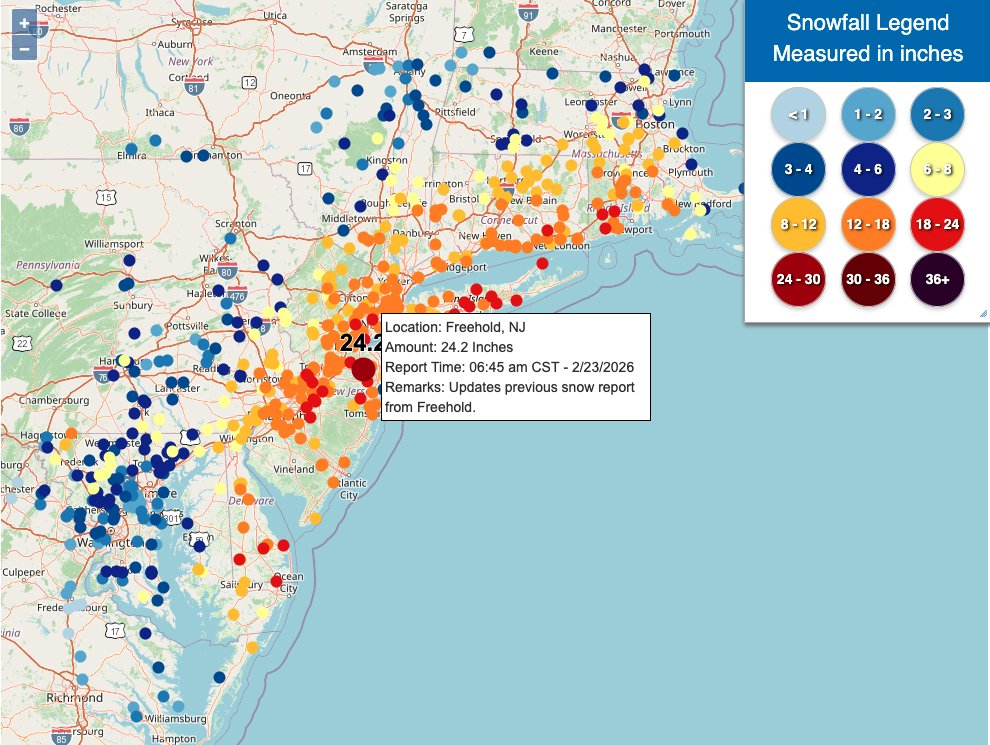
Dots Beat Bars

Today is just a quick little follow-up to my post from Monday. There I talked about how a Boston Globe piece using three-dimensional columns to show snowfall amounts in last weekend’s blizzard failed to clearly communicate the data. Then I showed a map from the National Weather Service (NWS) that showed the snowfall ranges over an entire area.

Well scrolling through the weather feeds on the Twitter yesterday I saw this graphic from the NWS that comes closer to the Globe‘s original intent, but again offers a far clearer view of the data.

Much better

Whilst we miss individual reports being depicted as exact, that is to say the reports are grouped into bins and assigned a colour, we have a much more granular view than we did with the first NWS graphic I shared.

The only comment I have on this graphic is that I would probably drop the terrain element of the map. The dots work well when placed atop the white map, but the lighter blues and yellows fade out of view when placed atop the green.

But overall, this is a much clearer view of the storm’s snowfall.

Credit for the piece goes to the National Weather Service graphics department.

Obfuscating Bars

On Friday, I mentioned in brief that the East Coast was preparing for a storm. One of the cities the storm impacted was Boston and naturally the Boston Globe covered the story. One aspect the paper covered? The snowfall amounts. They did so like this:

All the lack of information

This graphic fails to communicate the breadth and literal depth of the snow. We have two big reasons for that and they are both tied to perspective.

First we have a simple one: bars hiding other bars. I live in Greater Centre City, Philadelphia. That means lots of tall buildings. But if I look out my window, the tall buildings nearer me block my view of the buildings behind. That same approach holds true in this graphic. The tall red columns in southeastern Massachusetts block those of eastern and northeastern parts of the state and parts of New Hampshire as well. Even if we can still see the tops of the columns, we cannot see the bases and thus any real meaningful comparison is lost.

Second: distance. Pretty simple here as well, later today go outside. Look at things on your horizon. Note that those things, while perhaps tall such as a tree or a skyscraper, look relatively small compared to those things immediately around you. Same applies here. Bars of the same data, when at opposite ends of the map, will appear sized differently. Below I took the above screenshot and highlighted two observations that differed in only 0.5 inches of snow. But the box I had to draw—a rough proxy for the columns’ actual heights—is 44% larger.

These bars should be about the same.

This map probably looks cool to some people with its three-dimensional perspective and bright colours on a dark grey map. But it fails where it matters most: clearly presenting the regional differences in accumulation of snowfall amounts.

Compare the above to this graphic from the Boston office of the National Weather Service (NWS).

No, it does not have the same cool factor. And some of the labelling design could use a bit of work. But the use of a flat, two-dimensional map allows us to more clearly compare the ranges of snowfall and get a truer sense of the geographic patterns in this weekend’s storm. And in doing so, we can see some of the subtleties, for example the red pockets of greater snowfall amounts amid the wider orange band.

Credit for the Globe piece goes to John Hancock.

Credit for the NWS piece goes to the graphics department of NWS Boston.

Snowmageddon Round 2?

For those of you like myself from the East Coast—even if some of us have unfortunately moved away from civilisation—terms like Snowmageddon and Snowpocalypse draw upon memories of lots and lots of snow. So with all the hype about today’s snowstorm about to pummel the East Coast, the Washington Post took a look at the forecast range of snow and compared that to Snowmageddon.

Attack of the 6-ft tall snowman

Side note, as someone who it could be said uses a lot of purple in his work, I love the colour choices here.

Credit for the piece goes to Kat Downs.

Boston’s Snowy 2015

Boston has finally had it. And by it I mean the snowfall that broke the record. And by record I mean the record for the most snowfall in a year. Well, at least since they started recording it in 1872. The Washington Post has a nice chart placing the season not just in context, but also showing how quickly the snow fell. Most of the snow has fallen only from 25 January onward. And winter is not yet over.

DC is puny compared to  Boston

Credit for the piece goes to Kevin Uhrmacher.

Shovelling Out of Boston

Boston and the rest of Massachusetts are attempting to dig out of the blizzard that struck them earlier this week. The Boston Globe has provided its readers with a step by step set of directions for how to best extricate people and cars from snowed in homes.

Shovelling out
Shovelling out

Credit for the piece goes to James Abundis and Javier Zarracina.