
One project on which I have been working the last few weeks is an interactive data visualisation piece tracking the 2026 measles outbreak in Pennsylvania. A few years ago now I closely followed the COVID-19 pandemic, mapping it and charting it in a near daily series of datagraphics—to be clear, and this is a broad oversimplification, measles is less deadly than COVID.
Frustratingly, we had eliminated measles in the United States by 2000, because the Measles, Mumps, and Rubella (MMR) vaccine is both incredibly effective and incredibly safe. Unfortunately people today tend to disbelieve facts and science and fear the vaccine and refuse to vaccinate themselves and/or their children. Since 2020, fewer people are vaccinating themselves and their children and more people are becoming infected.
Worse, measles is perhaps one of the most easily spread virus, which only compounds the problem; it can linger in the air hours after being coughed or sneezed into the environment by an infected person.
Put those two factors together and you have Pennsylvania as the site of the worst and deadliest outbreak of measles in the United States in 2026—also the worst and deadliest in the United States in years. And with indoor weather rapidly approaching, I decided to put back on my health monitoring design hat and create a data display—I am loathe to use the term dashboard—to track the outbreak using the Pennsylvania Department of Health’s data.
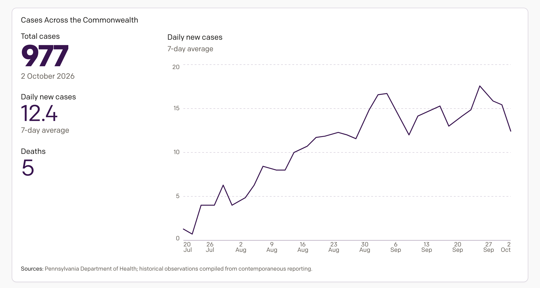
The screenshot above is from this morning, but the actual thing updates in the afternoon after the Commonwealth updates its figures. In this part of the piece I track a computed rolling seven-day average of new cases. This helps show whether the outbreak is increasing, holding steady, or decreasing. As of Monday morning, the curve may be cresting—that’s good. But, this could also just be a lull. Regardless, statewide the situation warrants further monitoring.
But I also wanted to get a bit more granular. I live in Philadelphia, but grew up out in Chester County, a western suburb of the city. Chester County is one of the dozen or so counties identified as having community transmission. In other words, in some counties someone passing through an infected area gets sick, but stays home, and the infection stays highly localised. Not great, but manageable. In community transmission, that means the infected are out and about and the virus is in the wild and thus the risk of infection is significantly increased for the unvaccinated. And so I also added a map of Pennsylvania’s counties.
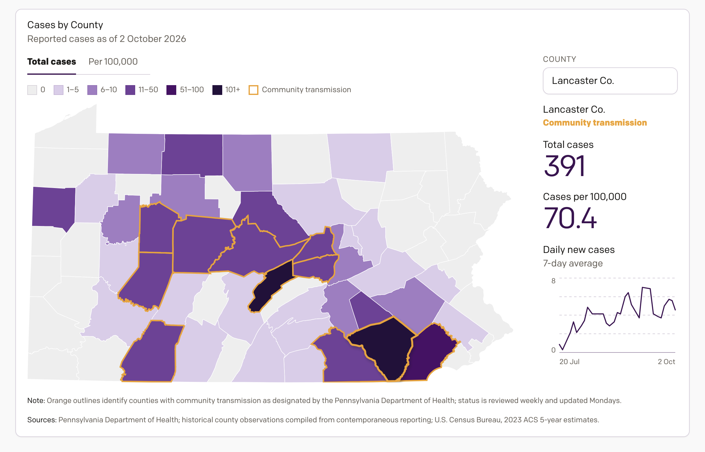
My choropleth defaults to colouring counties by the number of total cases, with those counties in community transmission outlined in orange. Here, however, we face the all too familiar problem: bigger populations mean bigger case counts. So I also offer a toggle to explore the outbreak at a per capita (or 100,000) scale, which basically makes all populations equal. Spoiler, whilst Lancaster County remains in a bad way in both views, the per capita view shows how the outbreak is hitting northern Pennsylvania and Appalachia particularly hard.
The default view loads the county with the greatest number of cases, but it also shows that county’s rolling seven-day average of new cases. The goal here is similar to that which I have for the Commonwealth-wide view: is the situation in a particular county improving, stabilising, or getting worse?
During the COVID pandemic, I heard from several people they trusted me more than media outlets to present the data and status of that viral outbreak’s spread. It became a heavy burden to bear and in time I realised the daily reporting of death and illness had burned me out. One reason I stopped posting here on a daily basis.
I do not intend to post daily updates on measles here on Coffeespoons or on my social media. Will I post the occasional update? Certainly, when the situation warrants or if people request an update. But I would encourage those interested in keeping tabs on the situation to listen to the Pennsylvania Department of Health or visit my work, but to be clear,…
…damn it, Jim, I’m a designer, not a doctor.
Ultimately I just hope my data visualisation work meaningfully contributes to the discourse.