Tag: Pennsylvania
-
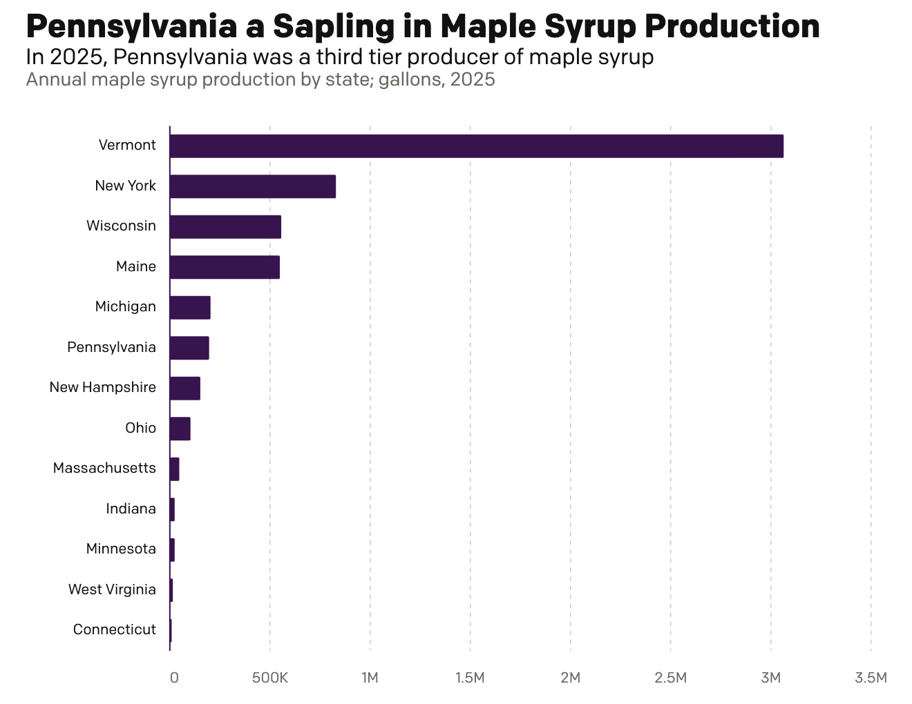
Maple Syrup Monday
This morning over breakfast I was reading an article in the Philadelphia Inquirer about Pennsylvania maple syrup production. My breakfast was oatmeal with maple syrup, cinnamon, and all space along with orange juice and a cup of tea. They talked about Pennsylvania’s production and compared it to Vermont’s, which made me want nothing more than…
-
248 Years Later, Philadelphia’s Still Hosting Debates
For those of you living under a rock, 2024 is a presidential election year in the United States and the campaign for the November election truly kicks off post-Labour Day. And post-Labour Day here we are. Tonight features a presidential debate between the two candidates, Vice President Kamala Harris and former president Donald Trump. Harris…
-
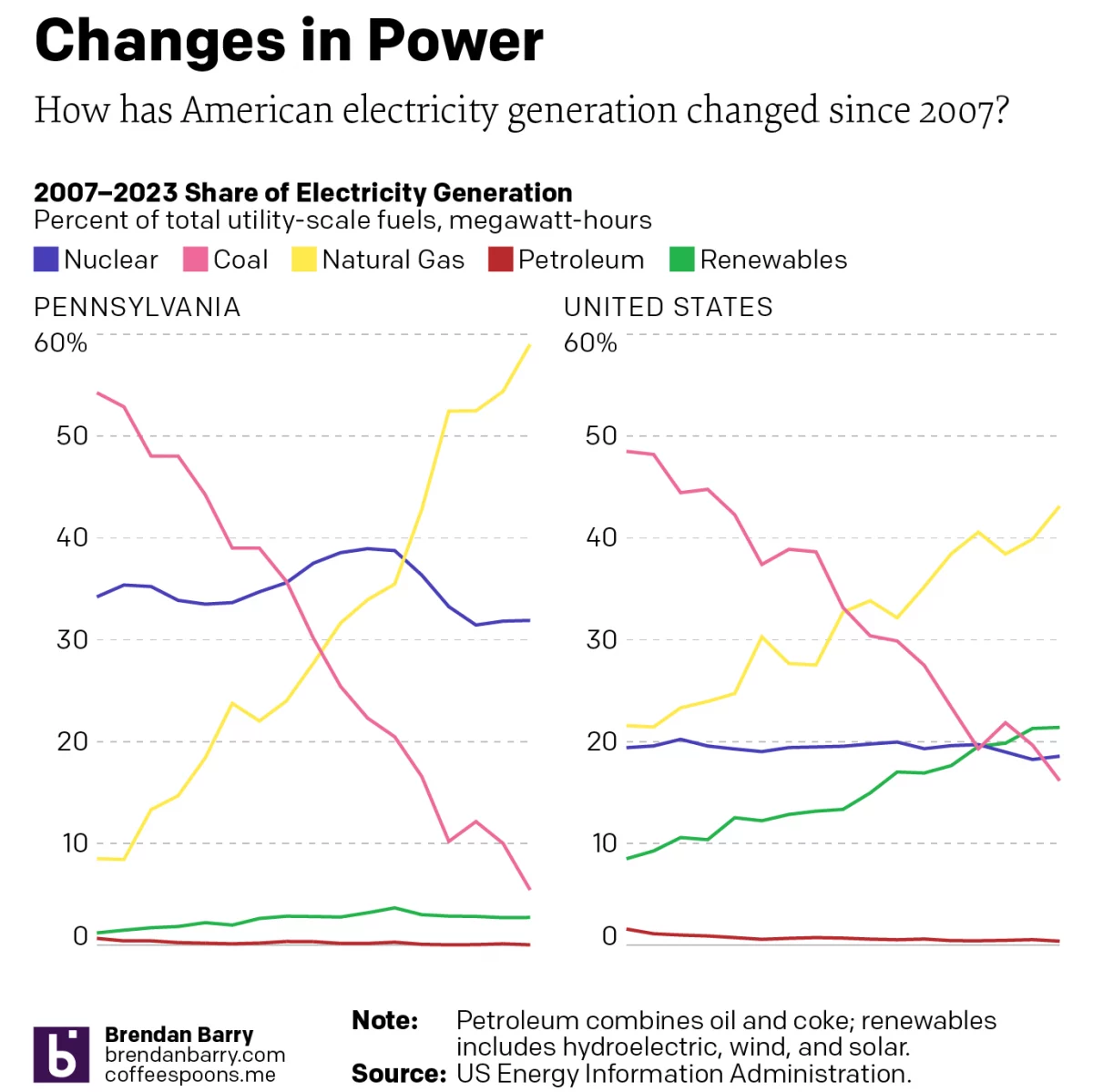
Electric Throat Share
For the last few weeks I have been working on my portfolio site as I update things. (Note to self, do not wait another 15 years before embarking upon such an update.) At the University of the Arts (requiescat in pace), I took an information design class wherein I spent a semester learning about the…
-
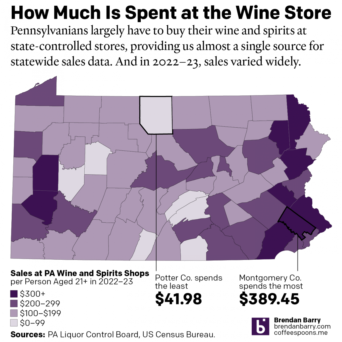
The Sun’s Over the Yardarm Somewhere
It’s been a little while since my last post, and more on that will follow at a later date, but this weekend I glanced through the Pennsylvania Liquor Control Board’s annual report. For those unfamiliar with the Commonwealth’s…peculiar…alcohol laws, residents must purchase (with some exceptions) their wine and spirits at government-owned and -operated shops. It’s…
-
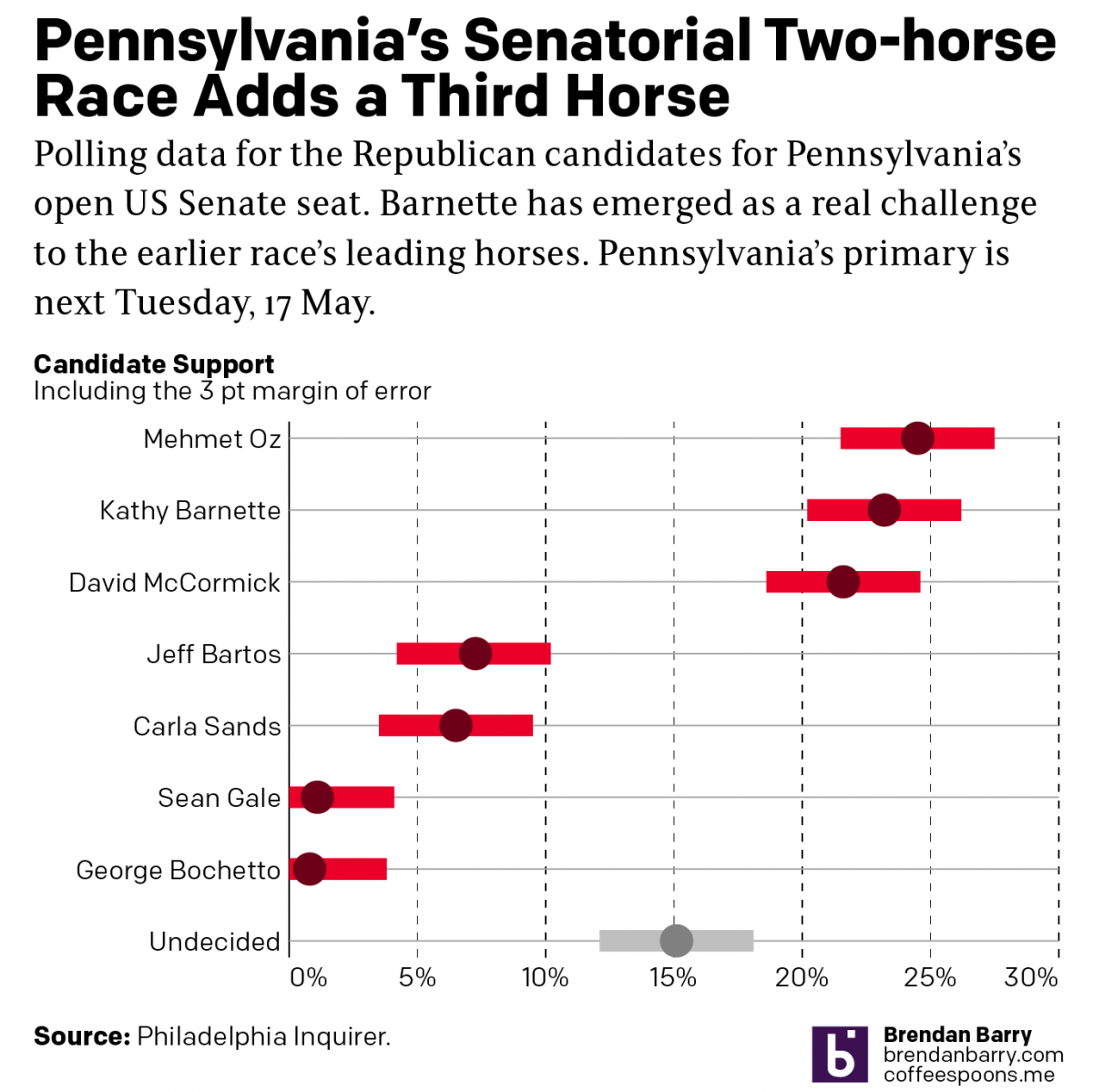
Political Hatch Jobs
Earlier this week I read an article in the Philadelphia Inquirer about the political prospects of some of the candidates for the open US Senate seat for Pennsylvania, for which I and many others will be voting come November. But before I get to vote on a candidate, members of the political parties first get…
-
How Accurate Is Punxsutawney Phil?
For those unfamiliar with Groundhog Day—the event, not the film, because as it happens your author has never seen the film—since 1887 in the town of Punxsutawney, Pennsylvania (60 miles east-northeast of Pittsburgh) a groundhog named Phil has risen from his slumber, climbed out of his burrow, and went to see if he could see…
-
Where Are the Votes?
I’m not working for a good chunk of the next few days. But, I did want to share with my readers an analysis of Pennsylvania’s missing votes. Broadly, Trump needs to win the Commonwealth of Pennsylvania next week—yes, the US election is now one week away. Though, Pennsylvania allows mail-in ballots postmarked on Election Day…
-
Cheesesteaks and Politics
For those unaware, Pennsylvania matters in the 2020 election. And it has mattered for years as a perennial swing state. There are of course the visits to steel mill cities like Pittsburgh, deindustrialised places like Johnstown, and unions love visits to places in Lackawanna and Luzerne. (You can read more about Pennsylvania as a swing…
-
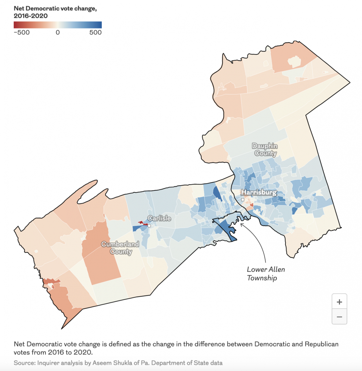
Parties in Pennsylvania
This is from a social media post I made a few days ago, but think it may be of some relevance/interest to my Coffeespoons followers. I was curious to see at 30+ days from the general election, how has the landscape changed for the two parties since 2016? Well, this project has driven me to…