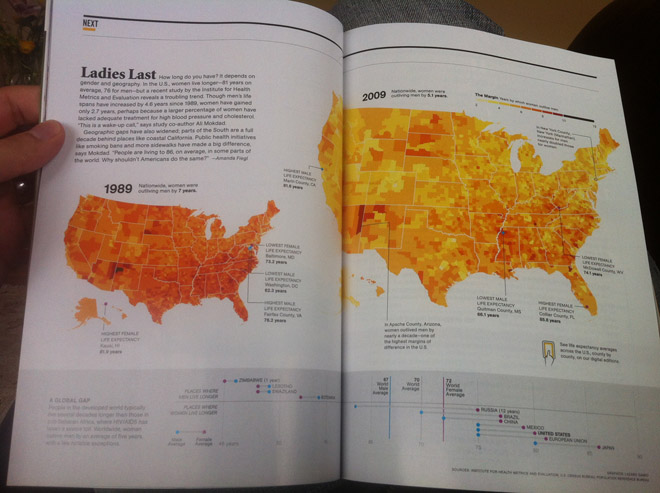
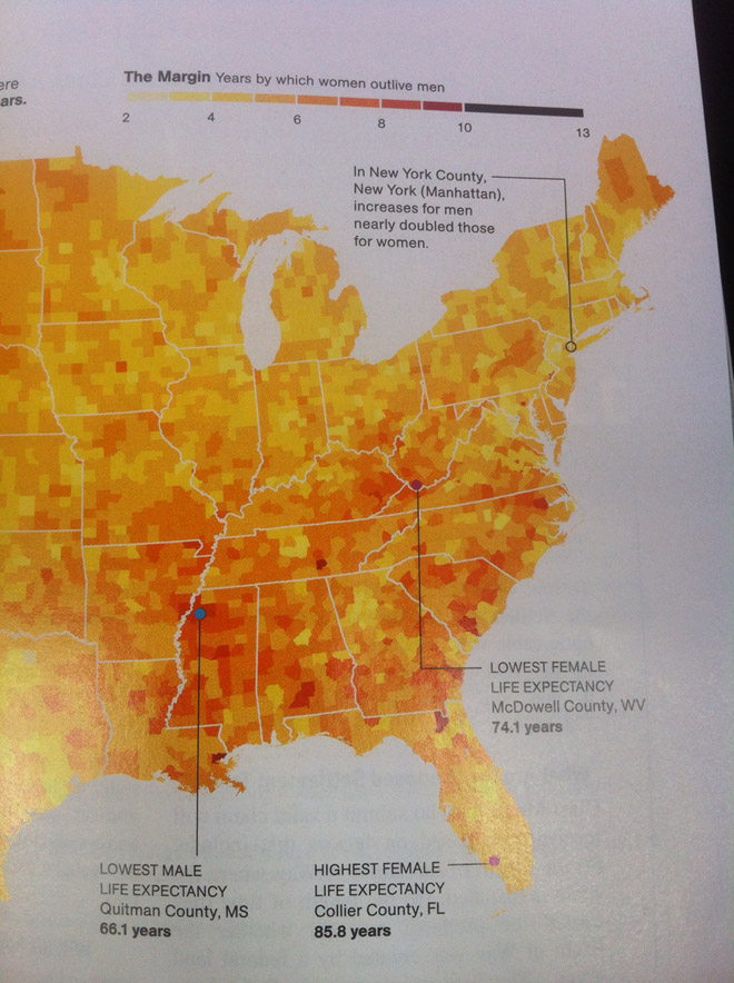
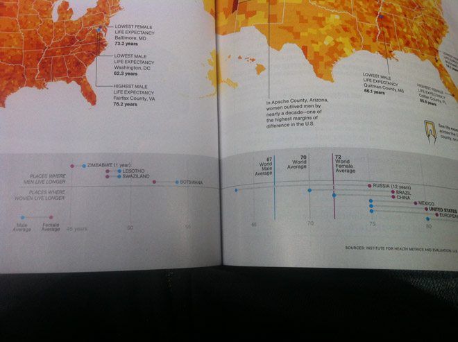
Today’s post comes via my coworker Jonathan and his subscription to National Geographic. The spread below looks at the gap in life expectancy between men and women in the United States. Outliers are highlighted by drawing lines to the counties in question while the same colour scale is used on a smaller map to look at historic data. And of course for those concerned about how the US places amongst its piers on the international stage, a small selection of countries are presented beneath in a dot plot that looks at the differences and averages.


Credit for the piece goes to Lazaro Gamio.
Leave a Reply
You must be logged in to post a comment.