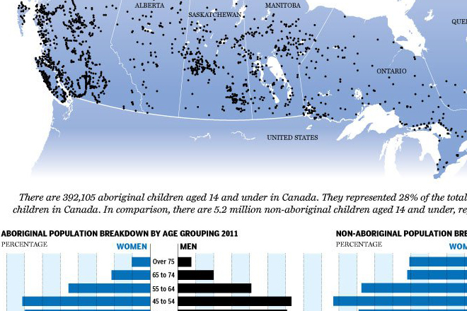
Recently the National Post looked at the results of a Canadian census that identified significant growth in people identifying with the aboriginal populations of Canada. As an American, I am not terribly familiar with Canadian native populations, but if I recall, they are broken into the three groups examined in the infographic: First Nations, Inuit, and Metis. The First Nations are the original tribes of Canada, the Inuit are the natives from northern Canada, and the Metis are the mixed-race persons of native and early European colonisation.

I find interesting the National Post’s use of network diagrams (the bubbles with lines) to show how the subcomponents form the whole. This as opposed to perhaps a more common form of a tree map or bubbles within a bubble. I would be curious to see or learn about which is the most effective at showing the relationship both in terms of structure (hierarchy) and size (without the datapoints included as labels).
Credit for the piece goes to Andrew Barr, Mike Faille, and Richard Johnson.
Leave a Reply
You must be logged in to post a comment.