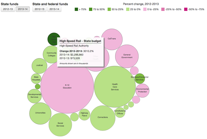
Yesterday I looked at the aboriginal Canadian identity infographic and wondered if bubbles in a bubble suffice for understanding size and relationship. Today we look at an interactive graphic from the Los Angeles Times where I do not think the bubbles suffice.

In this graphic, I cannot say the bubbles work. Besides the usual difficulty in comparing the sizes of bubbles, too many of the bubbles are spaced too far apart. These white gaps make it even more difficult to compare the bubbles. Furthermore, as you will see in a moment, it is difficult to see which programmes receive more than others because there is no ranking order to the bubbles.
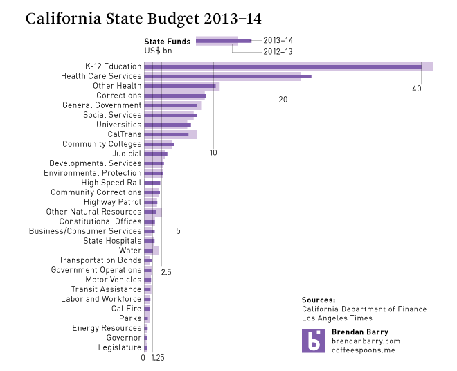
Below is a quick data sketch of the state funds only data for 2013 and 2012.

While I did not spend a lot of time on it, you can clearly see how simply switching to a bar chart allows the user to see the rank of programmes by state funding. It is not a stretch to add some kind of toggle function as in the original. One of the tricky parts is the percent growth. You will note above that my screenshot highlights high speed rail; the growth was over 3000%. That is far too much to include in my graphic, so I compared the actuals instead. That is one of the tradeoffs, but in my mind it is an acceptable one.
Credit for the original goes to Paige St. John and Armand Emamdjomeh.
Leave a Reply
You must be logged in to post a comment.