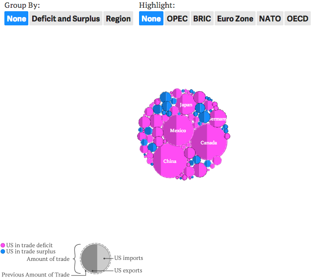
The US imports a lot. But it does not export quite as much. The difference between those two figures is what is known as the balance of trade. Quartz looks at the US balance of trade not at an overall level, but between individual countries.

This is not one of my favourite pieces. For starters, while the overall figures are in the accompanying text, it would be useful to include total US imports and exports alongside the graphic as a point of reference.
Secondly, a long-standing issue I have is area comparisons. Sometimes they are needed and useful, a good example is a tree map. But in this piece, the circles do not add up to a recognisable whole. They also do not help when looking at individual countries and their historical trade values. A dotted outline of a circle shows the previous year’s trade. But more often than not, the trade level was so similar that the circles nearly overlap exactly.
The grouping and highlighting functionality hints at a useful application to explore US trade data, but the clumsiness of the circles renders that usefulness moot. .
Credit for the piece goes to David Yanofsky.
Leave a Reply
You must be logged in to post a comment.