Yesterday the New York Times published a fascinating piece looking at the data on how often President Trump has gone after the Special Counsel’s investigation. (Spoiler: over 1100 times.) It makes use of a number of curvy line charts showing the peaks of mentions of topics and people, e.g. Jeff Sessions. But my favourite element was this timeline.
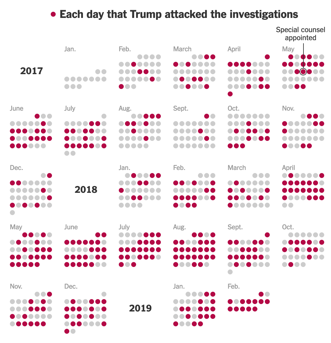
It’s nothing crazy or fancy, but simple small multiples of a calendar format. The date and the month are not particular important, but rather the frequency of the appearances of the red dots. And often they appear, especially last summer.
Credit for the piece goes to Larry Buchanan and Karen Yourish.
Leave a Reply
You must be logged in to post a comment.