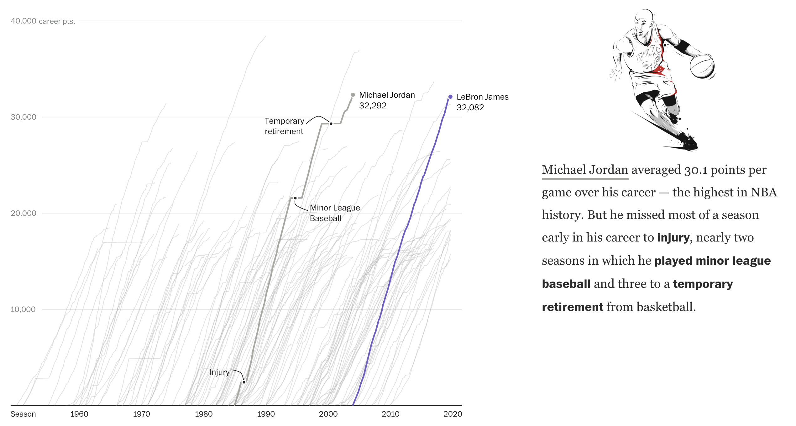
Back in 2012 the New York Times ran what is a classic data visualisation piece on Mariano Rivera. It tracked the number of saves the legendary Yankees closer had over his career and showed just how ridiculous that number was—and how quickly he had attained it. Last week, the Washington Post ran a piece that did something very similar about LeBron James, a future basketball legend, and Michael Jordan, definitely a basketball legend.

The key part of the piece is the line chart tracking points scored, screenshot above. It takes the same approach as the Rivera piece, but instead tracks scored points. Unlike the Rivera piece, which was more “dashboard” like in its appearance and function, allowing users to explore a dataset, this is more narratively constructed. The user scrolls through and reads the story the authors want you to read. Thankfully, for those who might be more interested in exploring the dataset, the interactivity remains intact as the user scrolls down the article.
While the main thrust of the piece is the line chart, it does offer a few other bar and line charts to put James’ career into perspective relative to the changing nature of NBA games. The line chart breaking down the composition of James’ scoring on a yearly basis is particularly fascinating.
But, don’t ask me about how he fits into the history of basketball or how he truly compares to Michael Jordan. Basketball isn’t my sport. But this is a great piece overall.
Credit for the piece goes to Armand Emamdjomeh and Ben Golliver.
Leave a Reply
You must be logged in to post a comment.