The Economist has an interesting piece looking at the areas of support for the far-right AfD German political party, arguably a neo-fascist nationalist party. It turns out that
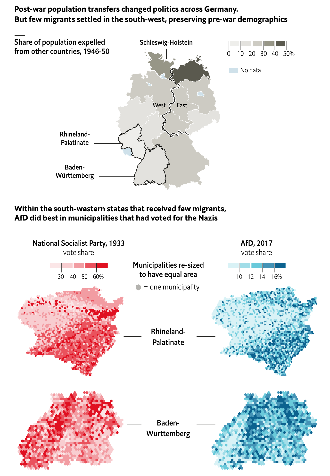
The piece does a great job of setting the case through the demographics map at the top of the piece. It shows how the two areas where the largest AfD support experienced the least changes from prior to the war. And with those demographics in place, the support for hardline nationalism might still be present, as is indicated by the support for the AfD.
In terms of the municipality maps, I would be curious if the hexagon tile map is because those borders have changed. Obviously 84 years can change political boundaries.
But I wonder if a single map could have been done showing the correlation between the 1933 vote and the 2017 vote. Of course, the difficulty could well be in that political boundaries may have changed.
And of course, we should not go so far as to compare the AfD to Nazism.
Credit for the piece goes to the Economist graphics department.
Leave a Reply
You must be logged in to post a comment.