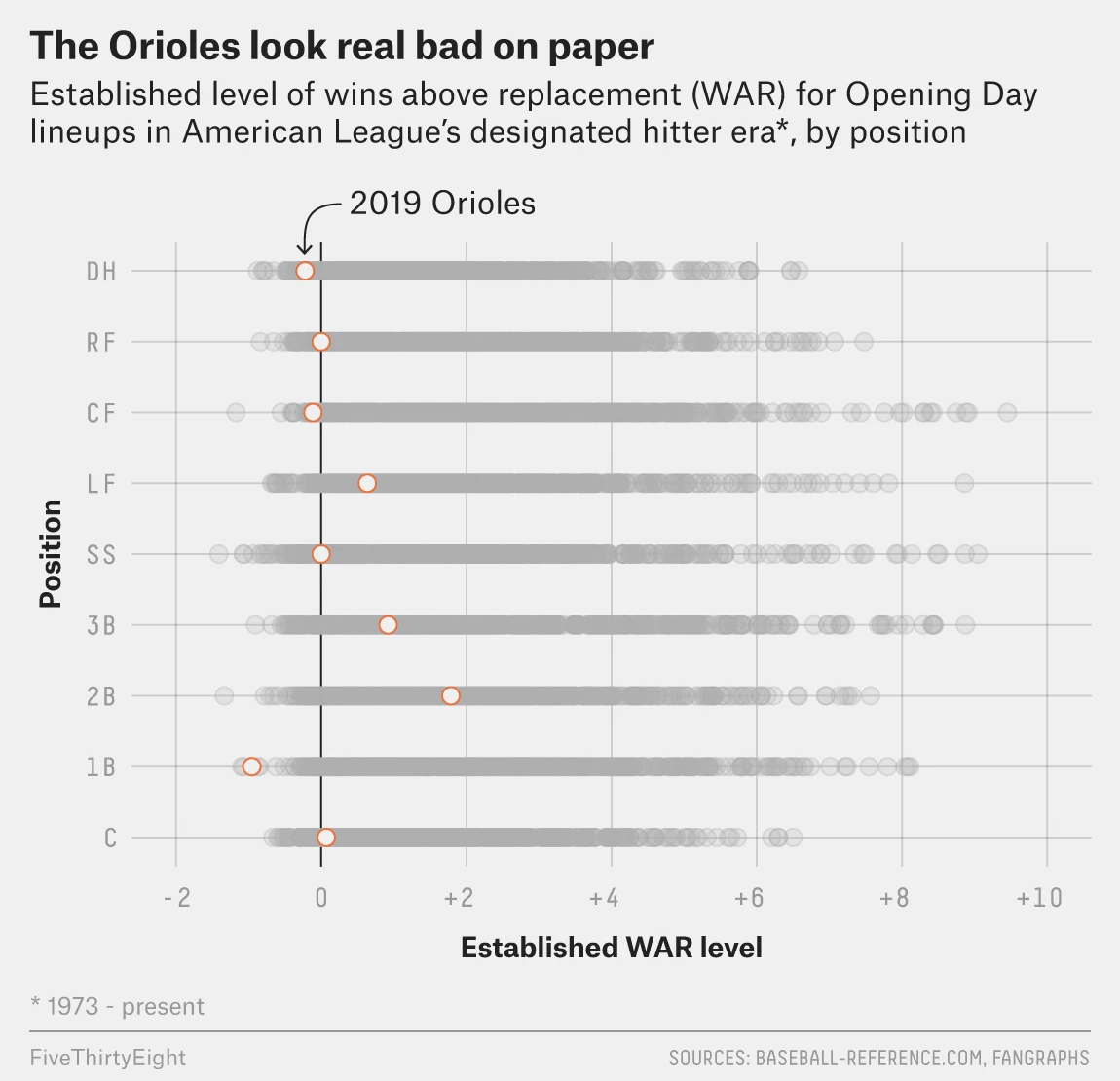
Baseball is almost upon us. And oh boy do the Baltimore Orioles look bad. How bad? Historically bad. FiveThirtyEight went so far as to chart the expected WAR, wins above replacement, of each position of all teams since 1973. And the expected Orioles lineup looks remarkably bad.

What is nice about this graphic is the use of the medium grey for each team/year combination. I may have used a filled orange dot instead of open, but the dots do at least standout and show the poor positioning of just about everything but the second baseman.
Credit for the piece goes to the FiveThirtyEight graphics department.
Leave a Reply
You must be logged in to post a comment.