Tag: line chart
-
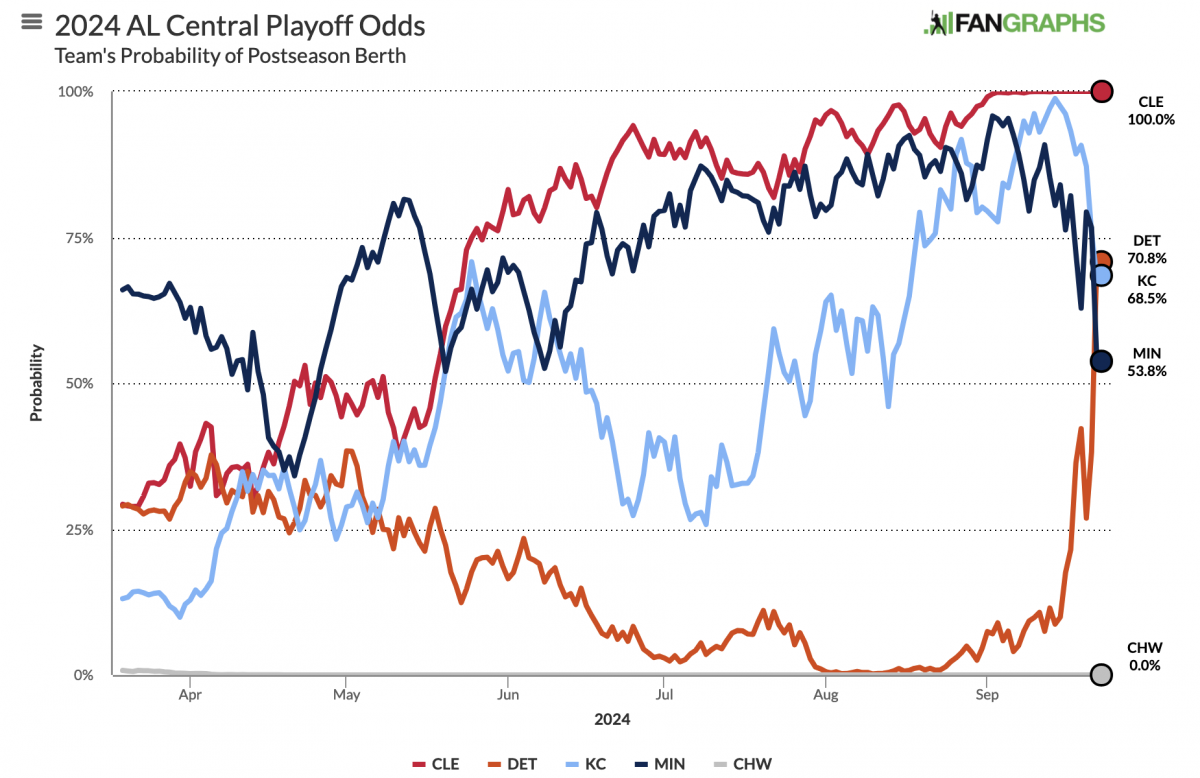
Labelling Line Charts
Today I have a little post about something I noticed over the weekend: labelling line charts. It begins with a BBC article I read about the ongoing return to office mandates some companies have been rolling out over the last few years. When I look for work these days, one important factor is the office…
-

To X or Not to X
As it happens, the Latino culture largely remains x’ed out on using the term Latinx, according to a new survey from Pew Research. The issue of supplanting Latino/Latina with Latinx as a gender neutral replacement—or as a complementary alternative—emerged in the general discourse in that oh-so-fun year of 2020 when everything went well. One common…
-
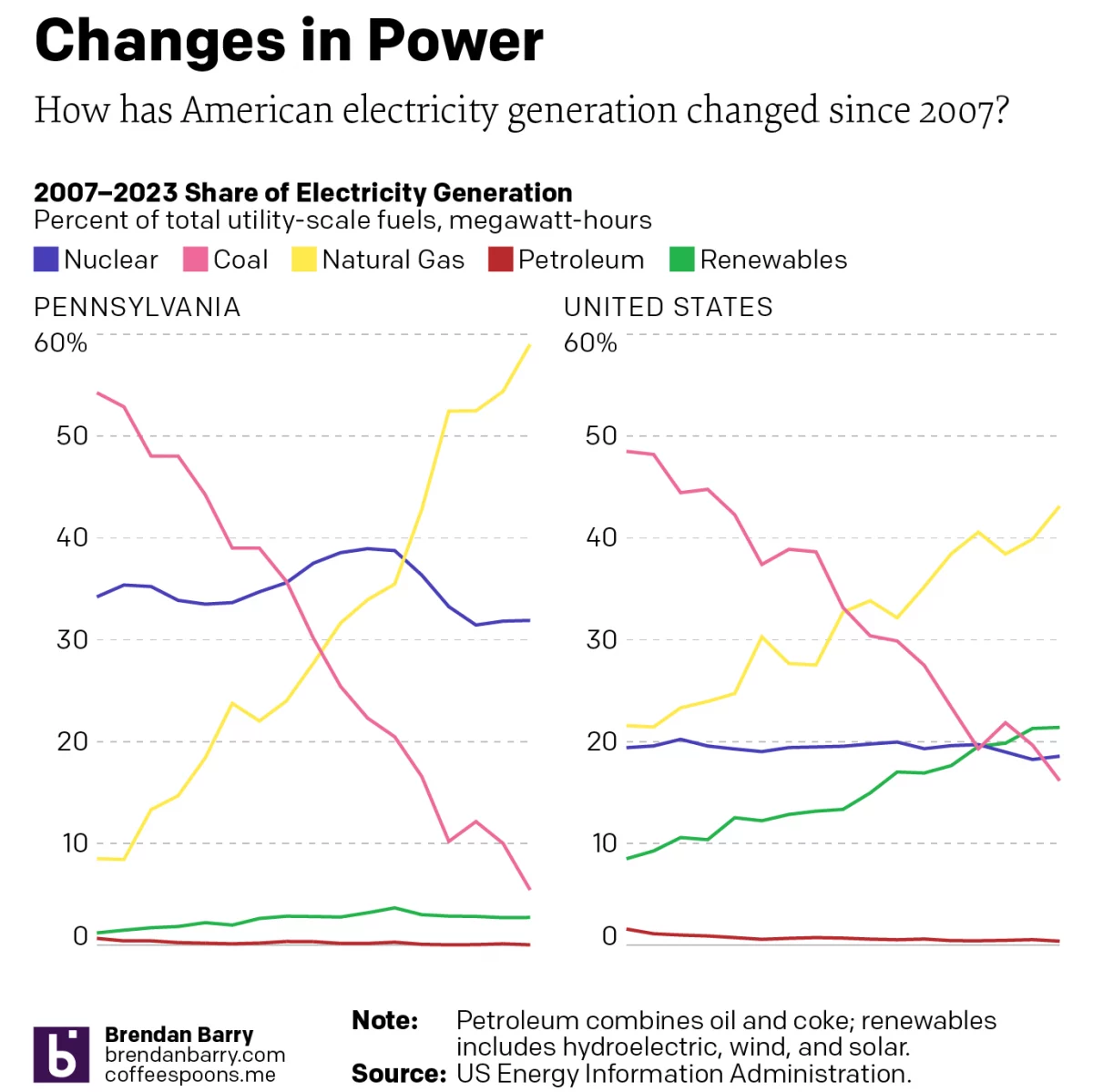
Electric Throat Share
For the last few weeks I have been working on my portfolio site as I update things. (Note to self, do not wait another 15 years before embarking upon such an update.) At the University of the Arts (requiescat in pace), I took an information design class wherein I spent a semester learning about the…
-
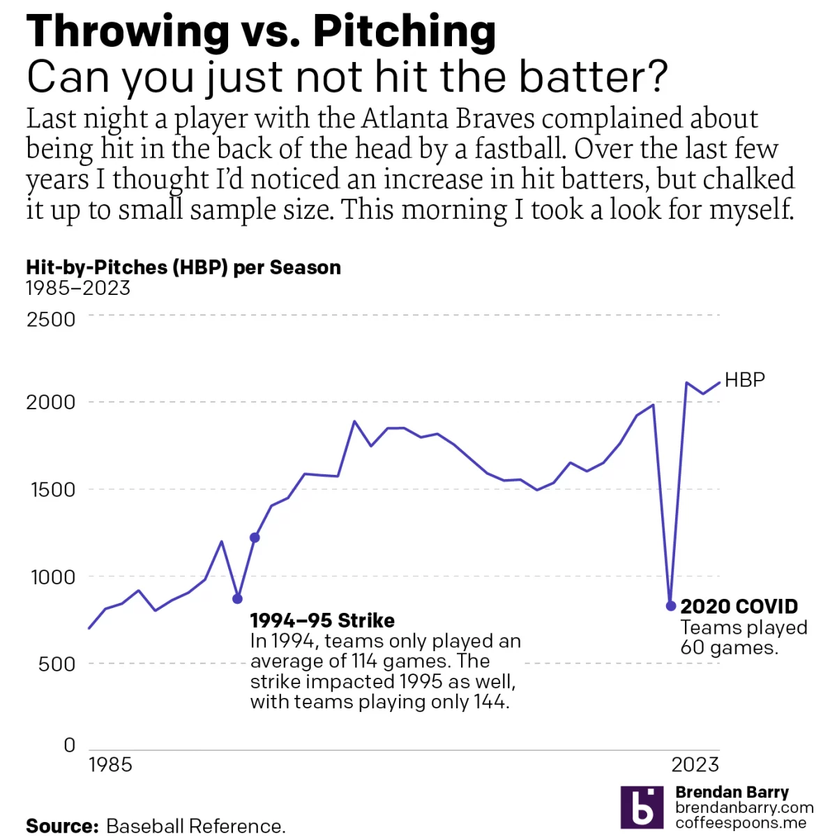
I Want a Pitcher Not a Back o’ Head Hitter
We’re about to go into the sportsball realm, readers. Baseball, specifically. Tuesday night, Atlanta Braves batter Whit Merrifield was hit in the back of the head by a 95 mph fastball. Luckily, modern ballplayers wear helmets. But at that velocity, one does not have the most reaction time in the world a number of other…
-
Just Keep Grinding it Out
There are certain journalism outlets that I read that consistently do a good job with information design or at least are known for it. Now I try to keep my media diet fairly large and ideologically broad, but in that there are also still some outlets that feature quality design than others. The New York…
-
Warming Towards Women Leaders
We are going to start this week off with a nice small multiple graphic that explores the reducing resistance to women in positions of leadership in Arab countries. The graphic comes from a BBC article published last week. These kinds of graphics allow a reader to quickly compare the trajectory of a thing between a…
-
It’s a Little Steamy Out There
And by out there I mean 1150 light years away. One of the five amazing images out of the first day’s announcement by the James Webb Space Telescope (JWST) team was not a sexy photo of a nebula or a look back 13.5 billion years in time. Instead it was a plot of the amount…
-
New Mexico Burns
Editor’s note: I was having some technical issues last week. This was supposed to post last week. Editor’s note two: This was supposed to go up on Monday. Still didn’t. Third time’s the charm? Yesterday I wrote about a piece from the New York Times that arrived on my doorstep Saturday morning. Well a few…