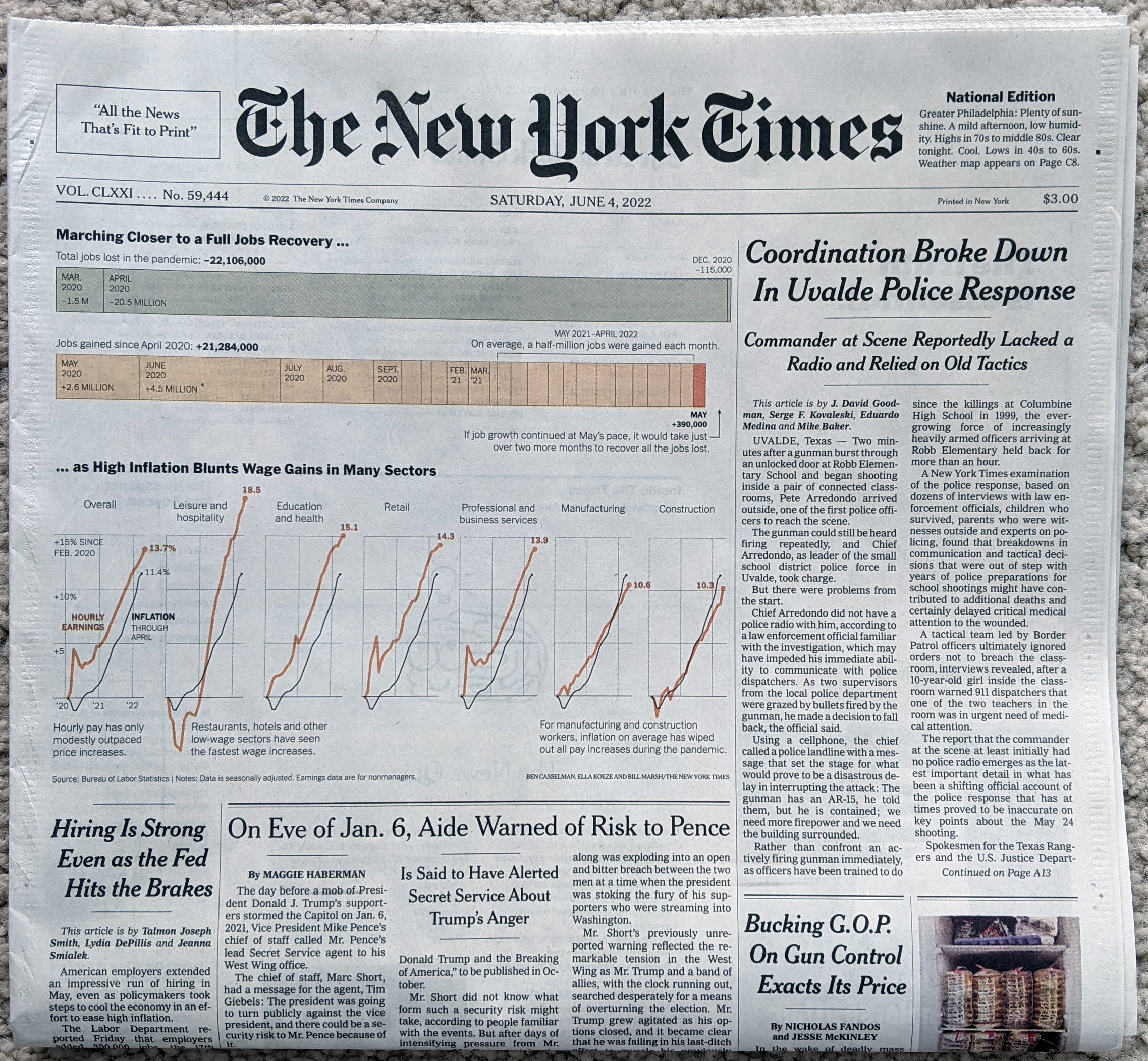
Friday the Bureau of Labour Statistics published the data on the jobs facet of the American economy. Saturday morning I woke up and found the latest New York Times visualisation of said jobs report waiting for me at my door. The graphic sat\s above the fold and visually led the morning paper.
We have a fairly simple piece here, in a good way. Two sections comprise the graphic. The first uses a stacked bar chart to detail the months wherein the US economy lost jobs during the previous two and a half years. We can take a closer look in this second photo that I took.
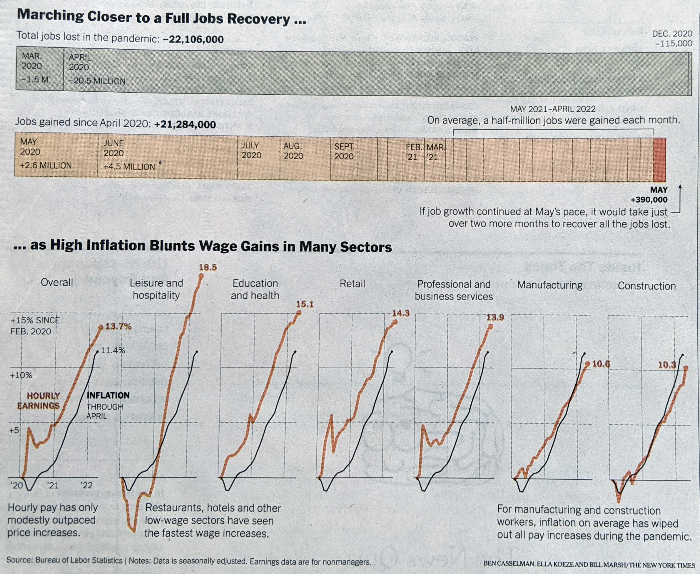
Here we can see the stacked bars pile up with the most recent bars to the right. Some of the larger bars have labels stating the number of jobs either lost (top) or gained (bottom). I’m not normally a fan of stacked bar charts, because they don’t allow a reader to easily discern like-for-like changes. In this instance, the goal is to show how close all the little bits have come towards making up the three negative bars. Where I take issue is that I would prefer the designers used some sort of scale to indicate even a rough sense of how many jobs the various bars represent.
That issue crops up again to a slightly lesser degree with the bottom set of graphics. These compare the growth of hourly earnings and inflation both from February 2020. During the first few months of the pandemic and its recession, you can see earnings for those most directly impacted by shutdowns drop. But there is no negative scale accompanying the positive scale and that makes it difficult to determine just how far earnings fell for those in, say, leisure and hospitality.
The second part of the graphic works overall, however it’s just some of the finer design details that are missing and take away from the graphic’s overall effectiveness.
This all fits part of a larger trend in data visualisation that I’ve been noticing the last few months. Fewer charts seem to be using axes and scales. It’s not a good thing for the field. Maybe some other day I’ll write some things about it.
For this piece, though, we have an overall solid effort. Some different design decisions could have made the piece clearer and more effective, but it still does the job.
Credit for the piece goes to Ben Casselman, Ella Koeze, and Bill Marsh.