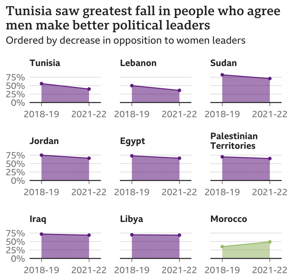
We are going to start this week off with a nice small multiple graphic that explores the reducing resistance to women in positions of leadership in Arab countries. The graphic comes from a BBC article published last week.

These kinds of graphics allow a reader to quickly compare the trajectory of a thing between a start and an endpoint. The drawback is it can obscure any curious or interesting trends in the midpoints. For example, with Libya, is its flat trajectory always been flat? You could imagine a steep fall off but then rapid climb back up. That would be a story worth telling, but a story obscured by this type of graphic.
I do think the graphic could use a few tweaks to help improve the data clarity. The biggest change? I would work to improve the vertical scale, i.e. stretch each chart taller. Since we care about the drop in opposition to women leaders, let’s emphasise that part of the graphic. There could be space constraints for the graphic, but that said, it looks like some of the spacing between chart header and chart could be reduced. And I think for most of the charts except for the first, the year range could be added as a data definition to the graphic and removed from each chart. Similar to how every row only once uses the vertical axis labels.
Another way this could be done is by reducing the horizontal width of each chart in an attempt to squeeze the nine from three rows down to two. That would mean two additional chart positions per row. Tight fit? Probably, but there is also some extraneous space to the right and left of each chart and a large gap between the charts themselves. This all appears to be due to those aforementioned x-axis labels. An additional benefit to reducing the horizontal dimensions of each chart is it increases the vertical depth of the chart as each line’s slope, its rise over run, sees its horizontal distance shrink.
Overall this is a really smart graphic that works well, but with a few extra tweaks could take it to the next level.
Credit for the piece goes to the BBC graphics department.