Tag: Philadelphia Inquirer
-
A New Downtown Arena for Philadelphia?
I woke up this morning and the breaking news was that the local basketball team, the 76ers, proposed a new downtown arena just four blocks from my office. The article included a graphic showing the precise location of the site. For our purposes this is just a little locator map in a larger article. But…
-
Legendary Adjustments
The other day I was reading an article about the coming property tax rises in Philadelphia. After three years—has anything happened in those three years?—the city has reassessed properties and rates are scheduled to go up. In some neighbourhoods by significant amounts. I went down the related story link rabbit hole and wound up on…
-
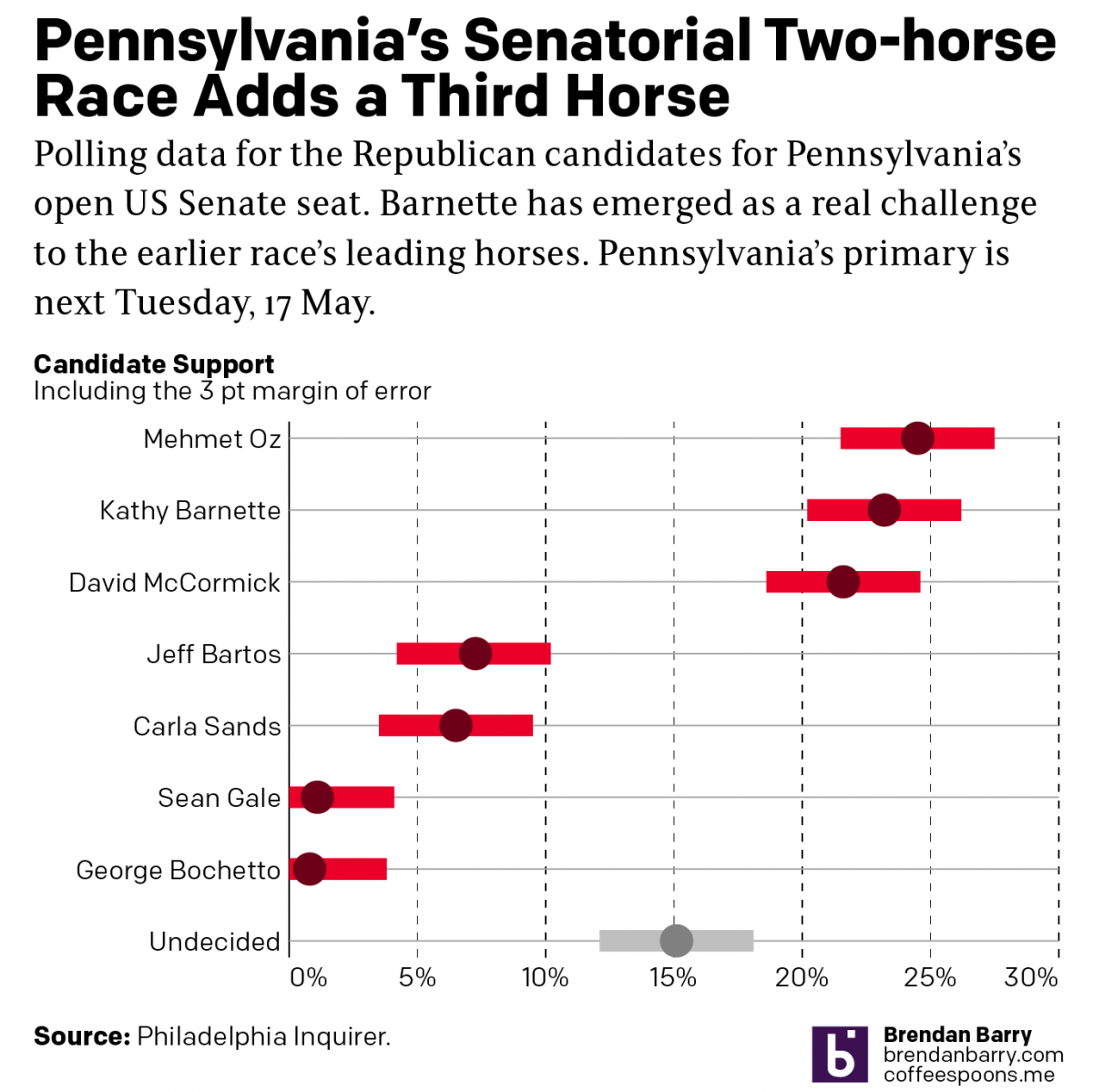
Political Hatch Jobs
Earlier this week I read an article in the Philadelphia Inquirer about the political prospects of some of the candidates for the open US Senate seat for Pennsylvania, for which I and many others will be voting come November. But before I get to vote on a candidate, members of the political parties first get…
-
Fire in Fairmount
Philadelphia made the national and international news last week, although for once not because we’re all being shot to death. This time because a fire in a rowhome killed 12 people, including nine children. The Philadelphia Inquirer quickly posted a short article explaining what occurred that morning. But the early indication, based upon the confession…
-
Roundabouts in Philadelphia
This is a piece I’ve been sitting on for a little while now, okay half a year now. There isn’t too much to it as it’s an illustration overlay on a satellite photo. But the graphic supports an article about the construction of a new roundabout in Philadelphia, coincidentally where I used to live. That…
-
We’re Gonna Need a Bigger Boat
A little over a week ago the Philadelphia Inquirer posted an article about sharks. It wouldn’t be the American holiday of 4th of July without mentioning Jaws. Think of it, there really are no good Hollywood films about the Constitutional Convention or Declaration of Independence. I mean we have Mel Gibson’s The Patriot. But, that’s…