We’re starting this week with an article from the Philadelphia Inquirer. It looks at the increasing number of guns confiscated by the Transportation Security Administration (TSA) at Philadelphia International Airport. Now while this is a problem we could discuss, one of the graphics therein has a problem that we’ll discuss here.
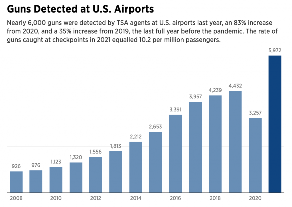
We have a pretty standard bar chart here, with the number of guns “detected” at all US airports from 2008 through 2021. The previous year is highlighted with a darker shade of blue. But what’s missing?
We have two light grey lines running across the graphic. But what do they represent? We do have the individual data points labelled above each bar, and that gives us a clue that the grey lines are axis lines, specifically representing 2,000 and 4,000 guns, because they run between the bars straddling those two lines.
However, we also have the data labels themselves. I wonder, however, are they even necessary? If we look at the amount of space taken up by the labels, we can imagine that three labels, 2k, 4k, and 6k, would use significantly less visual real estate than the individual labels. The data contained in the labels could be relegated to a mouseover state, revealed only when the user interacts directly with the graphic. Here it serves as a “sparkle”, distracting from the visual relationships of the bars.
If the actual data values to the single digit are important, a table would be a better format for displaying the information. A chart should show the visual relationship. Now, perhaps the Inquirer decided to display data labels and no axis for all charts. I may disagree with that, but it’s a house data visualisation stylistic choice.
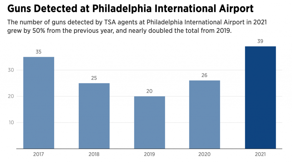
But then we have the above screenshot. In this bar chart, we have something similar. Bars represent the number of guns detected specifically at Philadelphia International Airport, although the time framer is narrower being only 2017–2021. We do have grey lines in the background, but now on the left of the chart, we have numbers. Here we do have axis labels displaying 10, 20, and 30. Interestingly, the maximum value in the data set is 39 guns detected last year, but the chart does not include an axis line at 40 guns, which would make sense given the increments used.
At the end of the day, this is just a frustrating series of graphics. Whilst I do not understand the use of the data labels, the inconsistency with the data labels within one article is maddening.
Credit for the piece goes to John Duchneskie.
Leave a Reply
You must be logged in to post a comment.