The other day I was reading an article about the coming property tax rises in Philadelphia. After three years—has anything happened in those three years?—the city has reassessed properties and rates are scheduled to go up. In some neighbourhoods by significant amounts. I went down the related story link rabbit hole and wound up on a Philadelphia Inquirer article I had missed from early May that included a map of just where those increases were largest. The map itself was nothing crazy.
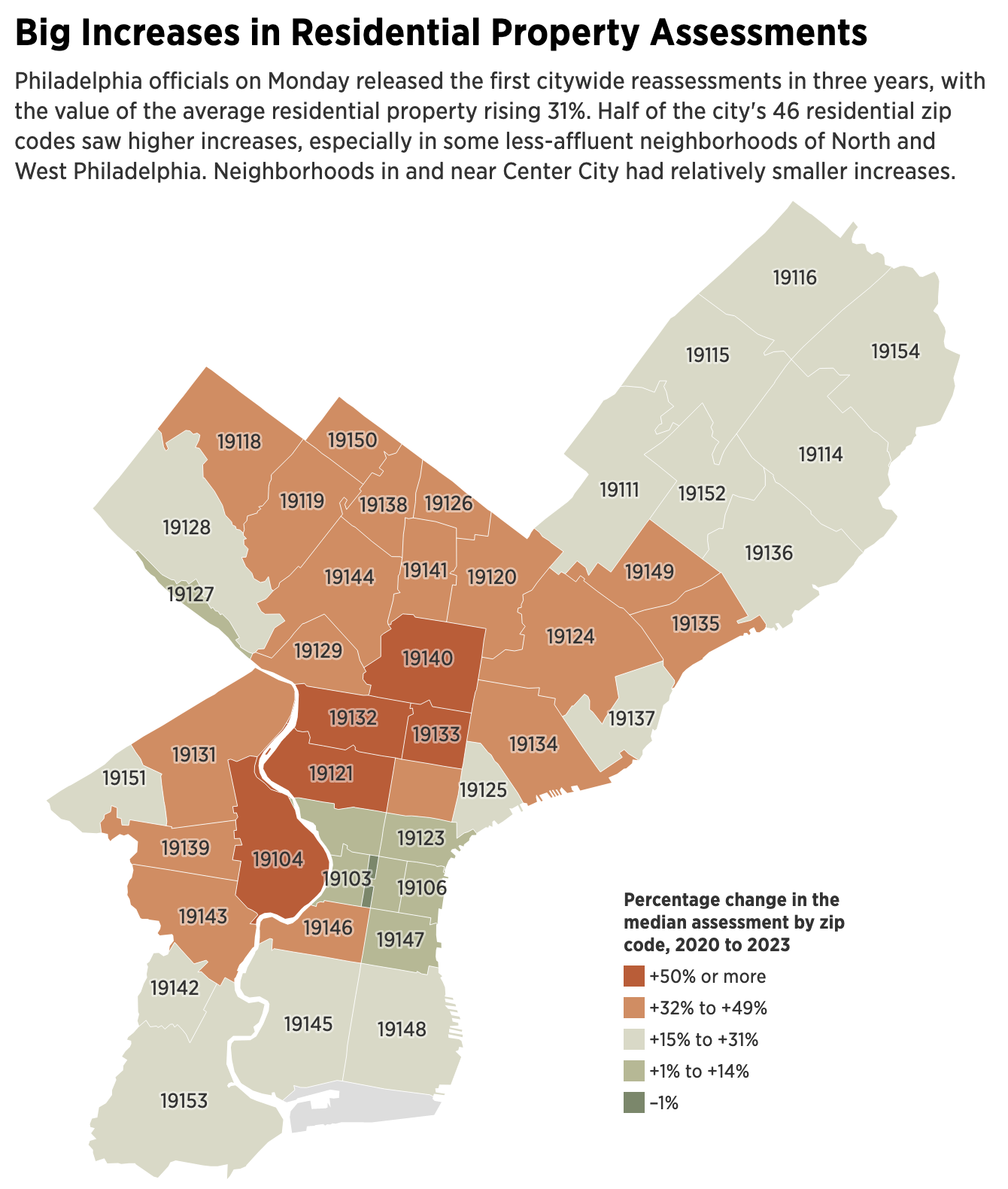
We have a choropleth with city zip codes coloured by the percentage increase. I was thrown for a bit of a loop as I immediately perceived the red representing lower values and green higher values, the standard green to red palette. But given that higher values are “bad”, I can live red representing bad and sitting at the top of the spectrum.
I filed it away to review later, but when I returned I visited on my mobile phone. And what I saw broadly looked the same, but there was a disconcerting difference. Take a look at the legend.
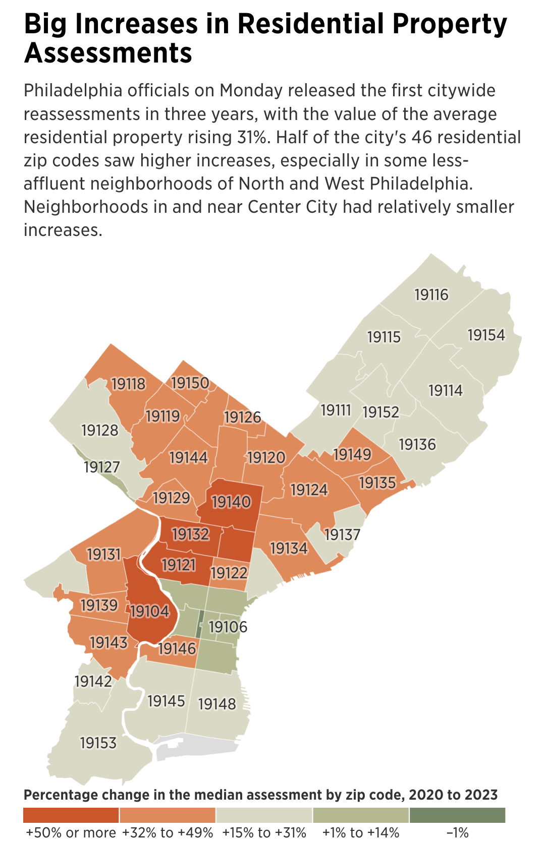
You can see that instead of running vertically like it did on the desktop, now the legend runs horizontally across the bottom. In and of itself, that’s not the issue. Though I do wonder if this particular legend could have still worked in roughly the same spot/alignment given the geographic shape of Philadelphia along the Delaware River.
Rather look at the order. We go from the higher, positive values on the left to the negative, lower values on the right. When you read the legend, this creates some odd jumps. For example, we move from “+32% to +49%” then to “+15% to +31%”. We would normally say something to the point of the increase bins moving from “+15% to +31%” then to “+32% to +49%”. In other words, the legend itself is a continuum.
The fix for this would be to simply flip the running order of the legend. Put the lower values on the left and then step up to the right. For a quick comparison, I visited the New York Times website and pulled up the first graphic I could find that looked like a choropleth. Here we have a map of the dangerous temperatures across the United States.
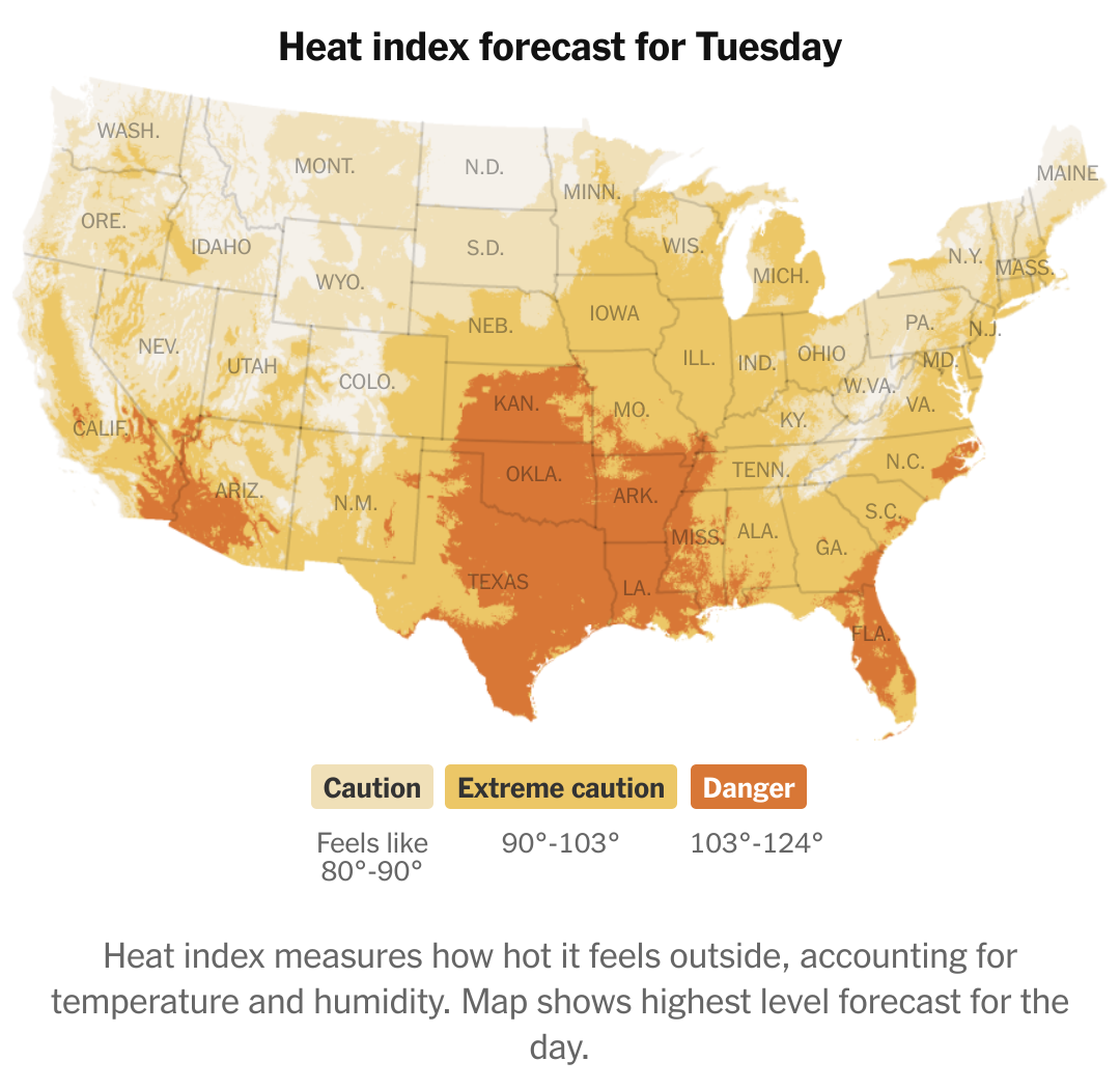
Note how here the New York Times also runs their legend horizontally below the graphic. But instead of running high-to-low like in the Inquirer, the Times runs low-to-high, making for a more natural and intuitive legend.
This kind of simple ordering change would make the Inquirer’s map that much better.
Credit for the Inquirer piece goes to Kasturi Pananjady and John Duchneskie.
Credit for the Times piece goes to Matthew Bloch, Lazaro Gamio, Zach Levitt, Eleanor Lutz, and John-Michael Murphy.
Comments
One response to “Legendary Adjustments”
[…] we examined a completely different topic, property tax increases in Philadelphia, but we contrasted that work […]