Well a little under two weeks later and here we are: Brexit. I wanted to take a moment in a slightly longer piece and comment on it. Not the results, because no, that I can leave to a pint at the pub. Instead I wanted to comment on this particular results content from the New York Times that I rather admire.
Overall the piece is not interactive; it features a static choropleth map with annotations and insets, particularly of greater London. On a side note, I would be remiss if I did not point out that similarly to the piece I wrote last week, this map omits a voting district: Gibraltar. Gibraltar, like Northern Ireland, borders the European Union directly via Spain. And despite voting overwhelmingly to remain in the EU, Gibraltar is omitted from these results.
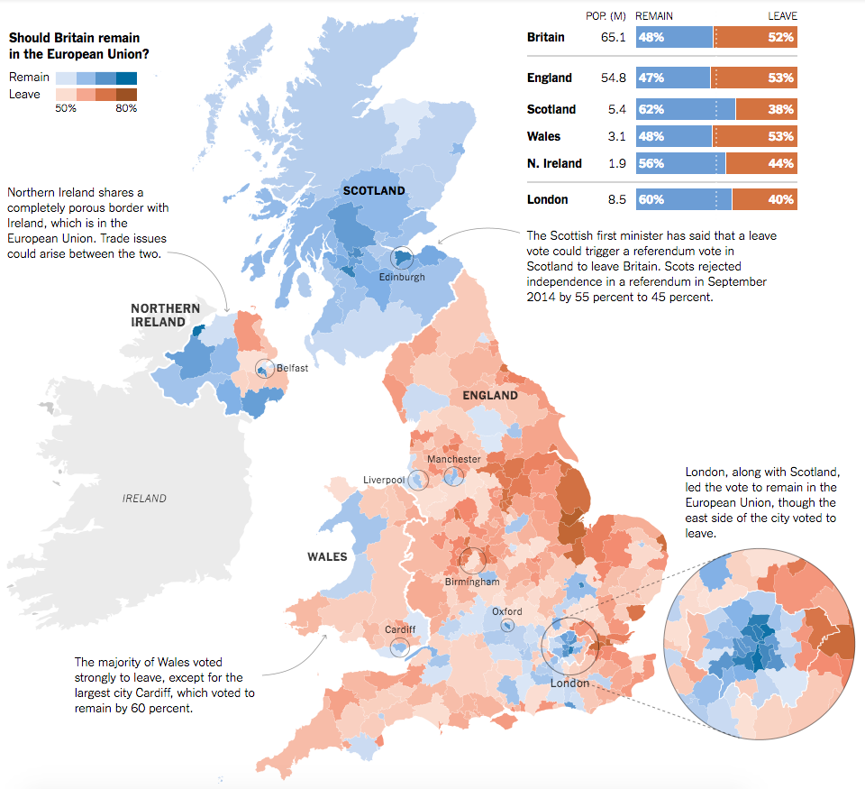
In a large layout, the piece makes excellent use of annotation text to indicate the overview stories for the home nations of the United Kingdom: Scotland, Wales, and Northern Ireland. Northern Ireland, of course, will likely have to deal with the reintegration of border controls between the Republic of Ireland and Northern Ireland, a point the piece makes quite clear.
Additionally the map makes use of small elements to draw attention to data points, i.e. geographies, worth noting. London dominates the urban landscape, but other important cities like Belfast, Manchester, Birmingham are circled to show the strength of Leave/Remain. I would be curious to know the rationale behind including some areas, but omitting others, e.g. the strong Remain results in Cambridge or Brighton or the strong Leave results in Boston, require knowing just where cities are located in England.
From a design standpoint, the colours used in the map work really well together in contrast to other palette choices one could make. (We will take a look at that tomorrow.) Additionally, the shape of the United Kingdom allows for contextual elements, e.g. the regional result aggregates, to be placed much closer and nearer to the results. The space also allows for those annotations to be placed near their particular geographies.
But, what makes the piece stand out is when the user consumes it on smaller screens. On a more tablet-sized screen, we see a tweaked layout.
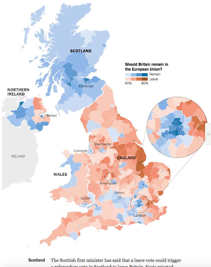
It makes use of the remaining wide-aspect dimensions to move the greater London results into a white space carved out by the peninsula of East Anglia. While the city and home nation labels remain, the regional annotations and results are gone from the graphic. Instead, they have been placed below the map, the main and most important part of the story.
Then for mobile phone or other narrow displays, the piece degrades even further.
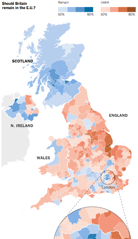
City labels and circles are gone, with the exception of London. The greater London inset moves from alongside the map to now below the map, in the Channel so to speak. This layout allows for a narrow screen to better view the geographic results and then scroll down into the districts of London that require more space to be displayed. The annotations and stories remain below the graphic.
The design of the overall piece accounts nicely for at least three different screen sizes while keeping the story constant. All the truly changes is the layout of the graphic (and the loss of a few contextual labels at the smallest of sizes). Overall, it makes for a rich and compelling—and well designed—piece on the Brexit results.
Credit for the piece goes to Gregor Aisch, Adam Pearce, and Karl Russell.
Leave a Reply
You must be logged in to post a comment.