Emmanuel Macron won the French presidential election yesterday. So Guess what we have a graphic or two of this week? If you guessed Mongolian puppies, you were wrong.
Thursday afternoon the Wall Street Journal—they seem to really be upping their game of late—published an article breaking down the connection between a Le Pen support in the first round and unemployment. For me, the key to the article was the following graphic, which plots those two variables by department. The departments that she won, generally speaking, suffer higher unemployment.
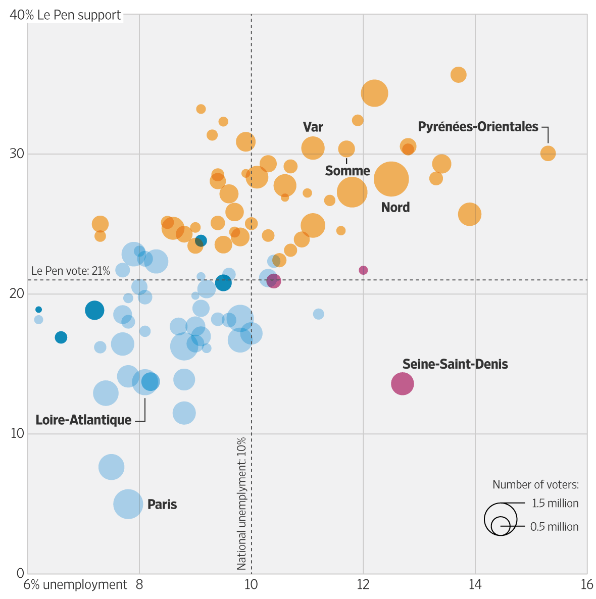
Colour coding relates to the winner of the department. I am not certain that the size of the voters in the department matters as much. But the annotation of particular departments, qualified as being limited to the French mainland—see my problem back in April about when France is more than France—flows through the several graphics in the piece.
This is a piece from the Thursday running up to Sunday’s vote. Tomorrow we will look at a piece from the day before the vote that looked at another key component of Macron’s win.
Credit for the piece goes to Martin Burch and Renée Rigdon.
Leave a Reply
You must be logged in to post a comment.