Brexit and the British General Election

On 8 June, Britons will go to the polls in a general election that Prime Minister Theresa May called to increase her parliamentary majority. The United Kingdom faces a number of issues—I am looking at you housing and the NHS for starters—but Brexit is on the minds of a lot of people.

That makes sense, because if you recall the nation split 52–48 to leave the European Union last June. But, as the Financial Times explained the other day, that split is not as even as it used to be and that may have significant ramifications for the Conservative Party not to mention Labour and the Liberal Democrats.

The author explains the piece in nice detail, but this graphic including along with the article does a fantastic job showing the movements.

Who's moved where?
Who’s moved where?

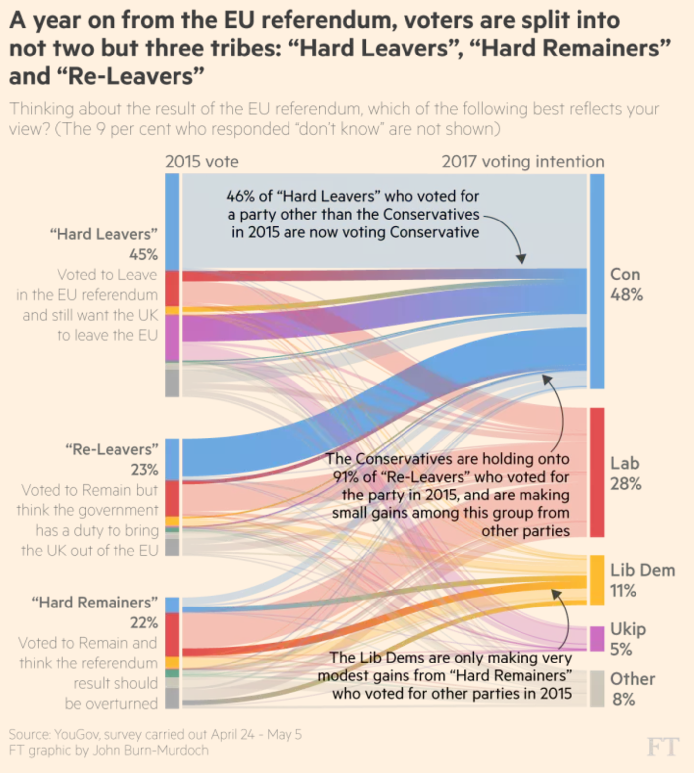
As you can probably guess, I am a huge fan of the annotations. Although I would argue that the centre and lower two, by being placed over the graphic, may be a bit illegible. But the concept is fantastic. It shows you just how difficult it will be for Labour and the Lib-Dems to beat May in June.

Credit for the piece goes to John Burn-Murdoch.

Declining British Wages

Now for the actual piece for today.

We have a scatterplot from the Financial Times that looks at wage and economic growth across the OECD, focusing on the exception that is the United Kingdom. And that is not an exception in the good sense.

The UK had the rare privilege of experiencing economic growth—that’s good—while simultaneously wages fell—that’s bad. But I wanted to comment on the chart today.

I would have designed this a little bit differently

Straight off the bat, the salmon-coloured background does not bother me. That is FT’s brand and best to stick to it and make your graphics work around it. Possibly the colours in the plot could use a bit of a push to increase separation, but that is more a design quibble. Instead, I am not too keen on the colour coding here.

Not that the colours need not be applied, but why to the dots? Note how the dots of a colour fall into one of the quadrants. Instead of having people refer to the legend, incorporate the legend into the chart by moving the labels to the plot background. You could colour code the labelling or even colour the quadrants to make it a bit clearer.

Credit for the piece goes to the Financial Times graphics department.

The Future of Climate Change

At the end of the month the world will gather in Paris, France for the next round of climate change talks. In advance of the talks, the Financial Times put together this model of how emissions reductions will help—or not—get climate change under control. The piece is two-fold. The first is a ten-step narrative that showcases the tool’s split of the time series into short-, medium-, and long-term impacts and how those work in the best and worst case scenarios. But it then allows the user to jump right on in and create their own scenarios.

Is it getting hot out there?

Credit for the piece goes to John Burn-Murdoch and Pilita Clark.