
Admittedly today’s piece fails to deliver on the data visualisation and information design spectrum. But I found it hilarious and apropos to this week’s content.

Credit for the piece goes to Randall Munroe.
Admittedly today’s piece fails to deliver on the data visualisation and information design spectrum. But I found it hilarious and apropos to this week’s content.
Credit for the piece goes to Randall Munroe.
Well, today is Black Friday. And so there were probably lines at the door of your local department store at the wee early hours of the morning. But I was working, and partly to bring you this. Google has data on what each state searches for the most. And Vox turned that into a map. Turns out a lot of you want boots.

Credit for the piece goes to Javier Zarracina.
It’s Friday. It’s October. That means it’s time for pumpkin spice cocktails, courtesy of This Is Indexed. Gentrify, people. Gentrify.
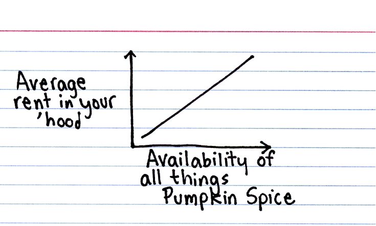
Credit for the piece goes to Jessica Hagy.
In the wake of Volkswagen, this piece from xkcd seemed appropriate this Friday.

Credit for the piece goes to Randall Munroe.
I’m Irish—my ancestors were from the southern part—and so I grew up Catholic and I went to Catholic schools. So I know some of my Jesus stories. There’s that one story about how at the end of some guy’s life he looks back at a beach—I have no idea what life means being on a beach—where he walked. He sees two sets of footprints and asks Jesus, “Bro, why are there two sets?”
“Dude bro, that’s me.”
“Whoa, then why are there sometimes only one set?”
“That’s when I carried you.”
My interpretation of Jesus speech notwithstanding, it’s one of those stories that is supposed to teach you that you are not alone. Probably because the thought of being a random event in the entire series of random events in the universe(s?) frightens people. Anyway, Randall Munroe over at xkcd took a look at the footprints story. Happy Friday, all. (And you too, bro. That’s right, I’m looking at you, Jesus.)

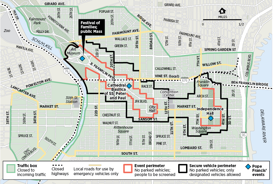
For those not from Philadelphia, you might not know the Pope is visiting the city in September for a global conference of sorts. While that is great news for the followers and believers, it means absolute hell for the other residents of the city. So finally the security map has been published, detailing just where vehicles can go and where inspections will be held.
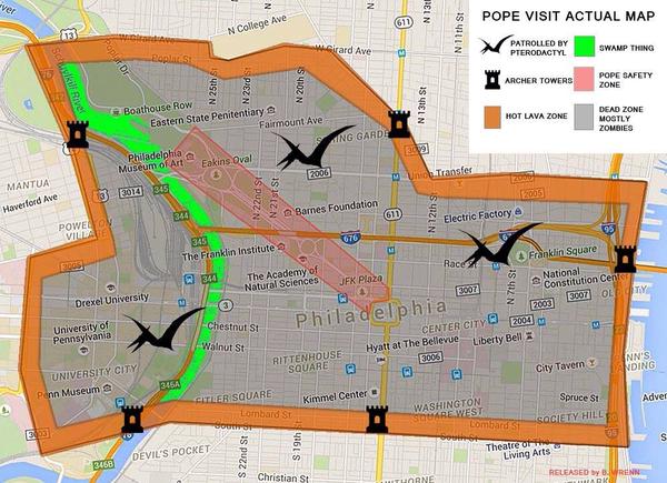
But the best—or worst—part was that for several weeks there was no public knowledge of just what would happen. And that meant maps like the one below were produced. Personally, I think this one would be a lot more fun.
Credit for the real one goes to the graphics department of philly.com.
Credit for the more awesomer one goes to B. Wrenn.
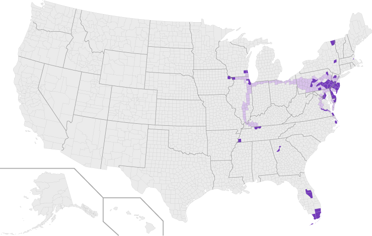
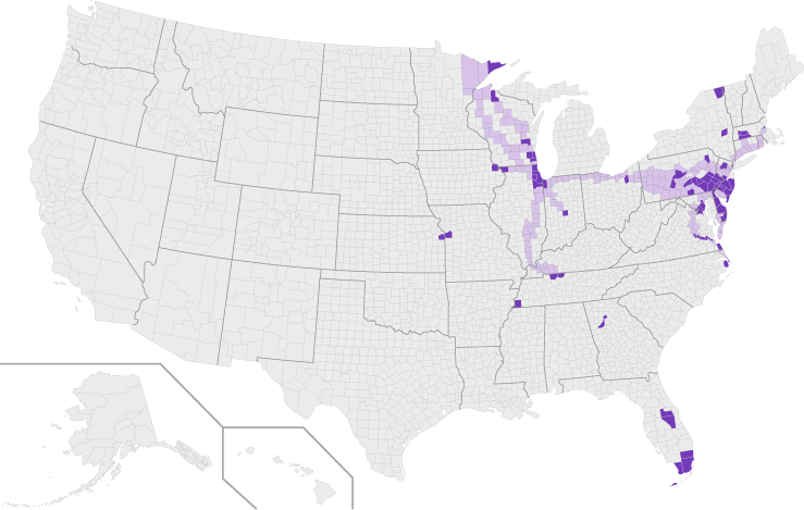
In January 2011, I made a map of counties I had visited in my life. I just rediscovered the file last weekend, and so today I decided to update the map. So below is 2011 and then after is 2015.
Even when things are funny, I do not always laugh aloud. This xkcd post, however, made me do just that. And for that, it’s going up on the blog as today’s graphic of choice.

Credit for the piece goes to Randall Munroe.
And of course a week with awesome science-y space news is not complete without a little bit of xkcd.

Credit for the piece goes to Randall Munroe.
It’s Friday, everybody, so let’s lighten the mood with cruel and unusual punishment.
Don’t worry, it’s not as bad as it sounds. No, today we look at a simple two-axis plot or matrix used by Jon Stewart to classify means of death and whether or not they would unconstitutional based on the cruel and unusual clause.
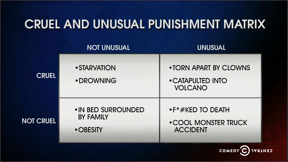
Credit for the piece goes to the Daily Show’s graphics department.