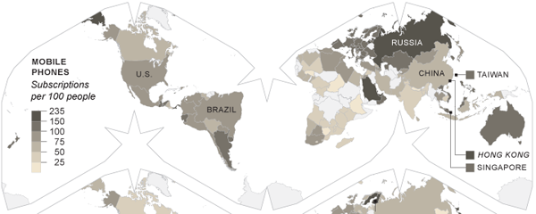
Technology changes and changes rapidly. The United States led the way with cabled phone networks. Now, countries in Africa are skipping landlines and moving straight to mobile phones. The New York Times has an piece on the changes in technology and accompanies that piece with small multiples of choropleth maps that showcase different technologies and their prevalence.

What is interesting about these maps is that the Times eschewed the conventional Mercator or Robinson map projections and went with a slightly more unusual layout. But, a layout that saves some space by its contortion of the world’s oceans. Was their reason spatial or something more about maintaining consistent area? I would be curious to see the piece in print to see if it needed to fit a narrow column.
All in all, an interesting set of maps.
Leave a Reply
You must be logged in to post a comment.