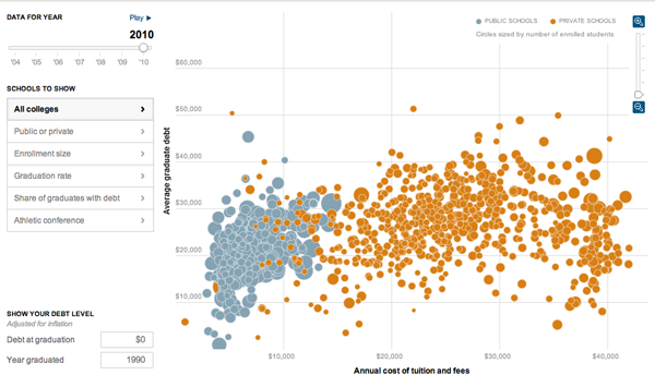
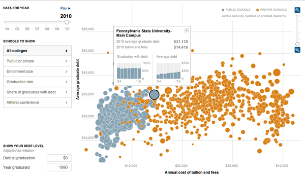
It’s that time of year when young men and women step outside into the big, real world and realise just how much money they owe to various creditors. Yay. The problem, however, has continued to get worse for students. This interactive infographic by the New York Times explains just how so by comparing student debt to costs.

While the bubble chart is also available in map form—though I don’t find that particularly useful myself—the more interesting added layer of complexity comes from the data displayed when the user selects a specific university.

Credit for the piece goes to Jeremy White, Andrew Martin, Andrew W. Lehren, and Archie Tse.
Leave a Reply
You must be logged in to post a comment.