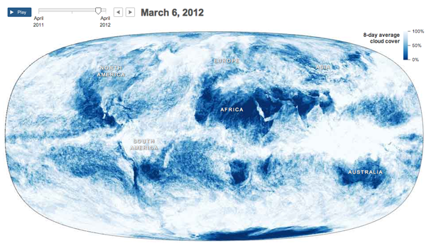
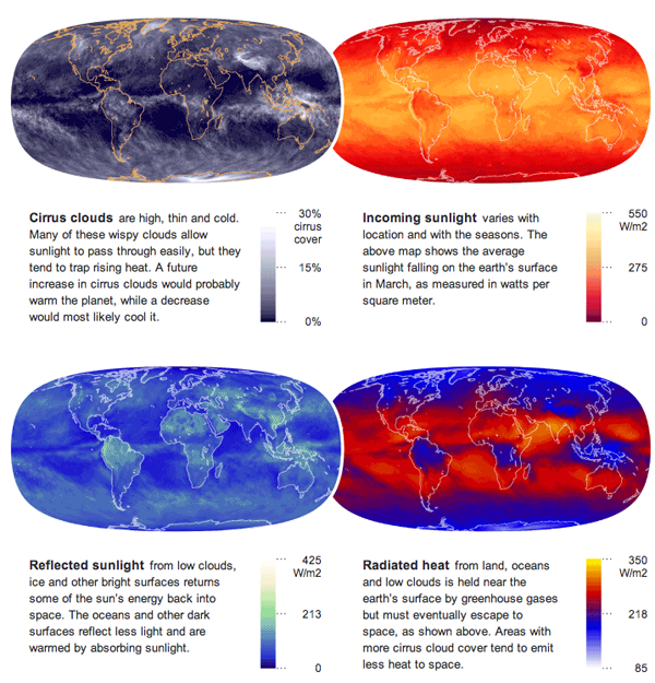
Supporting an article about how the clouds are the last great hope for the climate change skeptics, the New York Times published an interesting infographic that looks at cloud cover and insolation, the amount of solar energy that irradiates the planet.
The main feature is an animation of a year’s worth of cloud cover. The mapped data begins to clearly show the difference between air circulation over the oceans and over land, with the interface between the two creating the rough outlines of the continents.

Supplementing the animation are four small multiples of different measures that look at energy and its conservation across the planet.

Credit for the piece goes to Jonathan Corum.
Leave a Reply
You must be logged in to post a comment.