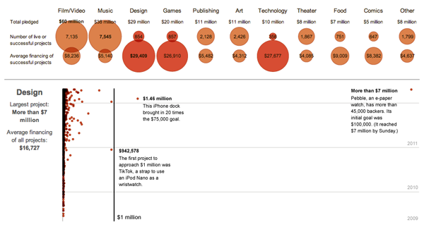
Kickstarter has been around for a little while now, financing some interesting projects. The New York Times has an infographic about how much each project earned. And while there is nothing particularly fancy about each, they are all scatter plots, the quirk is that the time and value axes have been reversed from their customary positions. While unusual, it supports the longer range for the monetary figures and the short range for the three years of Kickstarter history.

Furthermore, the data is broken out into different industries, e.g. design, food, and dance, that have adjusted value scales to make intra-industry comparisons easier. Nothing fancy, but an attentive care to the detail of the data.
Leave a Reply
You must be logged in to post a comment.