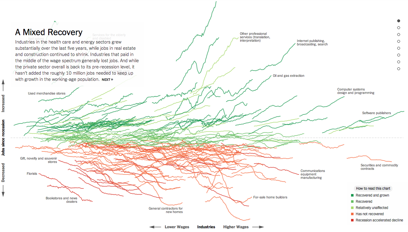
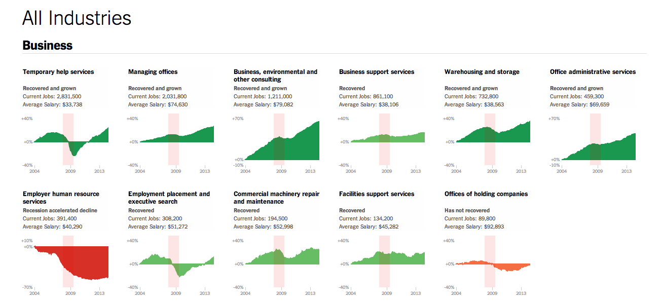
Normally I try to reserve Fridays for the lighter stuff. But yesterday, the New York Times published a really fantastic piece about how the Great Recession changed the American economy through job growth or loss in each sector of the economy. Naturally this sounds very difficult because the American economy is both very large and very diverse.

If you check the piece out, however, you will find that you are offered a guided tour with analysis to provide context to an otherwise jumble of coloured lines. As a bonus, highlighted words in the text bring up small charts showing the actual job growth history for the particular sector. The jumble, however, is also organised along the x and y axes by two important metrics: wages and jobs since the Great Recession. This allows you to see whether low wage jobs have performed better than higher paying and whether either has created more jobs than the other. Line colouration denotes whether a particular sector has grown and recovered, recovered, not recovered, or recession accelerated a previous decline.
Then at the very end is another really great part of the piece. This is a collection of all the small charts arranged by areas of the economy.

Lastly, for those of you who have to work on smaller screens, don’t worry, they made it responsive. Overall, a great piece.
Credit for the piece goes to Jeremy Ashkenas and Alicia Parlapiano.
Leave a Reply
You must be logged in to post a comment.