Let’s consider today a follow-up to yesterday’s piece. (No, I do not believe I have ever done a follow-up piece, but why not start now all these years later.)
Yesterday we looked at the Post, Journal, and Times for their coverage of the fallen rain amounts in southeast Texas. But at the time, we only had actual totals from the Post and Journal. The Times had only produced a projection map. The Times piece yesterday was perhaps the most underwhelming of the three, though it certainly did some things correctly, namely it was small, simple, and quick to get the reader to the point that Houston was likely to be flooded by storm’s end.
Well that had changed by the time I got home last night.
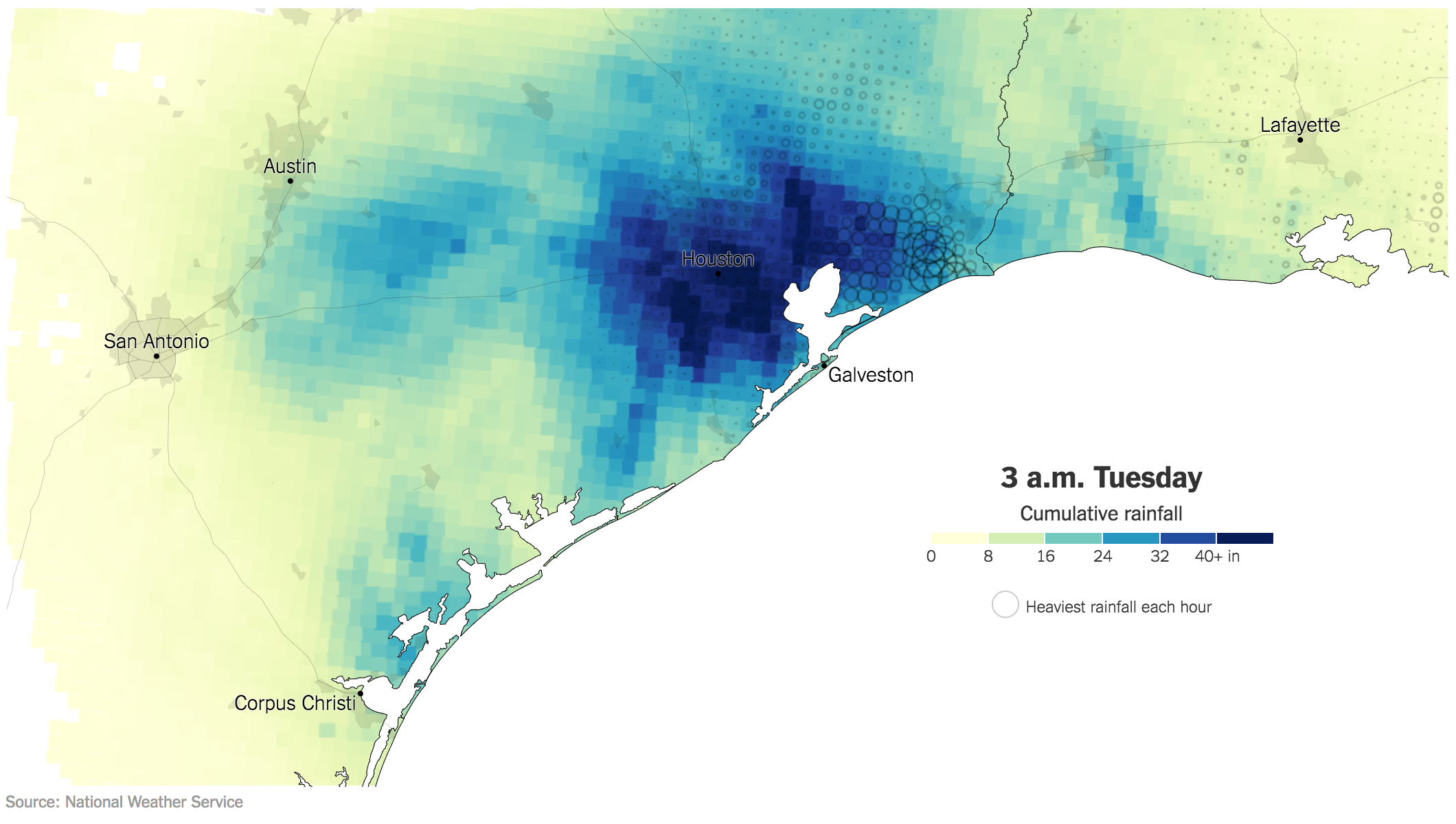
What is different about this piece? Well this one is an animated .gif showing the cumulative rainfall. In other words, Texas starts dry and every hour just makes the map bluer and bluer. An additional feature that I find particularly useful is the dot map, which indicates where the heaviest rain was falling in each hour. Especially early on in the event, you can see the bands of rain sweeping in from the Gulf.
The bins also work better here, though I wonder if more segregation or a different palette would have worked a bit better. But, my biggest critique is the same I have with many animated .gifs: the looping. And unfortunately I do not have an easy solution. You certainly need to see it loop through more than once to understand the totality of the rainfall. But then I really do want to be able to examine the final map, or at least final as of 03.00 today.
Anyway, this was a really nice piece that should have been showcased alongside the others yesterday.
Credit for the piece goes to Gregor Aisch, Sarah Almukhtar, Jerey Ashkenas, Matthew Bloch, Joe Burgess, Audrey Carlsen, Ford Fessenden, Troy Griggs, K.K. Rebecca Lai, Jasmine C. Lee, Jugal K. Patel, Adam Pearce, Bedel Saget, Anjali Singhvi, Joe Ward, and Josh Williams.
Leave a Reply
You must be logged in to post a comment.