Yesterday we looked at trade with China. Today, we look at Canada, allegedly ripping off America. But what does the data say? Thankfully the Washington Post put together a piece looking at just that topic. And it uses a few interesting graphics to explore the idea.
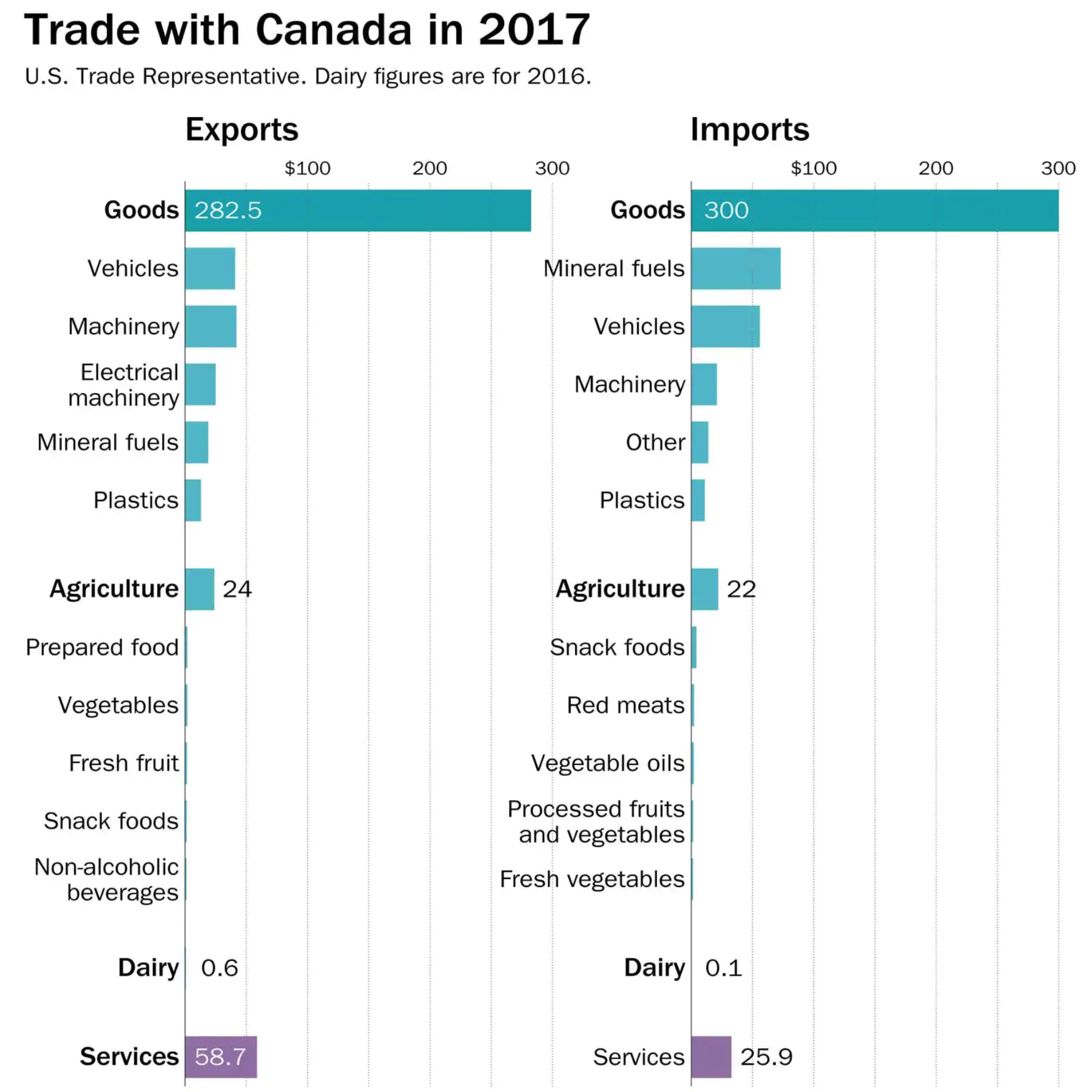
The easiest and least controversial graphic is that below, which breaks down constituent parts of our bilateral trade.

Note that the graphic does not just show the traditional goods part of the equation, but also breaks out services. And as soon as you consider that part of the economy the US trade deficit with Canada turns from deficit into surplus.
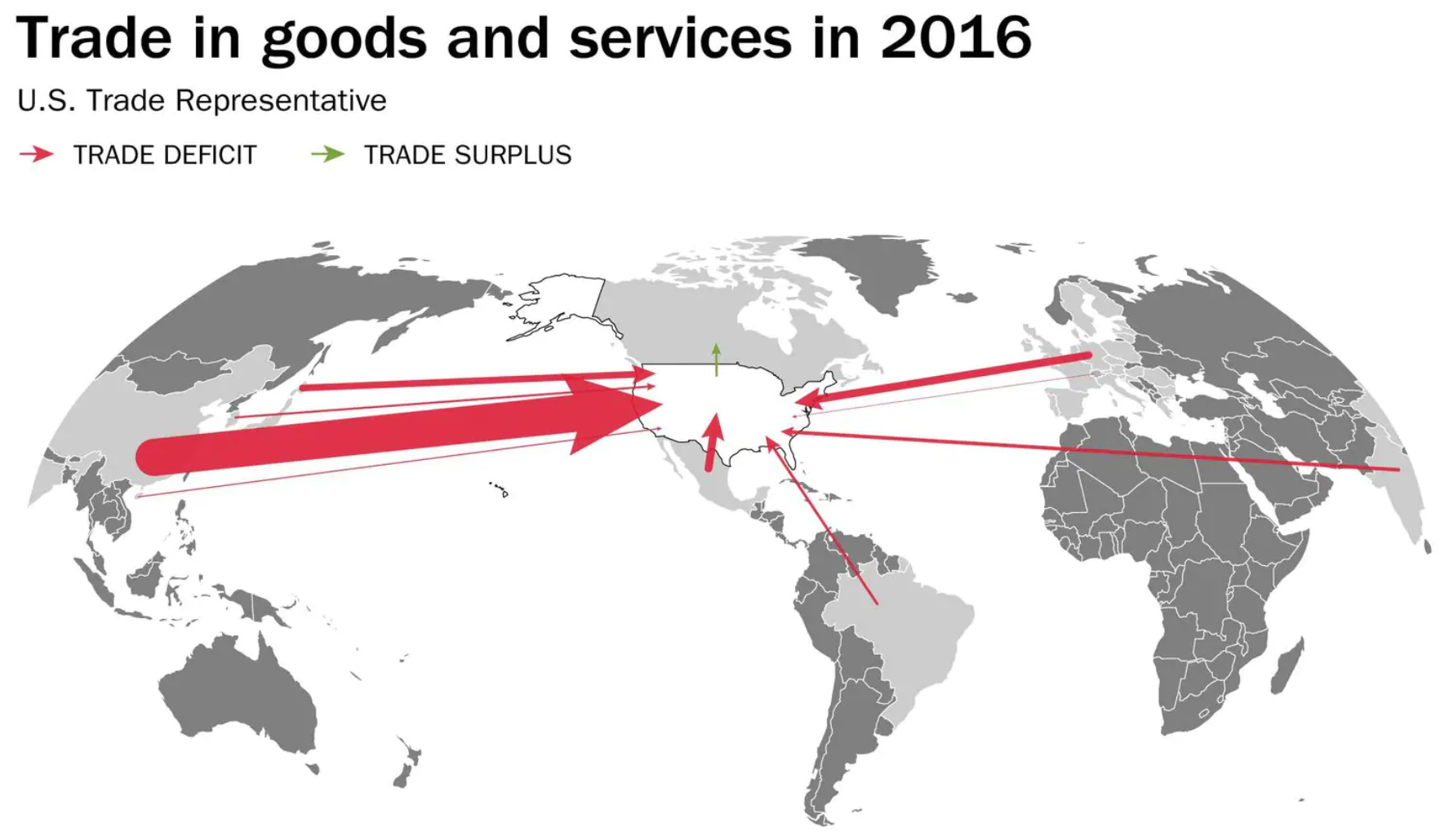
But the graphic also uses a pair of maps to look at that same goods vs. goods and services split.

Parts of the design of the map like the colours, meh. But the designers did a great job by breaking the standard convention of placing the Prime Meridian at the centre of the map. Instead, because the United States is the story here, the map places North America at the map’s centre. It does lead to a weird fracturing of the Asian continent, but so long as China is largely intact, that is all that matters to the trade story.
This all just goes to show that it is important to begin a conversation about policy with facts and understand the actual starting point rather than the perceived starting point.
Credit for the piece goes to Philip Bump.
Leave a Reply
You must be logged in to post a comment.