Following up on yesterday’s post about the facts on tariffs, today we look at an article from Politico that polled voters on their feelings about trade and trade policy. Now the poll dates from the beginning of June and unfortunately a lot of things have changed since then. But, the data overwhelmingly supports the conclusion that voters, at that time at least, do not support placing tariffs on goods coming into the US.
Let’s take a look at another component of the article, however, a chart exploring the infamous trade deficit. First of all, trade deficits do not work like how the president says they do—but we will come back to that in another post. In short, trade deficits are neither good nor bad. They are just one way of describing one facet of a trade relationship between two countries.
This piece looks at the trade balance between the United States and China.
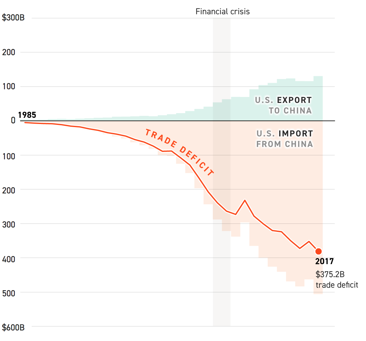
Now, from the topical standpoint, it does a really nice job of showcasing how our imports have surged above our experts. From a topical standpoint, however, we do not know if this is a total trade deficit or just in goods, like the president prefers to talk about, or in goods and services, the latter of which accounts for way more than half of the US economy.
From a design perspective, I have a few thoughts and the first is labelling. The chart does label the endpoints of the data set, 1985 and 2017. But aside from a grey bar representing the Financial Crisis, there are few other markers to indicate the year. In smaller charts, I often do this myself, because space. But here there is enough space for at least a few intervening years to be labelled.
Secondly, the white outline of the red line. I have talked before of a trend to showcase a line over other lines with that thin stroke. But this is the first time I can recall the effect being used over an area filled with colour. Is it necessary? Because the area is light and the line dark and bright, probably not.
Then the outline appears on the text in the graphic, in particular the labels of imports, exports, and the trade deficit label. The labels for the imports and exports likely are necessary because of that light grey used for the text. But, as with the line for the trade deficit, its label likely provides sufficient contrast the thin white outline isn’t necessary.
Credit for the piece goes to Jeremy C.F. Lin.
Leave a Reply
You must be logged in to post a comment.