Late last week I was explaining to someone in the pub why the World Cup matches are played beyond their 90 minute booking. For those among you that do not know, basically the referees add up all the stoppage time, i.e. when play stops for things like injuries or people dilly dallying, and then tack that on to the end of the match.
But it turns out that after I explained this, FiveThirtyEight published an article exploring just how accurate this stoppage time was compared to the amount of stopped time. Spoiler: not very.
In design terms, the big takeaway was the dataset of recorded minutes of actual play in all the matches theretofore. It captured everything but the activity totals where they broke down stoppage time into categories, e.g. injuries, video review, free kicks, &c. (How those broke out across an average game are a later graphic.)
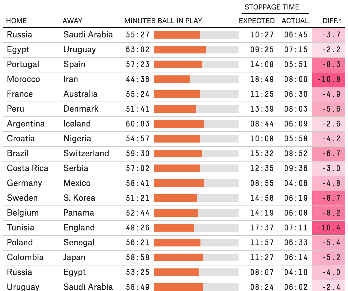
The setup is straightforward: a table organises the data for every match. The little spark chart in the centre of the table is a nice touch that shows how much of the 90 minutes the ball was actually in play. The right side of the table might be a bit too crowded, and I probably would have given a bit more space particularly between the expected and actual stoppage times. On the whole, however, the table does its job in organising the data very well.
Now I just wonder how this would apply to a baseball or American football broadcast…
Credit for the piece goes to David Bunnell.
Leave a Reply
You must be logged in to post a comment.