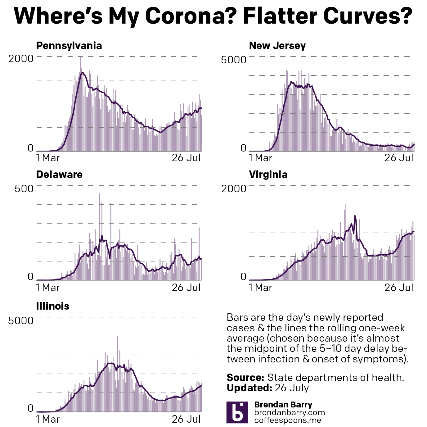
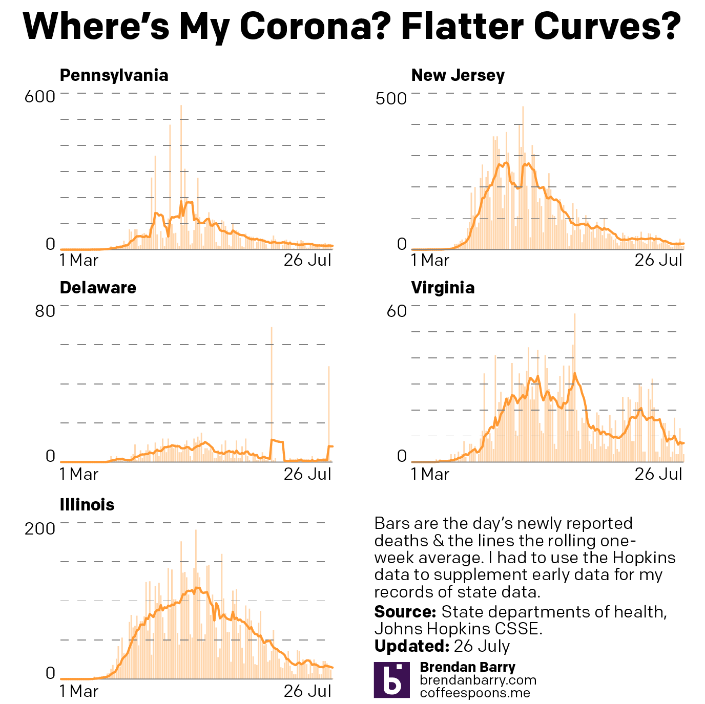
I do not want this blog to become a permanent Covid-19 data site. So in my push to resume posting last week, I tried to keep to from posting the numbers and instead focused on discussing how the data is displayed.
But I hear from quite a few people via comments, DMs, emails, and text messages that they find the graphics I produce helpful. So on the blog, I’m going to try posting just one set of graphics per week. Will it always be Monday? I don’t know. On the one hand, new week, new data. But on the other, weekend numbers tend to be lower than the rest of the week and could make it seem like, yay, the numbers are starting to go down especially if you only come to my blog and only see this data once a week.
So yeah, we’ll see how this goes. And I’ll try to keep Tuesday–Friday to discussing the world of data visualisation, although in these days, a good chunk of it will likely revolve around Covid.
Credit for these graphics is mine.
Leave a Reply
You must be logged in to post a comment.